Home › Forums › Sign Making Discussions › Graphic Design Help › what do you think of my new logo?
-
what do you think of my new logo?
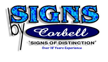
Posted by csigns on 28 November 2005 at 17:21this is my logo i designed for all my advertising this picture looks fuzzy but it is not
Attachments:
 Nancy Wannous replied 20 years, 1 month ago 7 Members · 11 Replies
 -
11 Replies
-

Hiya
Corbel 🙂 not from the nappa valley are u in CA? I have family out there and one of them is a manager for corbel ( the brandy makers )
nice logo btw 😀
-

The only bit that will age is the “Over 18 years experience”… if this is printed and have it lying around in 10 years time, it would look a bit odd as it is 28 years experience… okay “over” bit covers it, but you know what I mean
-
well in the past i have used since 1988 that would be better after i think about it. i never though much about the way put it but you are right it would age
-

i like the design, looks good mate…
i like the word “by” and how it sits, but i think it all needs pulling together as a logo mate. i mean this purely as constructive criticism, there is nothing wrong with the design. but “self preference” ide say tying the oval signs by together would improve it…
by now your probably wondering what the hell im on about? :lol1: :lol1:
sorry… i just mean each part sits on its own, no overlapping of text etc to make it appear as a logo… oh i give up, im hopeless at explaining 😳 😀 -
quote Forbie:Just like U!
Goop
smoothy :lol1: :lol1: :lol1:
-
 quote Robert Lambie:smoothy :lol1: :lol1: :lol1:
oh no andy…….youve got some competition………… :praise1: :praise1: 😉
nik
-

you guys are very funny.yeah funny but nice people. Thank you guys 🙂 😳

Log in to reply.