Home › Forums › Sign Making Discussions › Graphic Design Help › what do you think of my first business card design?
-
what do you think of my first business card design?
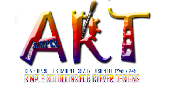
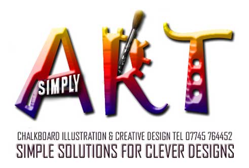
Posted by Nickie on 19 November 2003 at 15:06As a brand new business (and no formal training so please excuse, i am self taught) i have had to design my own logo. My business is called simply Art and is a chalkboard illustration & graphic design service. I wanted something that was modern colorful and totally original so i came up with this…..
This will be a sample of my business card – im only going to learn if you critique so fire away.
thanks in advance
NixNickie replied 22 years, 1 month ago 17 Members · 36 Replies -
36 Replies
-
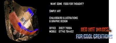
if anyone is wondering, its a chile and paintbrush in a block of ice – hence hot and cold …
slogan – want some food for thought?
Red Hot images for cool creationsok ok it was the best i could come up with lol….. ideas appreciated
regards
Nix -
Hi Nickie…
Here is my opinion.
I like the black background…like a chalkboard.But the copy is sooooo tiny.
If it were me, I would hand-letter and draw a logo instead of a cold digital print. I would use a chalkboard-looking kind of lettering.
If you did a ruff sketch of a frozen chili pepper, kinda cartoonical but still professional, it might have more impact. This cold be a such fun for you if you take it out of the box a bit.
Draw it, clean it up, scan it, then take it to a reputable printer who will help you assemble the pieces.I like your slogan a lot…it is very clever. But your company name should outweigh the slogan.
Love- JILL 😉
-
Like Jill said Nick I like the idea but the text is too small, I would letter a real board with my info, take a pic of it then bring that into something like Corel and make my design from this, cool 😎 idea with the chilli and the brush though.
-
hanx so much guys – i see what you are saying but also remember i do graphic design too, i was worried about doing something in chalk because that is only a part of my business – i do know what you are saying though and totally take it on board – it was this dilemma that has me bewildered before – i need to encorporate the two really,somehow if i can – chalkboards and digital graphics, doh but i do murals too – its a nightmare because what i cover is so diverse, so you can see my problem! which initially is why i stuck to a name like simply art coz it covered everything – thanx for your comments – i value them very much
Regards
]Nix -
Then why not do a double sided biz card, chalk stuff one side graphic design the other ( 😡 graphic designers!!! 😡 Sorry I used to be a printer) 😆 😆
-
If your company is called Simply Art then the name has to be more prominent. I’m not sure if you need to do the block of ice thing either – it’s a bit cyrptic.
-
-
The “Simply” looks a bit lost in the “A”
The tag line is killing my eyes 😮I do like the ART font, I was in France back in the summer & they seem to use that font a lot there, i like it.
-
Nickie
Can you tel me what services you intend to sell (?)
Just so I can give a better critique to you proposed card.Also consider that you may want to produce the logo in a single colour at some point for an advert, fax copy etc etc.
So going overboard on 4 colour is ok but in some instances will look crap ( technical terminology ) produced as a single colour.
As you will be aware many corporate brands have there logo in 1, 2 & 4 colour and all are easily identified as the same company…..
Hope this is of some help…..
Tim.
-
I like the first one. It’s a business card after all…………NOT…….a sign! Don’t like the white strip on the end though!
If you’ve a dilemma about having two distinct sides to your business why not get 2 business cards run/printed at the same time. I have 3. One predominantly Signs, one for T-shirts and one for my Boxing business!
-
Hi Nickie,
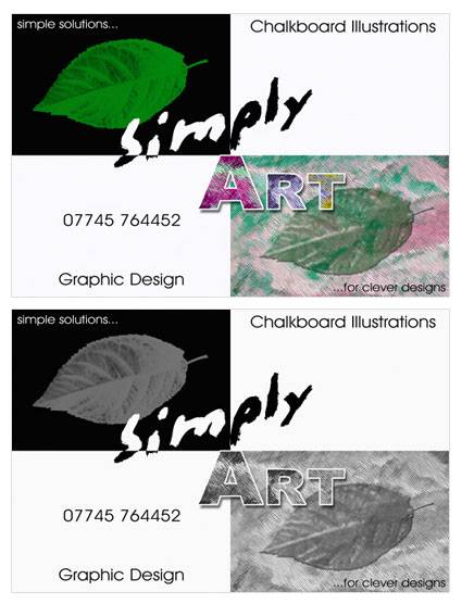
As a self taught designer too, in the same part of the world, I couldn’t resist putting a little thought into how you could come up with a simple but effective design. I came up with what you see below, which in my opinion sort of separates, yet denotes the two sides to your business without being too brash and busy. Hope this helps or gives you more ideas. Good luck 😀
Debbie
-
great designs debee! 😉 thank you for taking the time to help out.. 😛
now your spoiled for choice Nickie! 😀
-
Thanx alot you guys, i wanted something colourful because i suppose i’m kind of a colourful person lol! and i do love your design its lovely – i did something in black and white previously for the same reason but wanted something to kind of hit you in the face as soon as you look at it as im doing so many mail outs at the moment i wanted to be able to ‘catch the clients eye. I actually agree with Tim about the slogan underneath though i think im going to change that definately – i’ll try a few single colours on the Art and see what i can do to make it look better. Thankyou so much for your input, i really appreciate it.
My services are..
Digital photography and manipulation,
chalkboard illustration,
web design
and graphic Design,so you can see it’s a little diverse.
I do this because my clients see me as a creative person and have asked me to do certain design jobs for them and been happy with what ive offered and then passed me on to other clients.
My main clientele are marketing companies and pubs, restaurants and nightclubs, so i guess i get a little tunnel vision when it comes to designing my logo because the flyers and tickets etc i design for pub and club launches are all very colourful.
Once again i really appreciate you taking the time to help me with my dilema.
Kindest Regards
Nickie -
-
-
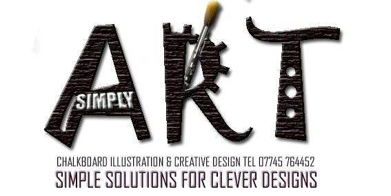
ok had a mess around with this.. not sure if its your cuppa-tea. i know it doesnt spell creativity… see what you think anyway. 😕
[c]
 [/c]
[/c] -
fantastic- the logo i designed looks much better the way its been changed and the simply and the slogan are much more visual – thankyou and robert what can i say – your design is fab really good – i was looking for some stock with chalk on it but couldnt find any – i didnt have the images – fantastic – it speaks volumes
-
I think, out of all of them i prefer Robs, (not trying to suck up either 😉 ) Clear and simple
Very niceSimon
-
agree with simon & debbie!!
very nice robert!!
Nicola
-
i prefer roberts also..
code :and like si, im not trying to suck up either :lol:i think all the others are great, better than i could do. but the chalk & layout of roberts comes across sharp & professional.
but what do i know… 😳 😳
-
Nice one Rob, clean & easy to read (drain) (drain) (drain) (drain)
Cheers, Steve
-
Nice one Rob but a bit to Corporate l@@king for me…
Well thas me in trouble…. 🙄
Tim.
-
Thanks for the comments nickie, simon, debbee, Nicola, sally, steve tim. 😛
Tim
Yep, you maybe right mate.. Its just another option I suppose.
I liked all the other designs too.. I just felt that they might be a bit to elaborate to make much impact at business card size. So I went for the subtle sort of approach.. But fair comment. 😉 -
I’d be pretty useless as an art critic as I like all the variations. Admittedly Roberts does look corporate and if that the clients you’re going for, its perfect.
Cheers, Dewi
-
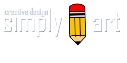
sorry i havent been around for a few days – i wasnt being rude ive just had a lot on – I have to see a director of a complex wednesday as he wants me to supply and do illustrations for 50 boards for him AND he wants them changing every quarter – what a christmas pressie eh – im so chuffed! anyway whilst ive been away ive been contemplating all the things that you’ve said to me and i guess ur right – i cant have anything too colourful and my business is so diverse i cant concentrate on any one thing so i came to a decision – it may not be the best but this is what ive finally come up with and already using…..
You all said the name was the most important thing so i thought simply ….. and then i thought …..art
-
Hi Nickie,
The pencil is nice and bold but perhaps a little too bold and the text seems a little faded. Maybe beefing up the text with a stronger colour and toning down the pencil a little?
Cheers, Dewi
-
Good luck with the order Nickie glad things are going the right direction 🙂
Tim.
-
yeah i know what ur saying about the text but trust me – it does look better as a letter head – almost as though the letters are raised from the paper – but it is still quite prominent and very legible. I wanted the pencil to be a strong contrast because thats the image thats doing all of the talking – it says sketch, art, illustration – well to the people ive asked anyway lol – im quite happy with this one as although its not great its simple and looks great on a glossy ad – it appeals to corporate as well as independant businesses. I love corporate logos but i do aim (most of the time) to cater towards independants as i provide my services at low cost without having to order bulk and its safer this way whilst im still learning and building confidence.
Does anyone know how i can learn about airbrushing technique, after seeing terry’s work i looked into it and saw that quite alot of illustrators use airbrush now and the effect is fabulous
Regards
Nix -
I Like the final design a lot. You are the person selling your services, and if you are comfortable with the image portrayed then who can argue with that. Glad to see things are going well for your new business.
All the best
Cheers
Danny -
Fully agree with Danny.
My head was in vinyl mode…. 😮 ….and perhaps one too many coffees.
Echos of whats already been said, contract sounds cool and oodles of luck 🙂
Cheers, Dewi
-
Nickie try this link for Airbrushing, they do weekend courses http://www.pkmsigns.co.uk/ and try these people for the airbrushes http://www.airbrushes.co.uk/index.shtml I have 2 Iwata brushes, and Eclipse and a Revolution and a Sprint Jet compressor, if you are cheeky they will give you discount if youy buy brush and compressor together, also our Alan Eveleigh good for airbrush tips.[/url]
-
Steve
Noel(newcomer) here
read the info you gave Nicki. I’ll check out those sites, what kind of paint is best for a. vinyl & b. general artwork. Have you done a lot of this airbrush work yourself? what type, signs?, art etc
Cheers
noel (?) -
some good lookin arts there, hey niks, whered you get your foto done i luuuuuv it
-
you have all been so positive and supportive, its been a real hard slog setting up in business and no doubt this christmas will be the hardest one yet but i know im on the up from here. I’ll defo look into that site for w/e courses steve thanks v much – priceless info that – oh and the picci was taken a few months back by a photographer friend of mine – i work part time as a model and actress too, although its more of a hobbie now – it has to be lol – im studying for a diploma too, but it helps to fund the business a little – phew its no joke being a single mum these days lol!
take care everyone – have a lovely christmas and an even better new year, wishing you all good luck and prosperity
nix xx
Log in to reply.


