Home › Forums › Sign Making Discussions › Graphic Design Help › what can i do with my yellow pages layout?
-
what can i do with my yellow pages layout?
Posted by graficxpress on 17 March 2005 at 13:05What is everyones thoughts on this? not finished yet but keen to get other peoples honest opinions on the layout etc.
graficxpress replied 20 years, 8 months ago 13 Members · 40 Replies -
40 Replies
-

could you convert text to curves as i dont have the fonts to see it properly
adrian
-

First of all, post a jpg so people can see an instant preview, you’ll get more constructive criticism that way.
Secondly, there’s not enough there to comment on yet. A rough draft is OK, but get all the info on then we’ll know how much you want to say on the ad.
As it is, this is the same as about 10 million other signmakers’ adverts. I have tried to make mine a little different to the same old boring layouts that everyone does, just to make it a little more noticeable. You’ve got to think ‘what would make them call me?’
-

…won’t open in Corel 9.
As Big G sez, just post a jpg please.
Love….Jill -
I’m sorry, but that is as about as intriuging as Bingo Night at the Old Folk’s Home. :lol1:
Negative space can be a good thing, but you have way too much of it.
Try panelization (putting some white copy in a black box) to get the most punch from a 1-color ad.
Love….Jill
(I don’t mean to sound too critical) -

😆 no worries Jill, I would rather have peoples honest opinions! I think it is pretty boring myself, but I am really struggling to think of ways to make it stand out! any ideas?!?
-
OK, I’ll kill 2 birds with one stone here.
Here’s my proposed advert for this year, which may give you some ideas.
Also, people can tell me what they think.
Attachments:
-
Here’s what I came up with.
But my creative juices are dry today.
I wasn’t sure of the name of your company!
Love….Jill -

very nice big g looks upmarket does this type ofdesign bring in general run of the mill stuff though – just a thought
chris
-
jill will you stop using that font please its driving me mad
chris
-
What’s the matter, Chris?
Don’t you like Mike Stevens?
The “sign!” one is a free download from LHF.
Love….Jill -
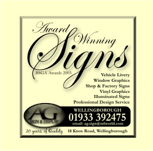
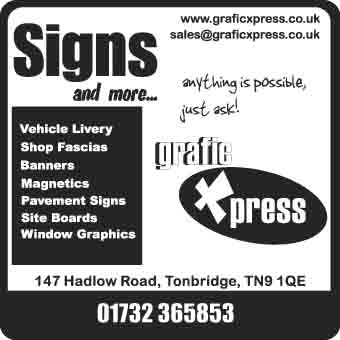
Big G, that looks good, very professional especially with the 20 years experience and award winning bit
Thanks Jill! I like the idea of that one.
What do you think of this : too boring still?
-

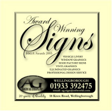
Getting there.
I would bring the black box out further inline with the test at the top.Dont like the “Anything is…” floating about in the white space.
Why not try and incorporate the logo into the outline in the bottom right hand area to balance against the diagonal opposite.
Just my 2p’s worth…….
Just don’t let Yell do your artwork I have 15 clients who I do Yell adverts for because they ahve not been happy with Yell.
Tim.
-
also ment to say…..
Try and think of a strap line……… what business are you pitching for anything specific?
They are already looking in the sign section of YPages so why say SIGNS…..?
Is your location a + should you bring it to peoples attention more?
Pic friends brains etc etc …brain storm why people should use you.
Leave white space in your advert, don’t be too flashy if it is just Black / Yellow. But try also not to be too uniform I guess just because it is a box it doesn’t have to be square.sorry thats 4p from me….
Tim.
-
Thanks for the advice Vivid, will have a play about with that now.
-
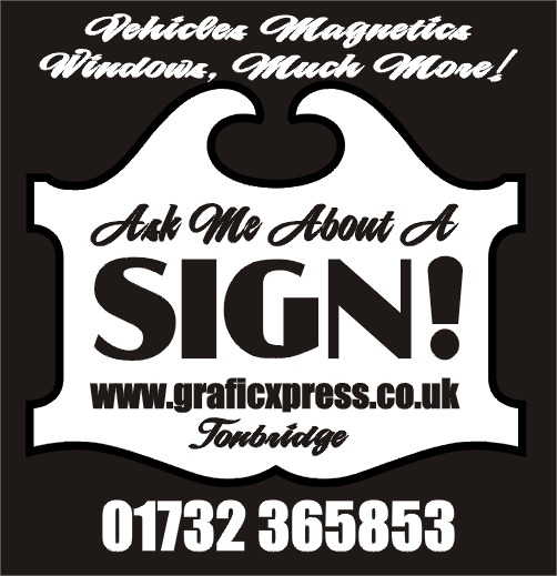
Try bumping the oval out of that box and enlargening it.
It is better than it was!
Love….Jill -
just playing around, i like to alter the shape so it jumps from the page
Attachments:
-

big G
ad looks great…love the script type
the right registered upper/lower case doesn’t sit right [I think]
would still re-arrange text lines according to length!
Cheers
Andrew 😀
Attachments:
-
Nice, both to Adrian and Andrew.
Isn’t it fun when we all put our heads together?
(now that I’ve gotten rid of those pesky lice)
Love….Jill -

great stuff guys!! 😛
i still prefer big g’s layout though !! 😀 😀
nik
-

When I see award winning, I don’t
give it any credence,
Joe public dosnt go for that.
Every take away in luton is award winning!
I would leave that bit out, just my opinion
Peter
Attachments:
-
no….i would keep, it fills the gap at the top and makes it more even!! 😛
Nik (mind you the more i look at it without….. 😀 )
-
I only put it there to annoy you Andrew! 🙂
I had the usual problem with this advert. Same old story: easy to do for others, impossible to do design work for yourself.
I am fairly happy with it. Reason for the rather elegant typeface choice is that I find that most of my customers are ladies. For some reason! Ladies like that sort of thing, I reckon.
That should start some arguments. 😀
-
it’s amazing how things grow arms and legs…..went to gym….thought i’d watch a bit of telly…….telly’s cr@p…..3 hrs later I’m getting annoyed by type…….. 😕
-
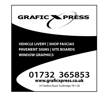
Wow! thanks for the great response guys, I really like those designs on page 1. Adrian, do you have a .cdr file of that design i could download please?
Cheers
James
-
Thanks Andrew! I’m really liking the second one. Do you have a .cdr or .ai file I could download please?
James
-
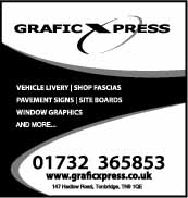
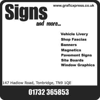
The finished two ads are below, Thanks to everyone for there help with these!
one will be going in the signmakers section and one in the promotional items section.
What do you all think? (resolution will be better in proper one of course 😉 )
Attachments:

-

have you calculated how much it will cost to send out a catalogue??
we`ve stopped sending them out due to evey tom d!ck and harry wanting one, when they just want 50 key rings etc….
-
becky, yes I have thought of that, tbh I don’t expect we are going to be inundated with requests for catalogues and they cost us so little it shouldn’t make to much difference. Plus every other company in that section offers a free catalogue…
-
Adverts look really cool! Hope they go really well for you 😀
Cheers, Dewi
-
Cheers Dewi!
I’d also like to say a big thanks to andrew for helping me out with these and also everyone else who contributed their ideas and opinions to the this thread.
James :thanks2:


Log in to reply.