Home › Forums › Sign Making Discussions › Vehicle Wrapping › vehicle wrapping: spiderman
-
vehicle wrapping: spiderman
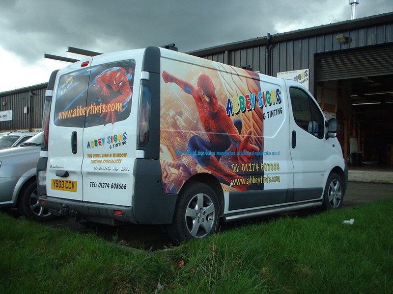
Posted by Stephen Ingham on 9 April 2005 at 20:33Hi all, here is our van we have just wrapped using the versacamm.
We have done it for a local car show run by a local news paper that we regularly advertise our tinting service in that is being run next week.
I had some great FUN doing it, single handed i might add.
I used graffiwrap and the matching laminate.
It has already attracted a lot of local interest, it certainly makes people look and we have gained 2 jobs through it.
I plan on changing the image pretty regularly, any thoughts on what to use next??
Cheers
stephen
Attachments:
 Stephen Ingham replied 20 years, 8 months ago 13 Members · 21 Replies
 -
21 Replies
-

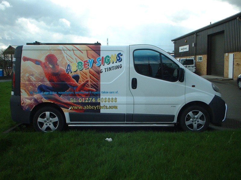
Looks great stephen, the only thing I would say is that the text gets a little lost over the image – could do with a white “glow” or something similar to give it a bit of a lift.
How did you go on with using a copyrighted image like that and where did you get the artwork ?Nigel
-

hi nigel, cheers for the comments.
i agree with the text getting lost in the image, its something we will address on our next attempt.
it was definately a great experience, and a great deal of job satisfaction when done.
its parked, backed onto a pretty busy road and great for business.
cheers
stephen
Attachments:
-

Nice one Stephen. This type of work is the future for signmaking 😀
-

great idea Stephen!! 😛
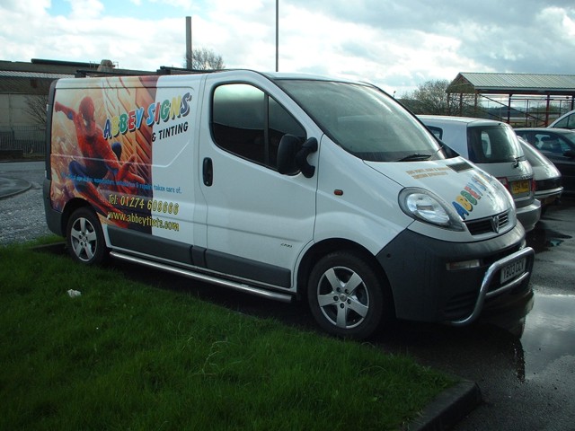
but i would have made the graphic continue to the end of the van 😀
and as Nigel pointed out……try and use another colour and a different text to throw your company name out more!! 😛
my opinions only!! 😛nik
-

Hi, I don’t think the multi-coloured lettering or that font do anything for the design maybe this should be changed. The picture design looks too awkward as it doesn’t fill the exact space it really should and the eye tends to look beyond for something that isn’t present, as you’ll all know, I’m not a fan of vehicle wraps, I personally think they look awfully cheap and absolutely hideous, we’ll do ’em, maybe if my arm is twisted and immediate payment is involved, but no, horrible things, hope the new Conservative government ban them.
I like to think clever design, proportionate layout, use and variation of colours, good use of fonts and ‘less is more’ is the way to go.
I’ve seen vans lettered by our competitors 👿 in standard vinyl, excellent use of fonts, great use colours and co-ordination of design that is far more striking and eyecatching than any vehicle wrap I’ve ever come across. Ours aren’t too bad too, I may add 😉
Admin please note – (this is not intended to be an insulting nor abusive post)
-

I agree to a certain extent. I don’t particularly like vehicle wraps. Not because they are a bad idea, but because they tend to be overdone: a massive collage of images that become a blur on a moving vehicle. On the other hand, if something like your vehicle makes people stop and look, ( and then send work your way) then it must be working.
You’ve done a good job by the looks of it. I would have liked to see a more logical place for the image to end though, perhaps at least at the edge of a panel.
I don’t want to insult you, but I would seriously consider updating your logo. If you are able to make a good job of something as difficult as a vehicle wrap, then you are better than your logo makes you look. If you know what I mean.
-
hi all, thanks for the comments, i value any critisism; good or bad.
the problem that i had with the image was without stretching or distorting it that was the best position and size.
I do agree totally that the text could be much better and it will be sorted on our next one.
I personally love the look of a wrapped vehicle, usually very eye catching and yes if it helps to atract potential customers i’m all for it.
Big G, any thoughts spring to mind regarding my logo update, again, please feel free, we have used that since we started and only used a plotter, hence the variation of colours.
cheers all
stephen
-

It is certainly eye-catching, and I hope it brings in biz,
but I agree with Outline and most of the other comments.
Anyone who has a fancy machine and the patience to apply
such a big graphic should also have the drive to learn more
about placement, colors, and letterstyles.
You don’t want to just be “anyone”.
If I had to do a big picture on something it would be my own image
(Not ME!!!) but something I had either drawn up or photographed.
Copyright issues are a huge concern.
I was thinking about a picture I once saw of the magician David Copperfield’s trailer. It has this huge picture of just his intense eyes on it.
Some of the things that you need to learn are:
Multi-colors tend to be hard to read, even with prismatics.
All-Caps are harder to read than caps & lower case lettering.
Over-use of a casual font can cause blindness!
(Just pulling your chain, thanks for posting, don’t be shy)
Love……Jill -
hi jill, some very interesting comments, thanks.
how do i learn about that stuff though?? never went to art college or owt like that.
cheers
stephen -
Come into my parlor, said the spider to the fly!
Seriously…I am also self-taught.
If you can get a copy of Mike Steven’s Mastering Layout,
please do so. Mine is in pieces!http://www.signcraft.com/features.asp
This is a great magazine and also sells design books!
My friends from the Letterheads are a big help, too,
(like Stevo)
You too can be a great designer!
(insert Charles Atlas ad here)
Love….Jill
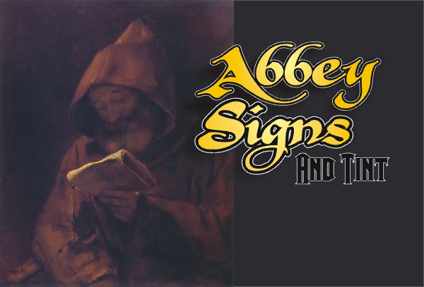
edited to add this lame suggestion (not good at Corel yet) 😉
Attachments:
-
Nice work Stephen! 😀 I agree with others that maybe your logo needs a bit of updating to reflect the type of work you’re now capable of, but the wrap looks spot on.
Nigel raised a valid point earlier though, and it may be something you need to look into. I’ve had to deal with copyright images a couple of times, Spider-Man being one of them. Vivid, the owners of the Spider-Man brand at the moment, take a dim view of their images being used without prior permission. Although its a bold image that will grab lots of attention for you, your idea of changing the graphic regularly may be more of a necessity than out of choice. It seems that larger companies and holders of copyrights are viewing the smaller guy as sport, sending out cease & desist notices for fun as those legal departments justify their budgets 😕 Better to be safe than sorry to coin an overused phrase 🙄
Jealous over the van though, I’ve been looking around at vans since some nice gentleman decided to ram the dewi-mobile. There’s so many different makes its hard to choose one over another.
Cheers, Dewi
-

Like the others have said Stephen it is a nice job and if it brings in work for you then its doing it’s job.
I have to agree with some of the comments about wraps, I don’t hate them but I do think there are to many people that think they can just slap a picture on the side of the van and it creates an eyecatching visual image which will attract business.
As for wanting to learn more, get a copy of the book Jill has mentioned, it’s been mentioned on here quite a few times now, Phil is another one on the boards that will tell you just haw good it is. If your really sad like me when you are out and about look at each and every sign and try to see how you could have made it better. -
Yeah it looks a bit ‘plonked’ on. I would have either cut out the actual Spiderman character from the background or faded the edge of the image in to white.
I do like a good wrap but you really need to be a skilled bitmap artist to come up with something good. Given that most sign companies have limited layout skills as it is there are going to be some really horrendous jobs on the roads given the same companies now getting printers.
Digital print is really going to sort the men from the boys.
-
quote autosign:Yeah it looks a bit ‘plonked’ on. I would have either cut out the actual Spiderman character from the background or faded the edge of the image in to white.
I do like a good wrap but you really need to be a skilled bitmap artist to come up with something good. Given that most sign companies have limited layout skills as it is there are going to be some really horrendous jobs on the roads given the same companies now getting printers.
Digital print is really going to sort the men from the boys.
Yep, I couldn’t have put it better myself, are you me????
Maybe not as I hate vehicle wraps, both the professional and amateur variety 😉Bitmap? last format I would ask for!
-
Hi all, quick update, we had the van on a show at Bradford Motorshow, and it went down an absolute treat, certainly grabbed some attention, kids loved it!!
Lots of interest for similar work by the looks of it.
Not to everybodies taste I agree, but a means to an end.
cheers
stephen -

Nice 1.
Not keen on the font itself and the colours but l think the idea is a very good one. 🙂 -
Saw this at signuk and I must say that it looked alot better in real life, the lettering over the image does not look clear here but in real life it looks quite good.
Asif
-
thanks for the comment asif, its soon to be changed with a new design, once i find the time to sit down and do something.
cheers
stephen

Log in to reply.