Activity Feed › Forums › Sign Making Discussions › Graphic Design Help › vehicle wrap: go-girl signs
-
vehicle wrap: go-girl signs
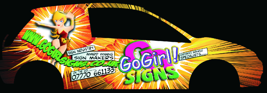
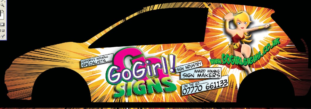
Posted by Cheryl Smith on March 2, 2010 at 1:46 pmIve gone cross eyed looking at this for so long… any constructive crits welcome… need to get this wrapped up as soon as possible and need others to point out any glaring mistakes….
thanks
CherylCheryl Smith replied 13 years, 11 months ago 30 Members · 114 Replies -
114 Replies
-
I like it, just the web address is hard to read otherwise will look great
-
Stand out design Cheryl….is the pink ‘Go’ a bit obscure in a bad way? Wonder how it would work with a white ‘Go’ and a pink ‘Go Girl’?
Just a thought. -
-
Yeah that’s a bit better, I think it’s really the "www" part which is not that important anyway, most people know what it starts with 🙄 :lol1:
Can’t wait to see it finished
cheers
Warren
-
-
I need to do our mini soon, it’s been without for too long 🙁
I agree that it doesn’t need the www. part but apart from that it’s great… it’s rather mac comic but great 😀
-
I am fed up with the sound of my own voice saying something along the lines of… oh im like a plumber with a dripping tap at home…or well everyone else is more important than me etc etc…….!
-
I would avoid the web addy all together and just pot the ".co.uk"
after the logo.
The award winning sign part in the comic strip banners is confusing the way it reads. I think you should make a badge-looking or shield emblem and put the award info in that.
*In the girls hand
I don’t like the green, it clashes. I would be leaning towards reds, burgundies, purples, and white.
Are you using Comic Sans in your logo?
:lol1:
I don’t like seeing another casual used along with it, if forced to use the SC. This has a lot of potential as an idea but needs more work.
Don’t be in a hurry just so you can say the vehicle is wrapped.
I do not mean to sound harsh, it’s just that everything but SIGNS is sort of hard to read.
But I guess if they can only read that you’ll be ahead.
😉
Love….Jill -
isnt it "award winning Sign maker" not "Sign makers"
i like ur webbie 🙂
-
I think it looks fab & will hit the spot of every non sign maker who sees it! I also prefer your original layout of the web address, but with the smaller www. Very Stan Lee – you just need a Kapow! on there somewhere!
Sorry 😳
-
-
quote Gwaredd Steele:I think it looks fab & will hit the spot of every non sign maker who sees it! I also prefer your original layout of the web address, but with the smaller www. Very Stan Lee – you just need a Kapow! on there somewhere!
Sorry 😳
that is exactly what I was after Gwaredd!! 😀
-
Thanks for everyones input..im sure youll agree it made a difference 😀
-
Cheryl that is going to be a head turner 😀 but should it not be vehicle "wraps or wrapping" ??? don’t know for sure 🙄
Lynn
-
Hi ya,the wrap looks good I think as has been said very eye catching and will turn heads. My only thought was I didnt like the knife !
-
i like it too, not sure on the web address, i think just .co.uk after the logo would make it more clean and legible? just my meagre crit!
Like Rich, I wondered whether the knife was appropriate in todays mollycoddled world! i’m not sure it is a knife but it looks like one!
as other have said, it’ll certainly be a head turner!
Hugh
-
looks good Cheryl. I’ll agree on the knife though. Designing your own stuff’s always a difficult one. You wont be missed thats for sure! 😉
-
hm… still think its a bit too much
knife/brush needs to go completely…
the photo number thing is not working for me…, maybe for the back of it.
Where’s the bonnet?
-
Cheryl i look at it differently than most,so please dont be offended
As something to catch the eye it will do that but design wise it is a miss match of shapes, colours and fonts
It does not show an ability to design with message in mind only to put
as many colours and effects all in one place the result being that the
reader has to work out what it is your offeringYour work has been recognized as being exceptional and rightly so
but personally i feel this looks more like an ad for tango than an
invitation to do business with a serious professional sign coThis layout has merits and there is potential but i feel the text lets it down
If you want the comic book look then you need to work on your choice fonts to complimentTerry
-
quote Jillbeans:I don’t like seeing another casual used along with it, if forced to use the SC. Love….Jill
What do you mean by this Jill?
-
I didn’t really want to comment on this for fear of offending but I do find the whole thing a real assault on the eyes.
It gives me the impression of trying to use every single effect/colour/style etc all in one go.
Certainly not in line with the classy work I have seen of yours Cheryl.
Each to their own though and you will never please all of the people all of the time.
Sorry. 🙁 -
Well I think it looks great Cheryl. No problem with the knife, as Jill said it is a tool in your business. I have seen chainsaws on the side of vans, doesn’t mean they are advertising the Texas Massacre 😀
Most vans drive by you with out even glancing at the business and message. If it was formal and understated it would be much the same. Yours would certainly get noticed and that is the point. -
I’ve got mixed views about it (aye….it’s called sitting on the fence)
My personal preference is simple, more corporate looking designs and I wasn’t sure whether that kind of layout would impress the corporate businesses that Cheryl advertises on her proposal…. but thinking about it I can imagine that the design suits Cheryl’s personality which has obviously done her no harm at all in securing those kind of customers
I do think that if you are going to wrap anything that it should be big and bold and different or for me there is little point in wrapping
I still can’t make my mind up but I do think the little tweaks along the way have helped
-
Surely the whole point in wrapping is to achieve something that couldn’t be done in any other way. Cheryls design could only be done by wrapping or by a very experienced airbrush artist.
Look at Sky TV, their vans run around with Simpsons Cartoon Characters as well as pictures of exotic animals.
If you’re going to wrap you might as well make it big and bold – no point in being understated about it.
Go girl 😀
-
quote Peter Dee:a real assault on the eyes.
🙁cool……just what I was after!!!
true….cant please all all the time………..but as Glenn says it does suit my personality. And many of my customerswork is about catching the eye and not fading in the background….tho I can and do offer that too…
Saying that …. there is some more to on this and I am listening to constructive crits -
Corporate, subtle branding is fine if you’re one of the big boys, but us small fry have to shout loudest!
Get it done, & enjoy the comments. If you change the fonts etc, it’ll completely lose the effect you want.
Remember – you’re advertising to the public – not fellow signmakers! Us lot are a critical bunch of sods who are never happy! :lol1:
The first ‘wow’ comment you receive will make it all worthwhile. Push those boundaries – I’m fed up of seeing stale corporate branding tbh – even on our own vehicles!
-
Cheryl I meant CS (Comic Sans) not SC (I am a two-fingered typer)
I think using comic sans in a logo is not as professional looking as it could be.
There are some fun cool casual fonts out there that have pop and strength.
http://www.artandsignstudio.com/fontmenu.html
http://signdna.com/shop/index.php?main_ … 7dm5la7te3
I think using two comic type fonts together is like using two scripts together on the same layout.I agree 10% with what Terry said, about the fonts and such.
I know that as a sign person I am more critical of a layout than a non-sign person is but I think anyone will be able to see a good layout through the WOW factor.Dan Antonelli
http://www.signshopmarketing.com/printd … /index.htm
Says we are to design for what the client likes, not so much as what we like.
It’s OK to have a girl and kind of a bubblegum look in a logo for you, something to attract the eye, etc.
But you want the client to get past the cuteness and see just what you can offer them. I did like the idea of a superhero/Amazon warrior woman holding a shield that said "Award Winning Sign Maker" bigger, with not so much kerpow on the front of the vehicle. Maybe not so much black lines etc. Not so much distorted text and colors that flow, not clash.I suggest stepping away from this for just awhile, and go out about town. Notice what attracts you, and why it does. You want to attract a customer who wants a wrap, of course, but you want it to be another award winning wrap. Again, I do not want to sound mean. I think you are a sweet person and seem like a great gal. You deserve a wrap that stops them dead in their tracks for all the right reasons!
-
quote Cheryl Smith:Jill…………I liked the idea of the logo.co.uk….thanks
Dave thanks for the signmaker spotted.This last design you posted, i think it would work, the only things i would suggest are to make it say ‘wraps’ instead of ‘wrap’
But the main thing i would change is i would loose the largest ‘GO’ behind your main text. Does it say ‘gogogirlsigns.co.uk’ or ‘gogirlsigns.co.uk’
You’ve got text on top of text there saying the same thing and it gets a bit confusing.
A lot of the other issues people have mentioned, i believe come down to personal opinion, but i do think those two points need altering to be technically correct. If you see what i mean.
I think it’s a great design and it will get you noticed, if you are going to have a loud design like that i think you should make sure it is clear to read. you don’t want any chance of people reading your company name or web address wrongly or it wont be doing it’s job.
Just my opinion!
Liam
-
quote Liam Pattison:But the main thing i would change is i would loose the largest ‘GO’ behind your main text. Does it say ‘gogogirlsigns.co.uk’ or ‘gogirlsigns.co.uk’
Is that a "GO"? I thought I saw "GG" (as GoGirl)? Either way, I think bigger question is does Joe Average see gogorlsigns.co.uk or signs.co.uk? Does poor Joe understand that GoGirl is a part of the site address or is it a separate phrase?
Anyway, I like the concept, it will definitely be noticed! -
quote Phill:Surely the whole point in wrapping is to achieve something that couldn’t be done in any other way. Cheryls design could only be done by wrapping or by a very experienced airbrush artist.
If you’re going to wrap you might as well make it big and bold – no point in being understated about it.
Go girl 😀
Some great comments here, but I tend to support Phills view and others. I think a more conservative sign would probably blend in to the scenery, but this will turn heads. Anyone that wants something similar will probably be more appreciative of the costs too, as people relate, rightly or wrongly, conservative signage as being cheaper, and ‘over the top’ to being more costly.
Not sold on the fonts, I’d go more comic strip style, but that’s only my choice.
Well done Cheryl.
-
I love it, I think the whole punch in the face attitude of it is quite splendid!
I think Shane has hit it on the head, try some comic book style fonts, have you heard of this website:
lot’s of free fonts and ideas on there. That will get you noticed and that, to me, is what wrapping was created to do.
Malk
-
OK here is my idea.
I haven’t had a lot of time to put it onto paper but I was thinking more retro. I don’t have the proper van outline so this is just flat.
And it’s probably nothing like you’d like.
😳
The main font is from the Fontry based on Captain-something-or-other comics. And the girl needed to be more buxom. -
in the middle of messing with it a bit more…photoshop crashed and wouldnt save anything…so just after a bit of feedback so far as to heading in the right direction before I start again ….
it is the right time to be changing the logo tho..ive had it 10 years…just about to move office this year and running out of stationary….so I dont mind the comic sans going….its worked good enough for me so far tho
this is great fun by the way….must get some proper (invoiceable) work done tho!!!! 🙄loving that Blambot site!!
Thanks for everyones input….it really is helpful…..keep em coming! -
I’m loving that!! The logo stands out more and that image is very cool indeed. The Blambot site is full of great ideas isn’t it.
Hope you go for this style as I’d love to see it on a car!! I did my truck a while back and even though it got slated by many, it did wonders for the business as everyone knew the guy in the "hotwheels truck"
Malk
-
quote Jillbeans:OK here is my idea.
I haven’t had a lot of time to put it onto paper but I was thinking more retro. I don’t have the proper van outline so this is just flat.
And it’s probably nothing like you’d like.
😳
The main font is from the Fontry based on Captain-something-or-other comics. And the girl needed to be more buxom.Love it Jill, but a bit conservative for Cheryl I reckon. 🙂
-
quote Malcolm Elliott:I’m loving that!! The logo stands out more and that image is very cool indeed. The Blambot site is full of great ideas isn’t it.
Hope you go for this style as I’d love to see it on a car!! I did my truck a while back and even though it got slated by many, it did wonders for the business as everyone knew the guy in the “hotwheels truck”
Malk
Malk, i love trucks, can we see your truck? or is it on here somewhere?
Liam
-
quote Liam Pattison:quote Malcolm Elliott:I’m loving that!! The logo stands out more and that image is very cool indeed. The Blambot site is full of great ideas isn’t it.
Hope you go for this style as I’d love to see it on a car!! I did my truck a while back and even though it got slated by many, it did wonders for the business as everyone knew the guy in the “hotwheels truck”
Malk
Malk, i love trucks, can we see your truck? or is it on here somewhere?
Liam
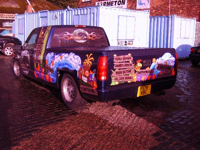
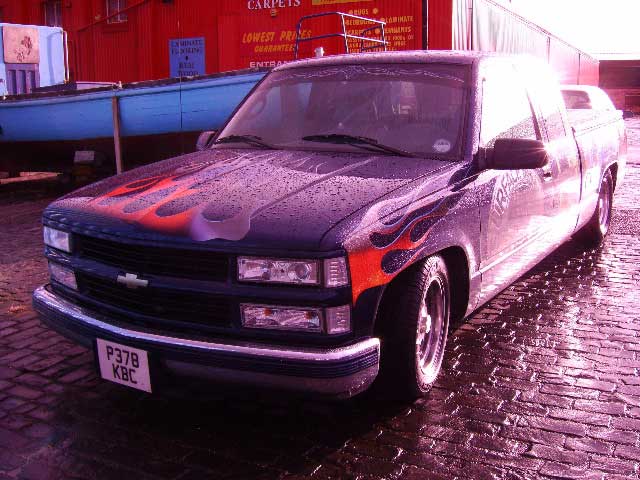
here it is before I stripped it and had to sell it!! sniff, broke my heart!
-
quote Cheryl Smith:in the middle of messing with it a bit more…photoshop crashed and wouldnt save anything…so just after a bit of feedback so far as to heading in the right direction before I start again ….
it is the right time to be changing the logo tho..ive had it 10 years…just about to move office this year and running out of stationary….so I dont mind the comic sans going….its worked good enough for me so far tho
this is great fun by the way….must get some proper (invoiceable) work done tho!!!! 🙄loving that Blambot site!!
Thanks for everyones input….it really is helpful…..keep em coming!Cheryl
Hope you dont mind me asking but does GoGirl have a sister 😳
Bob
-
quote Malcolm Elliott:quote Liam Pattison:quote Malcolm Elliott:I’m loving that!! The logo stands out more and that image is very cool indeed. The Blambot site is full of great ideas isn’t it.
Hope you go for this style as I’d love to see it on a car!! I did my truck a while back and even though it got slated by many, it did wonders for the business as everyone knew the guy in the “hotwheels truck”
Malk
Malk, i love trucks, can we see your truck? or is it on here somewhere?
Liam
here it is before I stripped it and had to sell it!! sniff, broke my heart!
Thanks Malk,
love the front view, bet you was gutted to sell that. I am currently torn between getting a van or a truck. Van = more practical, truck = looks cooler.cheers
Liam
-
quote Liam Pattison:quote Malcolm Elliott:quote Liam Pattison:quote Malcolm Elliott:I’m loving that!! The logo stands out more and that image is very cool indeed. The Blambot site is full of great ideas isn’t it.
Hope you go for this style as I’d love to see it on a car!! I did my truck a while back and even though it got slated by many, it did wonders for the business as everyone knew the guy in the “hotwheels truck”
Malk
Malk, i love trucks, can we see your truck? or is it on here somewhere?
Liam
here it is before I stripped it and had to sell it!! sniff, broke my heart!
Thanks Malk,
love the front view, bet you was gutted to sell that. I am currently torn between getting a van or a truck. Van = more practical, truck = looks cooler.cheers
Liam
Sorry to hijack the thread, but this is the one I want:
http://cgi.ebay.co.uk/1963-Chevrolet-C1 … 20af952122
-
quote Shane Drew:quote Jillbeans:OK here is my idea.
I haven’t had a lot of time to put it onto paper but I was thinking more retro. I don’t have the proper van outline so this is just flat.
And it’s probably nothing like you’d like.
😳
The main font is from the Fontry based on Captain-something-or-other comics. And the girl needed to be more buxom.Love it Jill, but a bit conservative for Cheryl I reckon. 🙂
Yes I really appreciate the time you have put in for me Jill…certainly steered me in the direction of new logo and changing fonts….
Malc….craxy pick up….louder than my idea….!!! Kewl….GoGuy!!
-
sorry to do your head in Cheryl but I liked it ho it was before, but that’s just me, it tied in to the rest of the design better, now I feel it looks like you spent a lot of time and effort creating the background and then just slapped the name on top 😕
Sorry it’s just my opinion, doesn’t mean much but felt like upping my post count :lol1:
not that it’s bad now …. 😛
-
Oh Lol…ive just been told about this site called bancomicsans.com…
seems its not just Jill who hates that type face…..and ive had it as my logo for 10 years……how embarassing lol 😛 -
The guy who owns bancomicsans is a member of another sign forum I go to. It’s really a hated font.
I am glad you are getting rid of it, but I do think you might check out some more font options.
There are so many nice alphabets out there.http://www.fontdiner.com/main.html
http://www.fontbros.com/index.phpAnd your girl would look cooler with a shield instead of just a balloon with text.
http://www.swanshadow.com/images/Captai … Almond.jpg
(hard to find a pic of a female superhero with a shield as an example)and Warren-
quote :I liked it ho😮
-
go on Cheryl, dress up in a cat suit and get some photos done like this

or maybe trailing your golden hair instead of the mask
😳 😳 😳 😳 (hot)
where’s my coat and my medication?
-
Jill……like the idea of a shield….
Dave you are a very naughty man.
I would need to up my training to wear one of those…and I have enough to do as it is…….!! -
quote Warren Beard:sorry to do your head in Cheryl but I liked it ho it was before, but that’s just me, it tied in to the rest of the design better, now I feel it looks like you spent a lot of time and effort creating the background and then just slapped the name on top 😕
This.
Every font has its place in context – even comic sans (and dare I say it, even brush script!!!) 😮
-
quote Malcolm Elliott:quote Liam Pattison:quote Malcolm Elliott:quote Liam Pattison:quote Malcolm Elliott:I’m loving that!! The logo stands out more and that image is very cool indeed. The Blambot site is full of great ideas isn’t it.
Hope you go for this style as I’d love to see it on a car!! I did my truck a while back and even though it got slated by many, it did wonders for the business as everyone knew the guy in the “hotwheels truck”
Malk
Malk, i love trucks, can we see your truck? or is it on here somewhere?
Liam
here it is before I stripped it and had to sell it!! sniff, broke my heart!
Thanks Malk,
love the front view, bet you was gutted to sell that. I am currently torn between getting a van or a truck. Van = more practical, truck = looks cooler.cheers
Liam
Sorry to hijack the thread, but this is the one I want:
http://cgi.ebay.co.uk/1963-Chevrolet-C1 … 20af952122
That is nice mate! We are going to get busted for the ebay links, but here is what i have been emailing to people with a message saying ‘it’s my birthday soon’
http://cgi.ebay.co.uk/Ford-F150-Monster … 5ad7446a61
sorry to take it off tapic as well, but it’s not that off topic as it’s all about eye catching vehicles!
Liam
-
I wasn’t referring to the choice of font but to the design, the colourful text with texture etc in it goes with the background design much nicer, I don’t like just the solid black lettering on top of such a bright colourful background.
I always try use different fonts when possible and there are some nice ones, I get a news letter called "Rising Stars" (I think) and some of the fonts on there are really nice, so by all means change the font but keep the lettering style to suit the background.
That’s all, can I have my head back now 🙄 :lol1:
:tongue:
-
Nobody is doing my head in Warren….I really know where I want to go with this…and am getting some great feedback….I deffo know what you are saying about the black…I was on my way to doing something more with this…. I wonder where it all leads me…..?
ooooooooo exciting!! :jump: :crazy: -
Not a fan of the black lettering myself.
The bouncy part is OK but I like something like Jiggy Roman.
http://www.artandsignstudio.com/jiggyroman.htmlI did think Dave was on to something with the photo idea, how better to showcase your printing capabilities than with a great picture?
I get that Rising Stars newsletter from MyFonts too and think it’s really informative.
-
Warren. I hope you didn’t misinterpret me. I was agreeing with you! :lol1:
(and I hope I haven’t misinterpreted you!)
-
no mate, just thought everybody was thinking that my comment was about the font choice and not the design as I was not too clear when I just said "I don’t like it" with "it" being the black text and not the font choice.
no worries, it wasn’t directed at anybody just wanted to clear it up 😉
cheers
Warren
-
oh Jiggy Roman!
Cheryl, you just been in a wedding dress, so easily stretch into a cat suit! prr prr! suggest it to ur husband, he might like the idea (the car graphic that is!) x
-
Dave: You have clearly spent too long on google images 😮
-
quote Jillbeans:I get that Rising Stars newsletter from MyFonts too and think it’s really informative.
I’ll second that Jill. Excellent ezine.
Can someone get throw a bucket of cold water over dave? :lol1: He needs to get some fresh air I think 😉
-
😮
Cheryl I just saw a site for a Go Girl.
http://www.go-girl.com/?gclid=CPer85Huo … agodsC9UZw
Holy moley! -
quote Jillbeans:😮
Cheryl I just saw a site for a Go Girl.
http://www.go-girl.com/?gclid=CPer85Huo … agodsC9UZw
Holy moley!Not a bad idea in truth, but I don’t think I’d like my wife or daughter wearing a T Shirt advertising that she uses it though. 🙄
-
quote Shane Drew:quote Jillbeans:😮
Cheryl I just saw a site for a Go Girl.
http://www.go-girl.com/?gclid=CPer85Huo … agodsC9UZw
Holy moley!Not a bad idea in truth, but I don’t think I’d like my wife or daughter wearing a T Shirt advertising that she uses it though. 🙄
yeh Ive seen that before………… customers like to send it to me *tee hee* 🙄
-
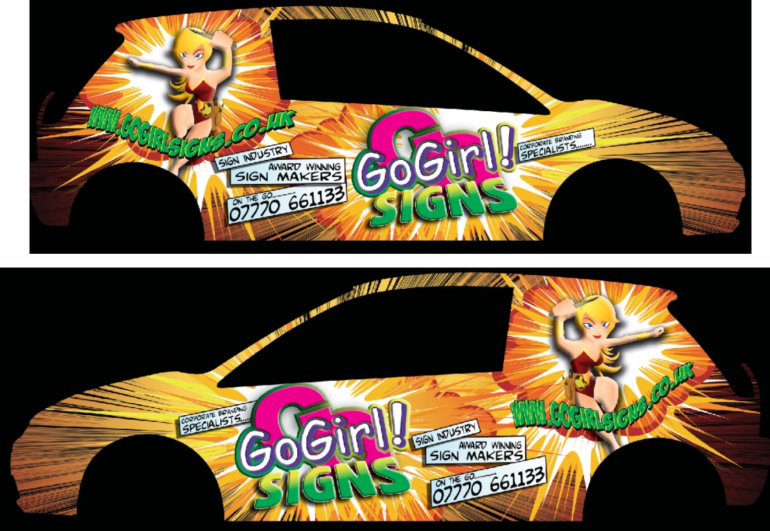
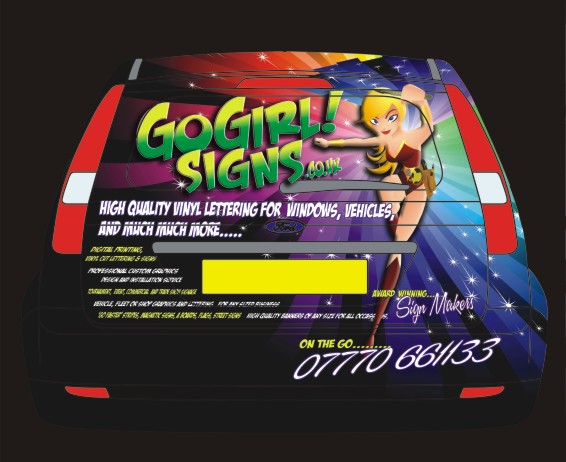
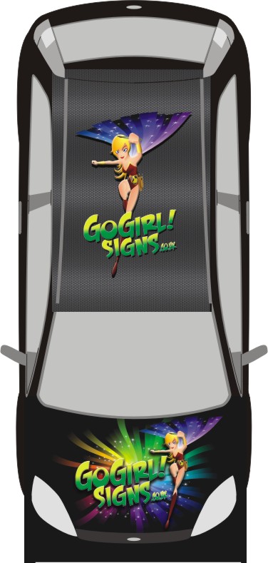
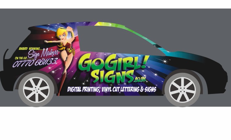
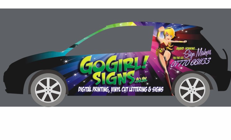
this is what I am going to do….
I feel I really did the right thing asking for crits as it has really pushed me to work on it…so thanks for all the imput from EVERYBODY.
Id like to carbon fibre the roof so ive got an example for my customers to look at…
which is the best one out there?
Cheryl -
I think that looks amazing……so much more impact than your initial ideas
a real head turner I reckon 😀
-
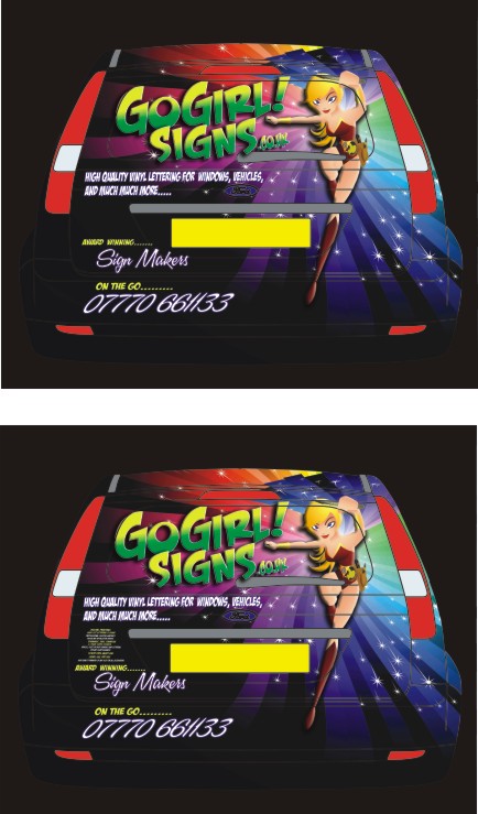
wow.. nice… regarding the text… rather a lot on the back which is too much tbh and u should stick it on a vinyl on vinyl to keep it straight
-
I think the whole comic book theme actually makes you want to read all the small text
It doesn’t look cluttered as a normal van would…..It just seems to work for me
-
you will get noticed, brilliant, I total agree with dave to much on the back just my opinion loose all the small text it will give cleaner lines. We use Hexis carbon fibre and find it easy to use. Just a thought it has a textured surface so i don’t know if your roof logo will work.
I hope this helps
Mike -
quote Dave Rowland:tbh and u should stick it on a vinyl on vinyl to keep it straight
thanks Dave, the lettering there whas really for people wandering around the vehicle or stuck in traffic…..I might keep the amount but do it smaller so you have to get up close to red it…maybe not so much on the back…but on the bonnet. It will be bad enough with tailgaters anyway!!
btw what is tbh? and what do you mean about vinyl on vinyl to keep it straight??????? -
quote Cheryl Smith:quote Dave Rowland:btw what is tbh? and what do you mean about vinyl on vinyl to keep it straight???????
tbh = to be honest…
computer cut text on the wrap I think Dave means. Its a good idea. I do it all the time.
bril design although I agree that the text on the back is too much. don’t tell them too much otherwise they will not feel the need to ask you questions.
-
Thank you 😀
I was really excited when this came together…
I agree that I do have all this info on the back of my business cards…
I think I will just re do the back without all the text…but do a smaller tiny version on the bonnet for people wandering around it when it is parked up and I am not there to answer questions.
oh yes…I dont want to give myself any more headaches than neccessary fitting this. separate lettering to the wrap. -
Cheryl that looks great. Looks like you’ve put a lot of time into it – why is your own van always the hardest thing to design?! Agree about the small text on the back and definitely do the smaller text in cut vinyl. Much easier!
John
-
I would lose all the small text on the back.
I’d make the fade in Go Girl white to yellow for more contrast.
Thank goodness you eliminated the Comic Sans, you are a good sport. -
IMHO – the new design looks REAL GOOD – As has been said a real head turner 😀
—
Eze -
quote Jillbeans:I would lose all the small text on the back.
I’d make the fade in Go Girl white to yellow for more contrast.
Thank goodness you eliminated the Comic Sans, you are a good sport.My personal bug bear is brush script….and im not such a fan of commercial script either…
about time I changed the logo anyhow…it was thrown together when I had started the business and had to come up with something in a couple of hours to get something to the printers!! -
-
brilliant top pic is the one for me, post some photos of the finished car
good luck
Mike 😀 -
Top one for me and I’d aslo love to see you using the same separation between ‘Award Winning etc’ and the ‘On the Go 00…’ on the back quarter panel on the sides….looks much better imo.
-
quote Harry Cleary:Top one for me and I’d aslo love to see you using the same separation between ‘Award Winning etc’ and the ‘On the Go 00…’ on the back quarter panel on the sides….looks much better imo.
okay Harry…will look into that …thanks
-
Top with all lower copy center justified on the back.
-
Looks fantastic Cheryl. Only niggle I see is…. is your website gogirlsigns.co.uk or gogirl!signs.co.uk
-
no worries…valid point.
It looks like gogirl!signs will get you to my old cruddy website anyway…I will update that site with redirection to my new website when I have something on it!!
CCheryl -
I have just discovered that I didnt make my logo or any other lettering on my van or anything from Comic Sans…..but it was the ttf ‘Technical’
which i beefed up with an outline….sigh :lol1: -
-
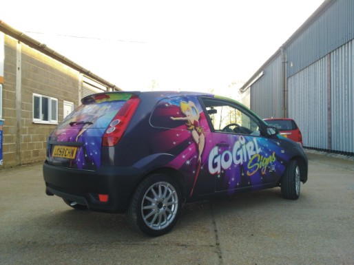
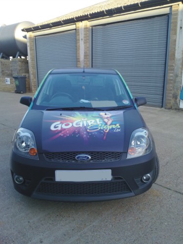
Looks great Cheryl, better I think than on the mock-ups.
Just a pity you can’t cover the windows……
Carbon looks neat too. 😀
-
Dave what you like!!!
cracking job looks great !!!
Rich -
Looks much nicer than your original concept and better in person than the sketch.
Log in to reply.


