-
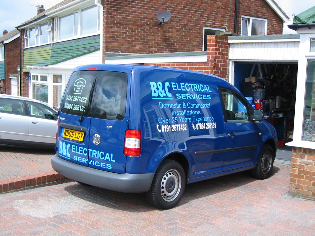
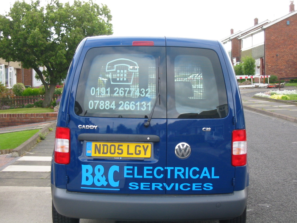
vehicle signage: b&c electrical
here’s a van i done it was all done to customers instructions
he came back the following day and wanted the numbers changed to white and increased in size so it now looks bunched up does not look too bad on the right side pictured but on the left because of the sliding door it
looks tight i showed him how it would be on the PC but he was adamant
(the customer is always right) 🙄 any comments appreciated
Dex
Attachments:

Log in to reply.