Home Forums Sign Making Discussions Gallery vehicle raphics: bob the plasterer

  • vehicle raphics: bob the plasterer

    Posted by stevea on 17 May 2004 at 14:41

    Hi a quick posting of a couple of vastly different jobs we have undertaken today……

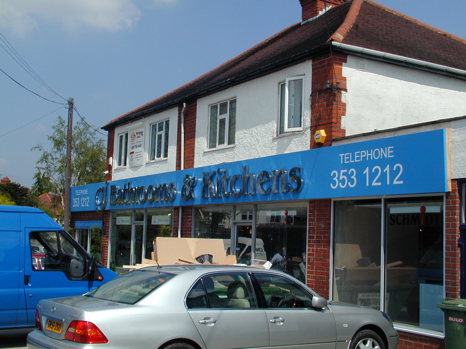
    1. Bathrooms & Kitchen showroom, 22m x 1m folded aluminium background powdercoated to Ral 5012. Built up polished Stainless steel lettering, 700mm high in Benguiat, applied vinyl lettering for the phone numbers.

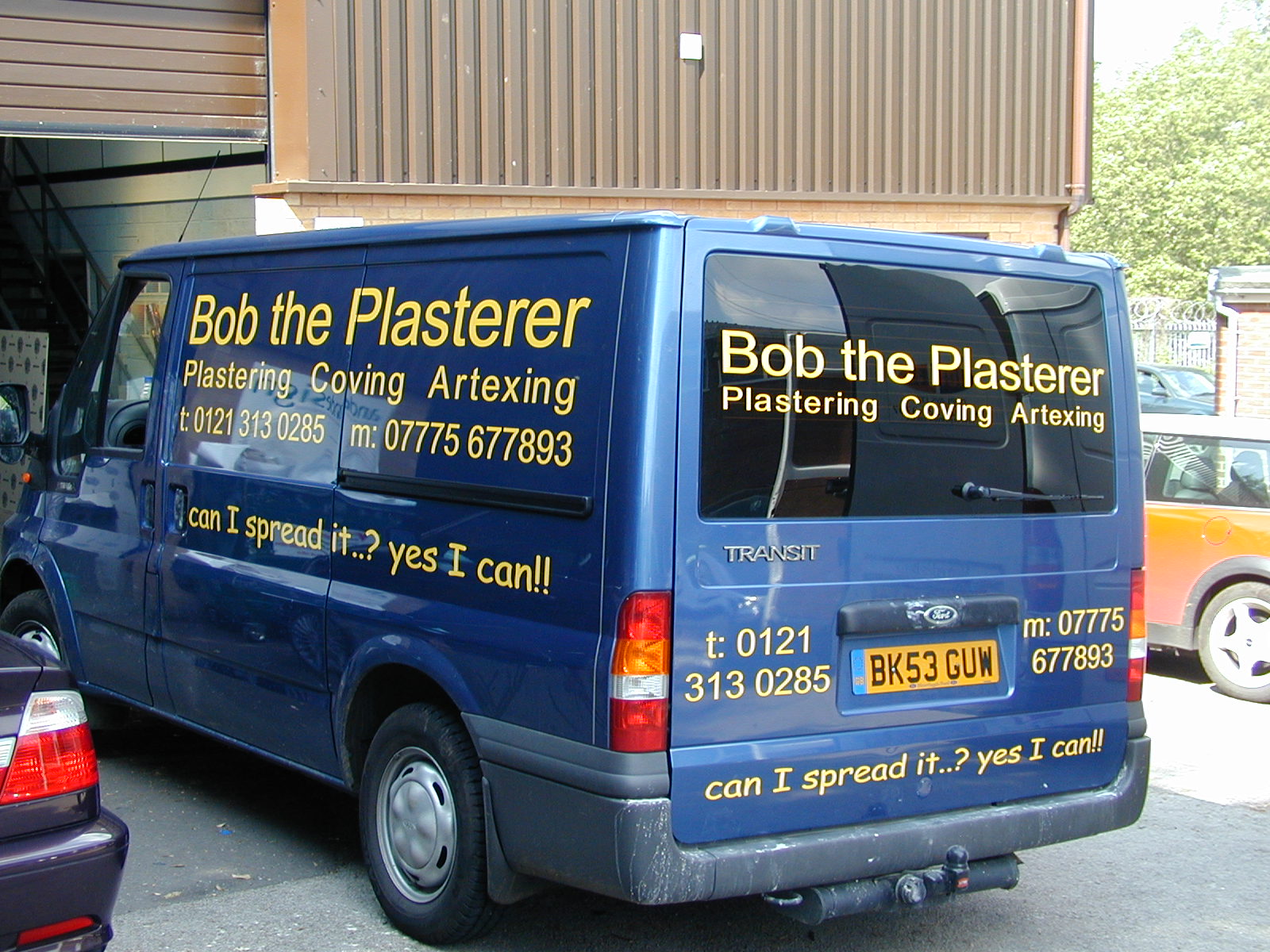
    2. ‘Bob the Plasterer’, Ford transit vehicle livery – the brief was that and I quote ‘I want nothing fancy, just lettering’, which is exactly what he got !

    However the simpleness of the type and contrast of the yellow against the metalic blue coachwork actually works quite well and is really eyecatching, which as a mobile advert for his business was exactly the result he wanted and out walked a very happy client.

    Steve


    Attachments:

    stevea replied 21 years, 6 months ago 5 Members · 6 Replies
  • 6 Replies
  • Pete Witney

    Member
    17 May 2004 at 22:15

    Steve, missed you on the other post , so Hi and welcome. Variety, that’s one of the great things about the sign business. Just one little crit. it may be an optical illusion but the spacing on the secondry copy looks a bit off, especially the i and n look a little close , and also can you make your pics a bit smaller ,I’ve only got an old wind up computer. Pete

  • John Singh

    Member
    17 May 2004 at 22:22

    Nice work Steve

    Eventually got to see the pics – I’ve not yet connected to broadband!

    Glad you could share it with us.

    Who makes your Stainless Steel letters? Must of cost a fortune at that size

    John

  • Robert Lambie

    Member
    17 May 2004 at 22:26

    what can i say steve.. very impressive! love the large chrome built-ups.. looks very smart. do you fabricate these letters or apply only?

    as for the bob the plasterer, yellow does look good against the blue. & i understand what you say about the customer just wanting plain text. i hate hwne they ask for stuff like this on a day when you have plenty time to be a bit more creative.. 🙄

    constructive critisism:
    back window of the van is running down to the right. you can see this running away from the heat strips to one side..

    thanks for taking the time to post your work mate. would love to see more when you you find the time. 😉

  • J. Hulme

    Member
    17 May 2004 at 23:26
    quote Robert Lambie:

    constructive critisism:
    back window of the van is running down to the right. you can see this running away from the heat strips to one side..

    Pity that rear wiper’s gonna tear most of it off first sign of frost though !

    Good stuff all the same 🙂

  • Robert Lambie

    Member
    18 May 2004 at 00:14

    outline, i can honestly say mate that i have never had a problem with wipers damaging the letters other than grazes dulling the vinyls shine..
    🙄

    i could be wrong of course but i have never ever have had a problem with it. 😕

  • stevea

    Member
    20 May 2004 at 12:30

    Thanks for the comments, constructive critism always welcomed.

    In regard to the text running down, the lad’s assure me this was actually replaced ahead of the client collecting, although I only have their word for this !

    The stainless steel lettering was supplied by Centre Signs in Leicester, who have always supplied us a top product and on time.

    Post lots more images when I get 5, but very busy at the momment

    Steve

Log in to reply.