Home › Forums › Sign Making Discussions › Gallery › Vehicle Graphics – Various
-
Vehicle Graphics – Various
Posted by Jim McManus on 6 February 2007 at 01:01Hello Guys,
Now that I’ve finally included an avatar, I thought I would push the boat out and include some of the things I have been up to recently. Nothing too exciting, but it all helps when you are getting started. Comments welcome, but please be gentle!
Attachments:
 Jim McManus replied 18 years, 11 months ago 15 Members · 16 Replies
 -
16 Replies
-

Not a bad start at all, Jim.
Couple of minor crits,
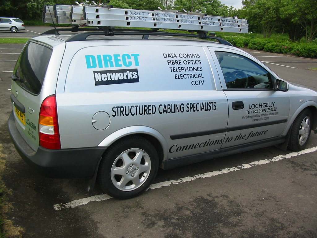
1/ it may be down to personal pref, but I usually line the text up on the lower panel of Astras, with the rest off off the writing. They are a sob to get looking right though.
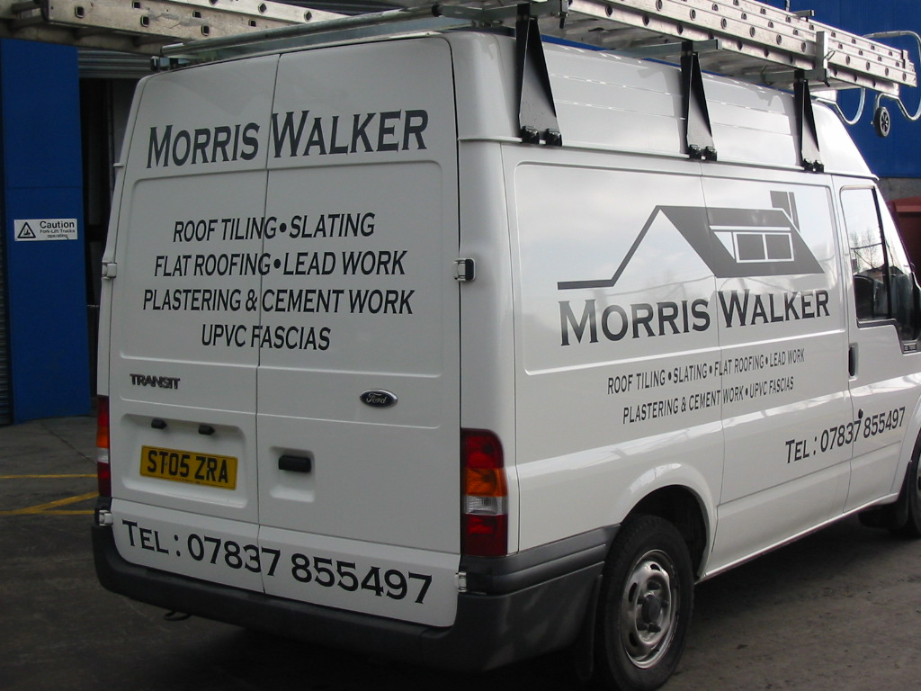
2/ on the Morris Walker van, the text on the rear door could have been raised a Little, reduced in size a bit and then the phone number could have been under it. better to see from following vehicles, and dosnt get as dirty.Just my 2ps worth
Thanks for showing
Peter
-

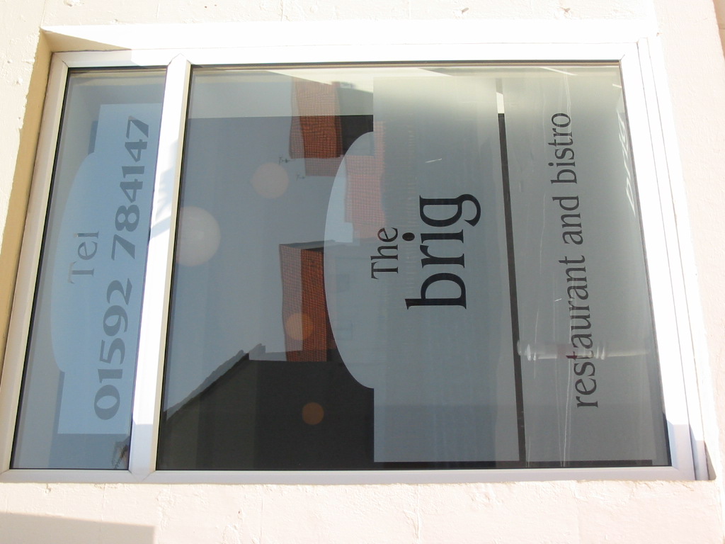
hm.. interesting window graphics, or is the window rotated?
nice work… good to see picture, easier to find u at sign uk if u go
-

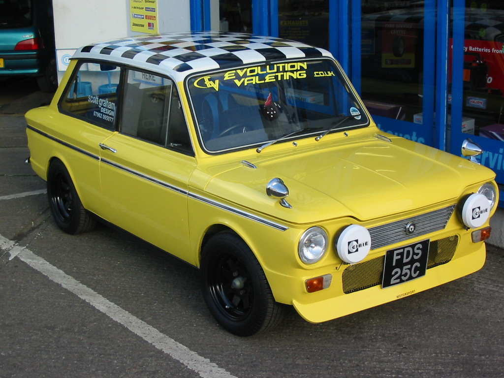
nice work jim, the Hillman Imp looks great.
well done……:appl:Ade
-

Well done Jim, good work and good to see you have loaded your pic.
The ol Hillman Imp, that takes me back.
Martin
-

Thanks for the comments everyone.
Dave, yes the window photo should have been rotated and I am definitely going to sign UK, flights already booked.
Peter, thanks for the comments, advice duly noted.The imp belongs to a friend who’s just opened his own garage so I’ve just finished doing all his signage for that too.
-

A Hillman Imp!
I thought they’d all long gone to the great scrapyard in the sky.
I had my very first road accident in a Singer Chamois (the upmarket model). My old man was not impressed! 😀
-

All looks well…
One crit, which is a personal pet peeve:
Try to avoid using "tel" before the phone number.
It’s really not needed 99% of the time.
Love….Jill -

Good job Jim.
As long as the customer is happy, that’s the main criteria these days.
Thanks for sharing
-

Nice set of jobs – and like Shane. If the customer is happy….and pays!!
Few minor (personal) tweaks I would’ve done. And I realise that very often the customer specifies what you can & cannot do – frustrating as it is.
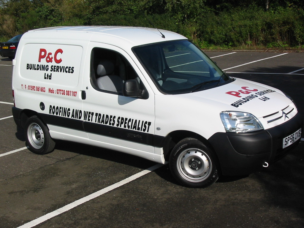
P&C – the ‘ltd’ looks a wee bit lost on it’s own line
The Brig – the phone number section is narrower than the lower bit and doesn’t ‘fit’ with the whole image.
Direct – The ‘connections to the future’ looks a bit too far back, maybe splitting mid-word for a better balance.
Morris – the side description – maybe an extended font or a wee stretch to ‘pad it out’.
Personally, I’m not keen on using matt vinyls on vehicles but the anthracite vinyl is great huh! I almost use it as a black substitute.The Imp – great, always fun to work on unusual cars. Had a (ford) Mustang Cobra in yesterday…nice rumbly V8…mmmm.
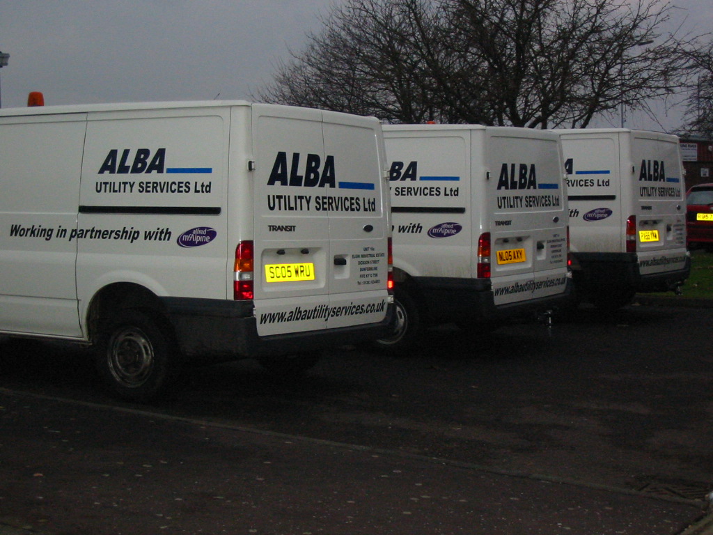
Alba – great to get ‘fleet’ work. Same money for less work… :lol1:
re: Jill & her ‘tel’ – kinda agree, I somrtimes push customers away from it if it will look better without it, and sometimes substite a phone symbol " ( " in Wingdings as a compromise.
Good to see it coming together for you.
Dave
-

Some nice work there and some helpful comments too.
Astra vans are always a pain in the (insert swear word here) as there are no decent lines to work from. And lots of my customers seem to drive them!!!
Lee
-

Good work Jim. As has already been said Astra’s are notoriously difficult to get the levels looking right but you seem to have managed it – well done 😀
-
Thank you again everyone for the comments, very much appreciated.

Log in to reply.