Home › Forums › Sign Making Discussions › Gallery › vehicle graphics: Telesat Communications
-
vehicle graphics: Telesat Communications
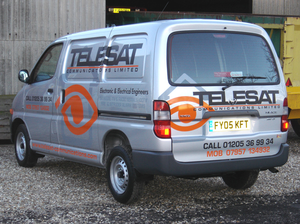
Posted by Steve Broughton on 4 March 2005 at 08:50Did this yesterday, and I still hate bloody powervans, panels as deep as the bloody grand canyon, customer wanted the whole package new logo design, biz cards and logos on disk for their website and here’s a first the customer was that chuffed he gave me a couple of bottles of decent plonk and paid me a substantial wedge too. 😛
Attachments:
 Steve Broughton replied 20 years, 10 months ago 12 Members · 12 Replies
 -
12 Replies
-

I really like that one. The colours really compliment each other.
Is it cut vinyl
-

As usual, nice job. Shame about those recesses though, you could lose a bus in there! They kinda ruin the 3/4 view.
Also, good use of the phrase “substantial wedge”. I like that one.
-

nice job there mate, very clean and professional
Stephen & Carrie
-

Excellent work, looks really smart. But doesn’t communicate have 2 M’s in it? 😮
Only codding :lol1: Couldn’t resist, it is a splendid job though, as has been said, good colour combination.
I’ve had the decent bottle of plonk once, but I’ve yet to recieve the substantial wedge that goes with it 😕 🙁
Cheers, Dewi
-

Not done any jobs for any councils lately have you Steve LOL
-

Excellent job Steve. Those deep recesses are a real pain to do – but the end result makes it all worth while.
How do you deal with the compound curves (where the corners of the house symbol run into the corners of the recessed panels) – are these stretched into place or do you cut the vinyl over the recess and add extra sections of vinyl into the gaps?
-

Hi Steve
Nice work, nice colour combination too.
Always good to have a happy, worthwhile customer.Constructive crit:
Looking at the job as a whole, it’s a bit too cluttered.
I would say that instead of using the mid grey ghosting image it may have been better using actual silver on silver. As the grey is too heavy and closes up the rest of the text.
Text under electronic & electrical contractors would have been better in “maybe” orange? The grey on that line of text (although contradicting my last comment) is now lost.
The line connecting the eye to the numbers on front door is too thick, closes up the space on the numbers.
The numbers & web address maybe better in a slimmer font of the same family but kerning opened slightly. If not on numbers certainly on web address. I think ide have maybe made the web address section a solid orange panel with slim silver text weeded from panel as a stencil, this way the orange panel would break up the monotony of the lines of text but also draw your eye towards it.
All this may not have been an issue but I feel because the main company name has a closed kerning it makes other areas appear that bit more cluttered.Just my opinion of course… just thought ide mention it.
-

I am sorry but i hate the word “Mob” otherwise OK, different.
L Jby the way, something different: We lettered a van today, or should i say finished off what we started on Mon when Blondy fell ill. Delivered it back to Bed Shop customer, pulled up outside, got out of van, locked it, walked over to be met at his shop door by the owner who handed me a cheque before i even got in the shop door!!!!!!!!!
why aren’t they all like that? -
I like that Steve,
question what vinyl did u use? only asking as i’ve done these recesses b4 with oracal751, and it seems to fail after a few weeks, even though i have cleaned the recesses, and heated it in.
-
Rob
quote :I would say that instead of using the mid grey ghosting image it may have been better using actual silver on silverthis was my first suggestion but the customer was worried it would not bee seen at all and as it is in a certain light it almost disapears anyway, whats with you and kerning? seems your pet hate :lol1: in some ways I agree with you but the customer insisted on the information on the van i.e. “this is the text that I want on the van nothing less” 🙄 his ideas was pictures of everything that he does scattered all over the van,
quote :Text under electronic & electrical contractors would have been better in “maybe” orange? The grey on that line of text (although contradicting my last comment) is now lost.true but
thats what I wanted, I’d rather it wasn’t there at all (see customers comments /\.)
Mort the grey is a cast vinyl and as Phil guessedquote rightsigns:do you cut the vinyl over the recess and add extra sections of vinyl into the gaps?I don’t hold with heating vinyl into deep gaps like on this van, doing it this way you don’t stretch the vinyl as much as “persuade it” to fit 👿

Log in to reply.