Home › Forums › Sign Making Discussions › Gallery › vehicle graphics: m&m services
-
vehicle graphics: m&m services
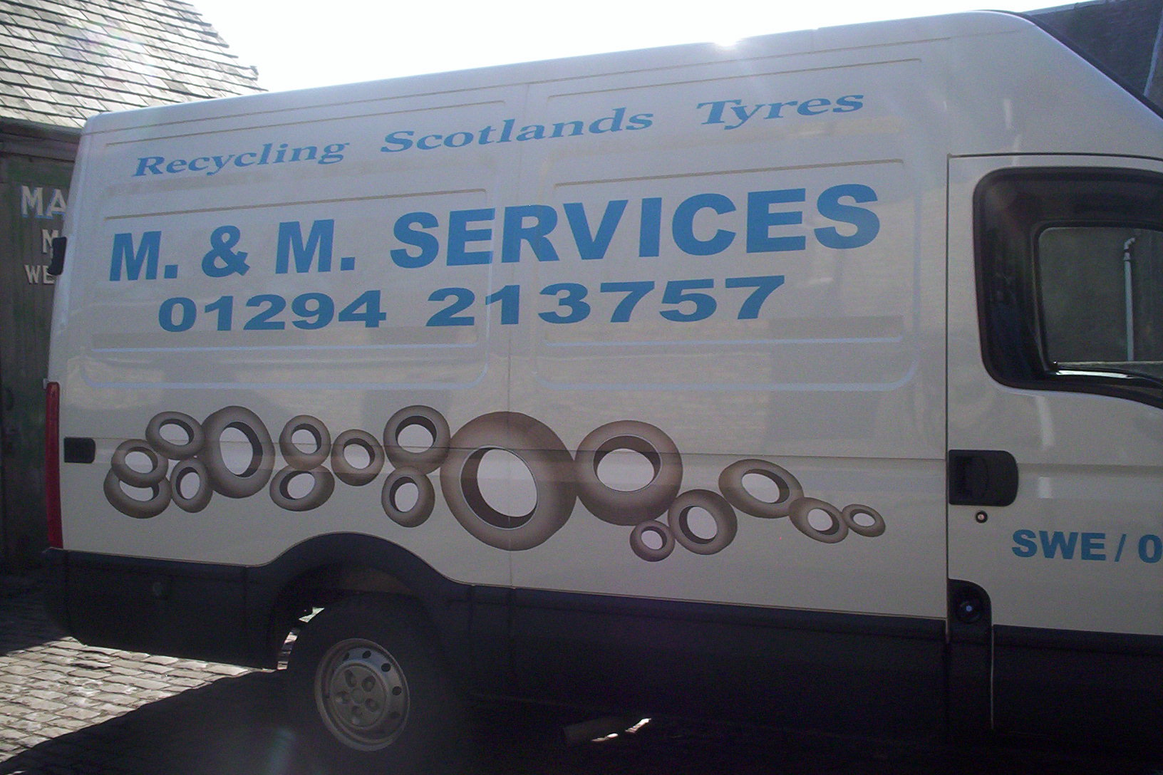
Posted by John Barr on 6 April 2006 at 22:01Hello everybody, finished this project last week, any comments please reply JOHN JBS 🙄
Attachments:
 Dennis Van Der Lingen replied 19 years, 9 months ago 4 Members · 4 Replies
 -
4 Replies
-

Don’t look so worried John 😀
Did they ask you to use the light blue on the white van for the Scottish flag theme or company letterhead or what? I feel that might have been better in a darker blue or green (recycling) maybe.
Also the words ‘Recycling Scotland’s Tyres’, in my mind should have been far more dominant. They should be proud of what they are doing (someone has to start!!) and should shout it. So I might have used a different font in order to bet it bigger/bolder, maybe all in caps, I dunno.
I don’t mind the contact details being as big as they are (see above 😀 )
The tyre print is OK, but I’m wondering if the white on the inside of the tyres is a different white from that on the van? Bloody hard eh? How many shades of white are there anyway!!!!
All in all they should be pleased with that.
This is just my opinion based on a 2 second lookie at the photo.
Thanks for posting.Cheers
Simon.
-

Good job mate
Like simon, I would have gone darker in the blue, or used an outline or shadow on the olympic blue. would have just given it a bit of punch.
The white inside the tyres does look different. Perhaps printing on clear may have solved that?
All in all, if the client is happy, that is what we all want at the end of the day.
Thanks for sharing
-

thanks guys for your comments, the customer has two other vehicles, which are this colour of blue, but with white lettering, yes i agree with contrast, i would have used a dark blue, or black, to throw out against white, the inserts have been left inside the tyres, the background white is closer compared to the photo, was also easier to handle without contour cutting the images. as we also say, the customer is always right, when they want to part with the cash at the end of the day! thanks JOHN JBS
-
it’s not to bad, i’ve done uglyer things because they said so. it pays the bills and that’s what matters because in the end it’s a buissines.
mabey we ought to make an ugly file in the portfolio? could all have a good laugh, the worst thing i did whas a white car with lemonyellow graphics on, so ugly you could hardly see it :lol1:

Log in to reply.