Home › Forums › Sign Making Discussions › Gallery › vehicle graphics: gjl joinery & carpentary services
-
vehicle graphics: gjl joinery & carpentary services
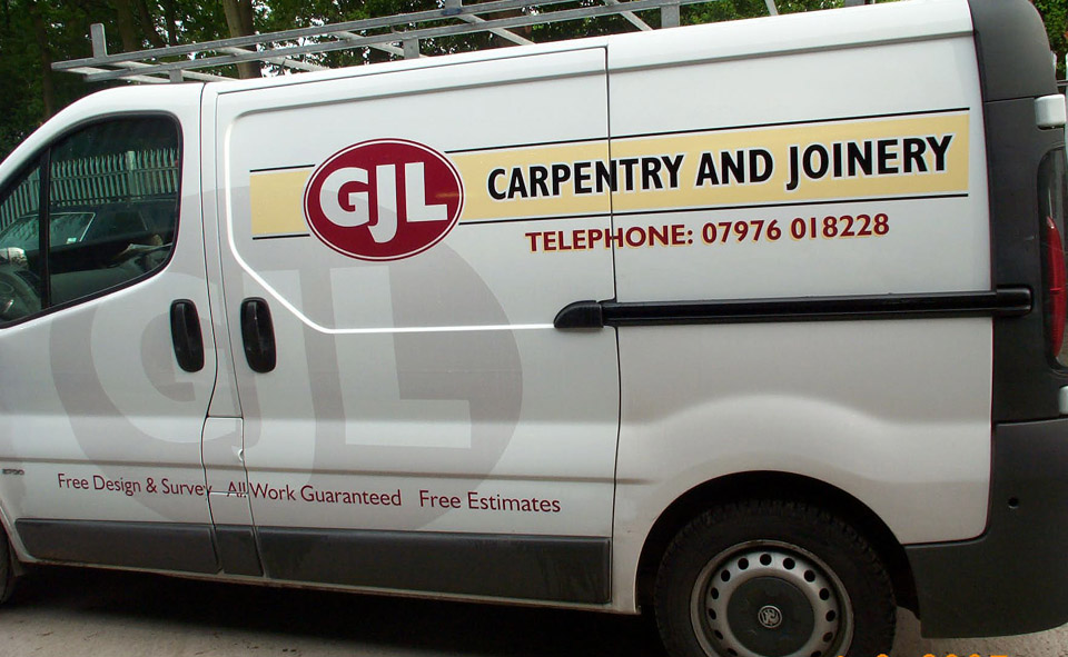
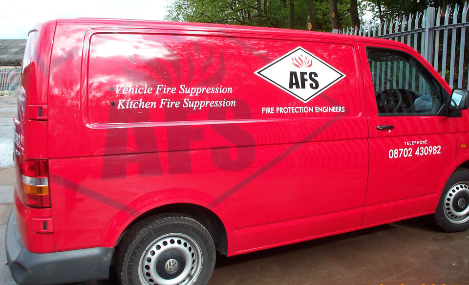
Posted by Neil Davey on 11 July 2005 at 19:57Just a few of my latest van lettering jobbies.
Any thoughts you may have are very welcome.
Neil
Attachments:
 Andy Gorman replied 20 years, 5 months ago 9 Members · 10 Replies
 -
10 Replies
-

Very smart i really like the water mark type effect.
Simon
-

real nice vans done there neil 😀
my only constructive crits. would be te top van i would have used a black shadow on the phone number instead of yellow just to throw it out a bit but it looks nice and crisp… 😀 and with the bottom one looks great but your spacing from the ‘V’ in vehicle is a bit away from the ‘e’……i like the way you have designed the van layout is really nice 😀 nothing personal i just say what i see 😉
nik
-

Both look smart, Job well done;
Are watermark type thing the latest fashion? Seen a few on the boards now.
Peter -

have to say I’m impressed both really nice only crit you didn’t really need any outline on the phone number on the top van
🙂 Lynn
-
Think they could be Peter… I’ve done a couple, one about Five Years ago, but they didn’t come out the way i wanted..
Simon
-

i quite like the watermark too, it is just a very dull light finish or am i right in thinking it’s transluscent ?
-

Nice work Neil, they both look good. 😀 I agree with the comments on the outline of the telephone number on the top one …. still good work though.
We have done a couple of vans with watermark effects …… I quite like the end result it gives.
:thumbup2:
-

Thanks gals and guys for your comments.
Keeps me on my toes as being on my own I’m the:-
Managing Director
Purchasing Department
Sales Manager
Quality Control
Tea boy
Cleaner
etc.
etc.
etc.Sound familiar?
Cheers Neil
-
So you must be the best in your office!
Very nice and clean designs!
Only things I would have done different:
– GJ just white and no watermark
– possitioned the bottom rule a bit different: bit up to keep ALL uncut and the first part to the left to keep the Y out ot troubles.But like I said: very nice!
JJ -

Well spotted JJ. I agree.
Still good work though. I especially like the GJ van.
Thanks for showing us your stuff.

Log in to reply.