Home › Forums › Sign Making Discussions › Gallery › Vehicle Graphics: Ford Pick-Up truck
-
Vehicle Graphics: Ford Pick-Up truck
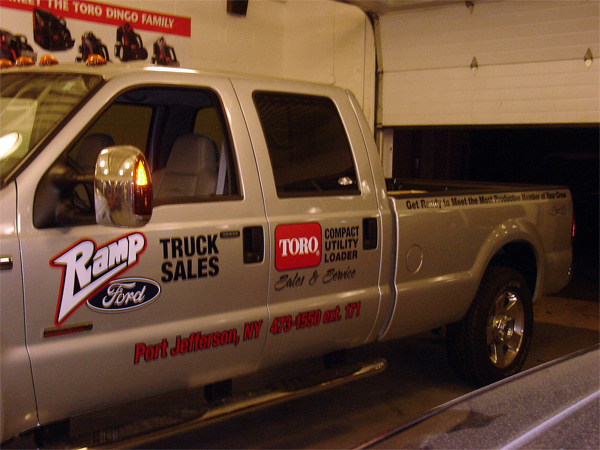
Posted by Bryan Cabrera on 16 October 2005 at 22:31Did this truck last night.
Used Avery A6. All layered vinyl applied dry. Some of the layers were done on the shop others were done on site.
I wanted to do something differen’t for the long sentence in the back but that is what the customer wanted.
Constructive criticism welcome.
Attachments:
 Bryan Cabrera replied 20 years, 2 months ago 5 Members · 9 Replies
 -
9 Replies
-

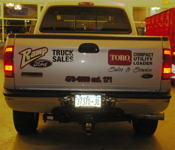
Here is a pic of the tailgate. Sorry for the crappy pic. It was very dark so had to lighten it up.
Attachments:
-

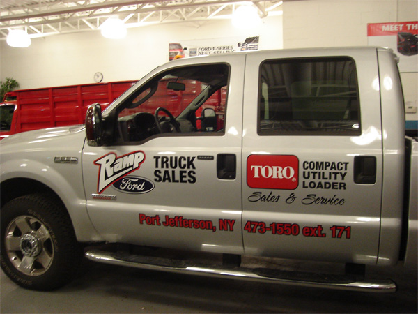
hi bryan, nice work mate… i can see there are logos used here and two seperate messages with them, hard to do much else with them other than what you have done already. so not much i can add to this.
the address and number in red and black….
i would have opened the kerning to about 120% before applying your black outline. i would not have made the black outline just as thick as that.
a common mistake with an outline is to damage ledgibility of the text. i feel this is what has happened here.
kerning: if the letters are too close and outline is applied. the outline becomes a halo because the texts outline merges between the letters creating a black background instead of thin outline.
outline size: if you use an over powering outline it closes certian areas of a letter reducing ledgibility.hope this makes sense mate, you know i babble on.. :lol1:
thank you for taking the time to post your work mate., looks great! 😉
-

hey bryan, nice work
just one thing, if I put text over the top of a Ford Logo, the guidelines trademark people will hunt me down and beat me with a stick!You get away with it though
-
 quote Dave Rowland:hey bryan, nice work
just one thing, if I put text over the top of a Ford Logo, the guidelines trademark people will hunt me down and beat me with a stick!You get away with it though
really Dave ? 😮
Looks good to me Bryan, i cant comment on the kerning, even though i found a help file in corel, i aint figured it out yet !!
i’ve got an old 1977 ford F550 recovery truck to do soon, looks a little different !
-
quote Robert Lambie:i wouyld have opened the kerning to about 120% before applying your black outline. i would also have not made the black outline just as thick as that.
a common mistake with an outline is to damage ledgibility of the text. i feel this is what has happened here.
kerning: if the letters are too close and outline is applied. the outline becomes a halo because the texts outline merges between the letters creating a black background instead of thin outline.
outline size: if you use an over powering outline it closes certain areas of a letter reducing ledgibility.hope this makes sense mate, you know i babble on.. :lol1:
Makes perfect sense. I actually did not want to use an outline at all my original design was just red lettering, but the customer wanted it outlined and my partner told me that red does not stand out on silver. It doesn’t look terrible on the truck but I will try the kerning suggestion next time around.
quote Dave Rowland:hey bryan, nice work
just one thing, if I put text over the top of a Ford Logo, the guidelines trademark people will hunt me down and beat me with a stick!You get away with it though
That is the logo they have been using for years. When I saw it for the first time I thought the same thing. They are a pretty big dealer and have been around a long time. Apparently they haven’t run into a problem with it.
-
quote :Looks good to me Bryan, i cant comment on the kerning, even though i found a help file in corel, i aint figured it out yet !!
i’ve got an old 1977 ford F550 recovery truck to do soon, looks a little different !
Thank you.
Kerning is pretty easy in Corel. If you are using Artistic Text (just click with Text Tool vs. Dragging a Text Box) click on the Shape Tool (the tool used to select nodes). You should then see arrows appear to the right of the text. If you drag the horizontal arrow it will adjust the whole rage of letters. You can move individual letters by dragging the little squares next to the letters. Hold the Ctrl key down to keep the letters aligned with base line.
Hope that makes sense. Let me know if you need further explanation.
-
yes it does make sense !!! thanks, i’ll read it again tommorrow when i’m awake and have a play around, handy little tool that node mover abouter thingy !
-

Bryan, I really like what you have done here. I would not have used the black outline either, I think red on silver is OK personally, but if the customers insists on it, not much else you can do. I probably would have made it as thin as I could tho.
Robs advise on Kerning is spot on too.
Well done tho mate. Thanks for sharing
-
quote Shane Drew:Bryan, I really like what you have done here. I would not have used the black outline either, I think red on silver is OK personally, but if the customers insists on it, not much else you can do. I probably would have made it as thin as I could tho.
Thanks Shane
It has been really helpful to get feedback from everyone on the board. Hopefully I remember to apply all of the advise and each job will get better.

Log in to reply.