Home › Forums › Sign Making Discussions › Gallery › vehicle graphics: coachtrans
-
vehicle graphics: coachtrans
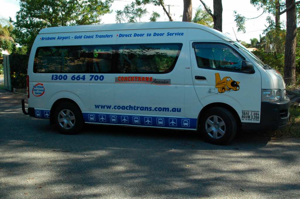
Posted by Shane Drew on 31 March 2007 at 11:15Have not posted anything for a while 🙂
I had to scale down the signs from a coaster to fit this commuter.
I’m not happy that the logo is so small, but the client was adamant with his request. On past form, it will be back in a week for me to redo it bigger 😕
Attachments:

 Lynn Normington replied 18 years, 8 months ago 4 Members · 7 Replies
 -
7 Replies
-

Nice work. Is the graphic on the front door printed?
This looks like a hiace is it the same thing with just the side windows etc?
-
 quote jxuereb:Nice work. Is the graphic on the front door printed?
This looks like a hiace is it the same thing with just the side windows etc?
Mate, the commuter is a bit longer than the Hi Ace. Its a dedicated Bus. This one is 12 months old, with 208,000k’s on the clock. It was with another tour company that I no longer do, but he’s just joined coachtrans, so I had to strip the old stuff (mongrel job!) and re do it in the new scheme.
The plane and logo are usually printed on my solvent printer, but this is a one off as all the other bus fleet are coasters, so I just computer cut them.
The orange and yellow are reflective, the rest is 551 Oracal. I normally print the black outline on the silver, and lay reflective orange over it, and I usually print the black over the yellow for the plane. They are both die cut then.
-

looks good Shane I always like blue on white it looks fresh.
Lynn
-
Thanks all,
I always like Blue on White too Lynn, I did the original design for the fleet about 8 years ago. Still looks a good design although I have gradually change the blue to this one. I used a slightly darker shade originally.
-
Shane I prefer the mid sort of blue I find the darker ones especially at night look black.
Lynn

Log in to reply.