Home › Forums › Sign Making Discussions › Gallery › vehicle graphics: bright sparks electrical
-
vehicle graphics: bright sparks electrical
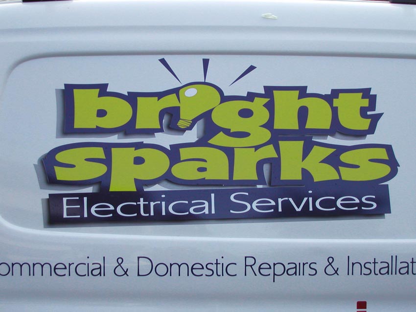
Posted by Terry Bull on 3 December 2005 at 00:55Heres a logo i created for an electricians van
all vinyl ..but airbrushedTerry
Attachments:
 David Rowland replied 20 years, 1 month ago 15 Members · 17 Replies
 -
17 Replies
-

sorry terry how doe’s that work
quote :all vinyl ..but airbrushednice job though Lynn
-

Brilliant Terry. I would have put money on that being a solid cut-out on stand off locators! That extra little shadow really makes it fool the eye.
-

top notch work as ever terry… that design with the added airbrush effects really lifts it from the surface. nice one!
thanks for taking the time to show us your work mate. 😉
-

Great work …. it really does look as though its raised off the van …. really does trick the eye. Very nice Terry!!
😀
-

brilliant work terry 😀
youve forgot the dot on repairs……………………… :peek:
nik 😉
-

Great stuff Terry
Just trying to work out at what point in the proceedinngs you added that shadow
I take it here are three colour layers? -
probablly lost in the realms of weeding Nik and has probabally been put back by now. 🙄
Lynn
-
quote :youve forgot the dot on repairs………………………
easily repaired though
Well ‘spotted’ Nik
-

Thanx folks
Lyn
the grey shadow was airbrushed where it would meet the lettershape
its not layered just butted upI did spot the missing dots ‘for it went out
Terry -

that’s really great! I love it, good choice of colour too.
-

I like it as well, the layout is excellent.
Very legible, yet full of life.
I have to do something like this very soon.
I use a Redneck airbrush to get a fade on a letter tho…
a rattle-can of Krylon.
Never was any good with the airbrush either!
Terry, I envy you.
I always love to see your work.
Love…..Jill
PS
Damn dots! -

That is awesome Terry.
Love she shadow, I gotta try that effect soon, I think that looks fantastic.
Any chance seeing some more of your work.
Its a real inspiration.
Great work.Neil :thumbsup:
-

😮
That’s lovely work Terry….
Step by Step …PLEASE!!!!!!!I have dabbled with tha airbrush and createx auto air paints but your stuff takes the cake.
Who needs a digital printer!!!
Cheers
Joe -

Terry I’ve just seen this thread.
That is superb!! :clap2:
One of the best things I’ve ever seen on these boards.
-

Very Nice Effects Terry
What paint and prep do you use with airbrushing to vinyl?Great work all around!
-

i am very impressed with that… i did take a close look as well
which font is that?

Log in to reply.