Home › Forums › Sign Making Discussions › Gallery › vehicle graphics: bad barnet
-
vehicle graphics: bad barnet
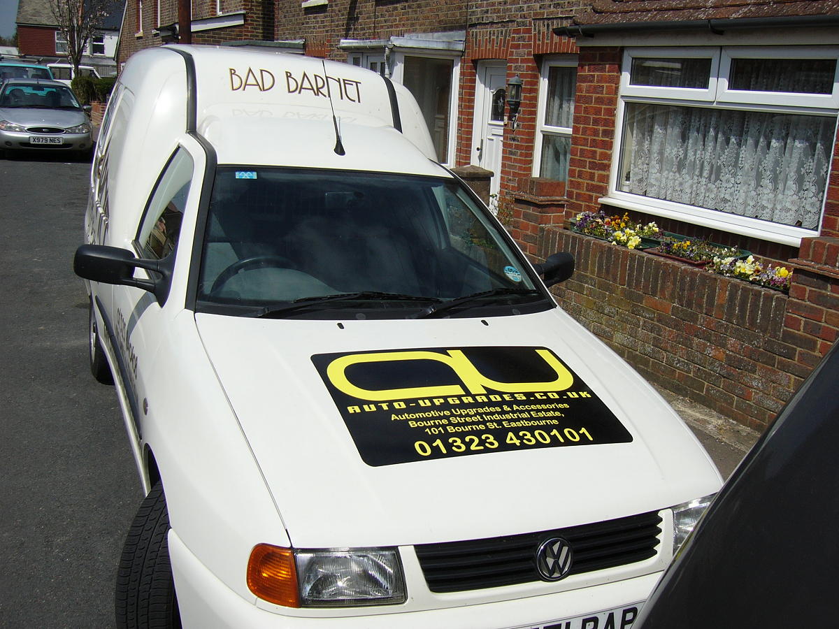
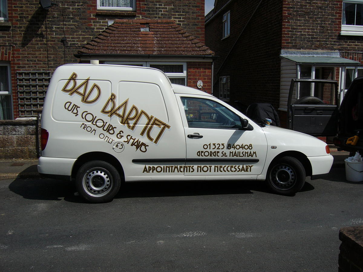
Posted by Hugh Potter on 26 April 2006 at 13:32hey oop, not posted owt in a while, so here’s a couple, i am now officially a hater of anything with recesses !
all done if oracle 751c,
Attachments:
 Hugh Potter replied 19 years, 8 months ago 10 Members · 23 Replies
 -
23 Replies
-

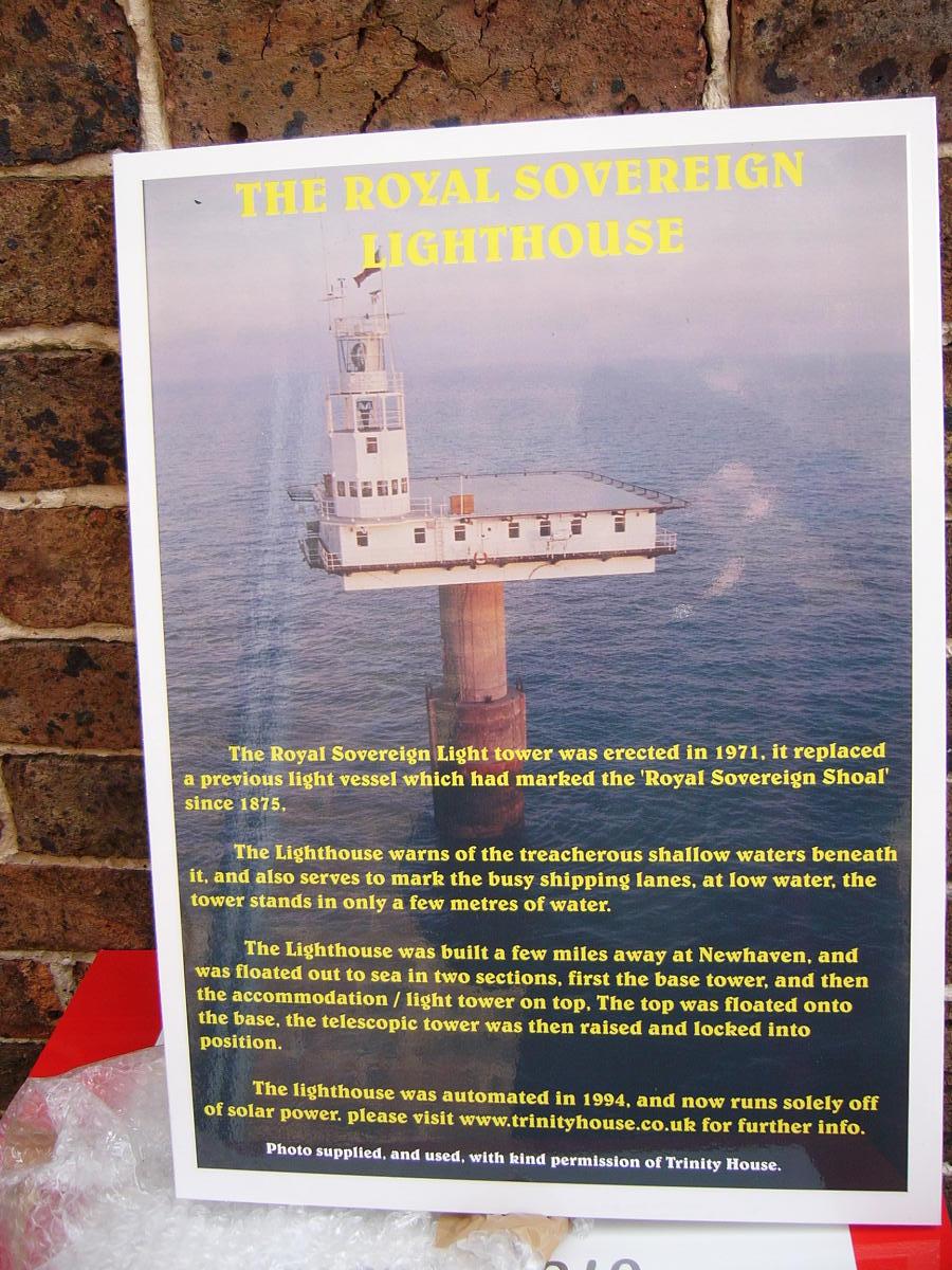
here’s one of a number of signs i’ve just done for eastbourne pier tackle shop. the guy is based on the end of the pier, and reckons he has around a hundred enquiries per day, as to what the tower out in the channel is ! so he figured it a better use of his resources to make a sign !!!
thanks to martin for the print.
Attachments:
-

nice work hugh 😀
good to see you like recesses 😀
on the van the main text looks ok, but i would have changed all the other wording to another font…when its all the same it takes away the whole look of the company name, also would have rotated the text up to the right a wee bit too…. 😉
nik
-
thanks Nic, to be honest, partially due to the angle, and recesses, this was my least fave design ! the colours work on the big wording, but like you say, i shoulda tried different fonts for the rest of it, or maybe diff colours at least.
just went passed a job i quoted on a while back, they wanted ‘cheap’ yet wanted the earth, and building work too, i see they have the signs as they wanted, but everything else they asked for has either been done differently or not at all ! so i’m pondering now, on the time i should spend getting a job ‘just so’.
erm…. thanks to Chris sharps for pointing out my error !! oops 😳 😳 😳 😳
-

good job i hate doing two sides of a van slanted as its a nightmare to line up. Looks eye catching , did you get a free Hair cut ?
-

How long did the van take you Hugh? and how did you go about the recesses? did you lay it on flat (on the raised areas) then heat up and work it in?
I have not done a van with really bad recesses yet, i did a transit which was a nice starter. 😀 -
cheers Patrick,
it wasn’t the easiest thing to line up, cant recall how i did now ! i think i just set up the lower text first, til it looked right, applied that, and measured where it was for the other side, then just measured 65mm up to the large text, which i centred by eye !hey Glen,
in total, fitting was around 5hrs, excluding the cock-up the otherday that is.the recesses were not fun, the central bit twen the panels, is a different height to the actual panels, causing grief when it came to laying it al down without a wrinkle !
the gold and light grey shadow were pre layered on the light bench. to apply, i got it where i wanted it, taped it all down and cut the main text in half to make it easier to keep true, did that pretty much without major calamity,
then (and this is purely because something wasn’t right with the reg marks) the dark brown text layer was cut into two, and carefully trimmed so i knew when it was central, couldnt see another way, as wet app is outta the question with recesses !
to get it into the recesses, i initially heated it and worked it in, but this was not without its probs, the 751c just goes too soft too quick, so i ended up working it in at the ambient temp (about 18degs !) and then applied heat once stuck.
in all i guess i learned a fair bit from this. though i won’t be looking forward to the next lot of recesses ! until now, i’d always worked around them !
-

Nice jobs Hugh I agree with Nik on this I woould have used a differant font on the rest specially the phone number like the light house one
Lynn
-
thanks lynn, duly noted. i like the print too, wish i’d had the bad barnet printed, only one layer to recess ! think i’ll consider it a better option next time, can’t be much in it price wise, the main names along used 4m of each colour vinyl !
-
so if you cut at 610 two sides and back would have been nearly that so not much waste and waste would have been in the price so you would have had some stripes left for boy racers windscreen stickers 😎
Lynn
-
not sure of the point, but you’re right, there wasnt much in the way of waste, and what i have left, is still wide enough for 4" letters to be cut !
as for the decals on recesses, print may not last quite so long (right or wrong?), but being only one layer, it has to be a time saver on installation,
-
ho ho, 186 views, and only 0.5% (arpx), ie 1 person, has spotted the mistake ! i’ll sleep safe in the knwoledge that if the sign making population have not noticed the error, then the general public will not notice either ! 😀 😀 😀 😀 😀 😀
thanks chris for pointing it out to me !
-

Was that the grammar or the punctuation in the light tower text?
-

mate, no one will see the lower case ‘p’ after the full stop on the last line of the poster…
i wasn’t going to say anything either lynn 😛
-
quote Hugh Potter:thanks for pointing that out shane, but it aint that !!
oooooopppsss sorry hugh, should have kept it to myself….. 😳 Now 100s of other sign people will not be able to look at it with seeing the mistake I pointed out 😮
Dont ya just hate that! :lol1:
-
i’ts funny really, i must’ve had a bad day, cos the day i did tht van and the pier signs artwork, i made three mistakes,
one on the van, one now pointed out on the tower, and one on a pair of matching liability signs, none of which were spotted by the customers when i sent thru the proofs !!
-

I dont think its necessary to point out the errors, 😀
Peter
-

Only one problem here for me and that is net curtains, I know I could be opening a can of worms here or as Hugh would prefer rag worms, but that net curtain took over the whole photo for me and became a complete distraction i’m not sure but it could even be twitching, cannot bring myself to look again. My advice would be to steer clear of this kind of backdrop when posting your work I must add the van looks good and don’y ask me about spelling.
Russ
-
Hugh, I hate that word anyway, needed, required, just a couple of my alternatives.
Peter
-

Hugh I think it should be one collar and two sleeves 😀 😀 😀 😀 😀
Peter
-
really ? damn, i was thinking it should be t’other way around, hmmm

Log in to reply.