Home › Forums › Sign Making Discussions › Gallery › vehicle graphics: alpha fire protection
-
vehicle graphics: alpha fire protection
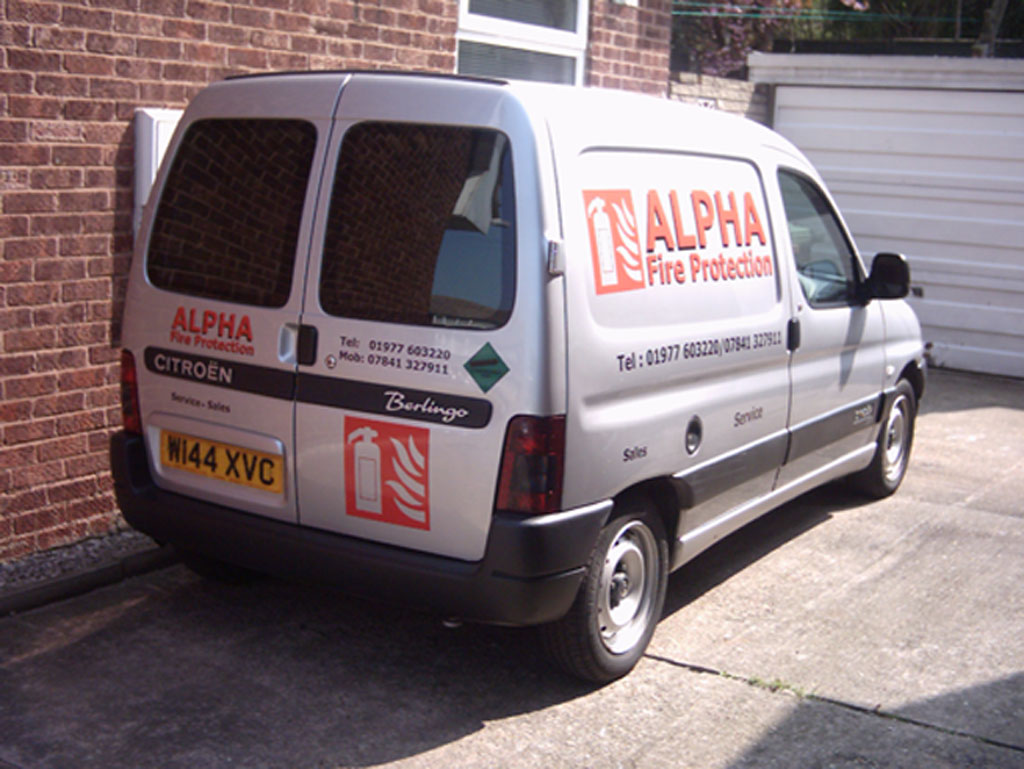
Posted by Dougie on 1 May 2005 at 20:44Hi everyone
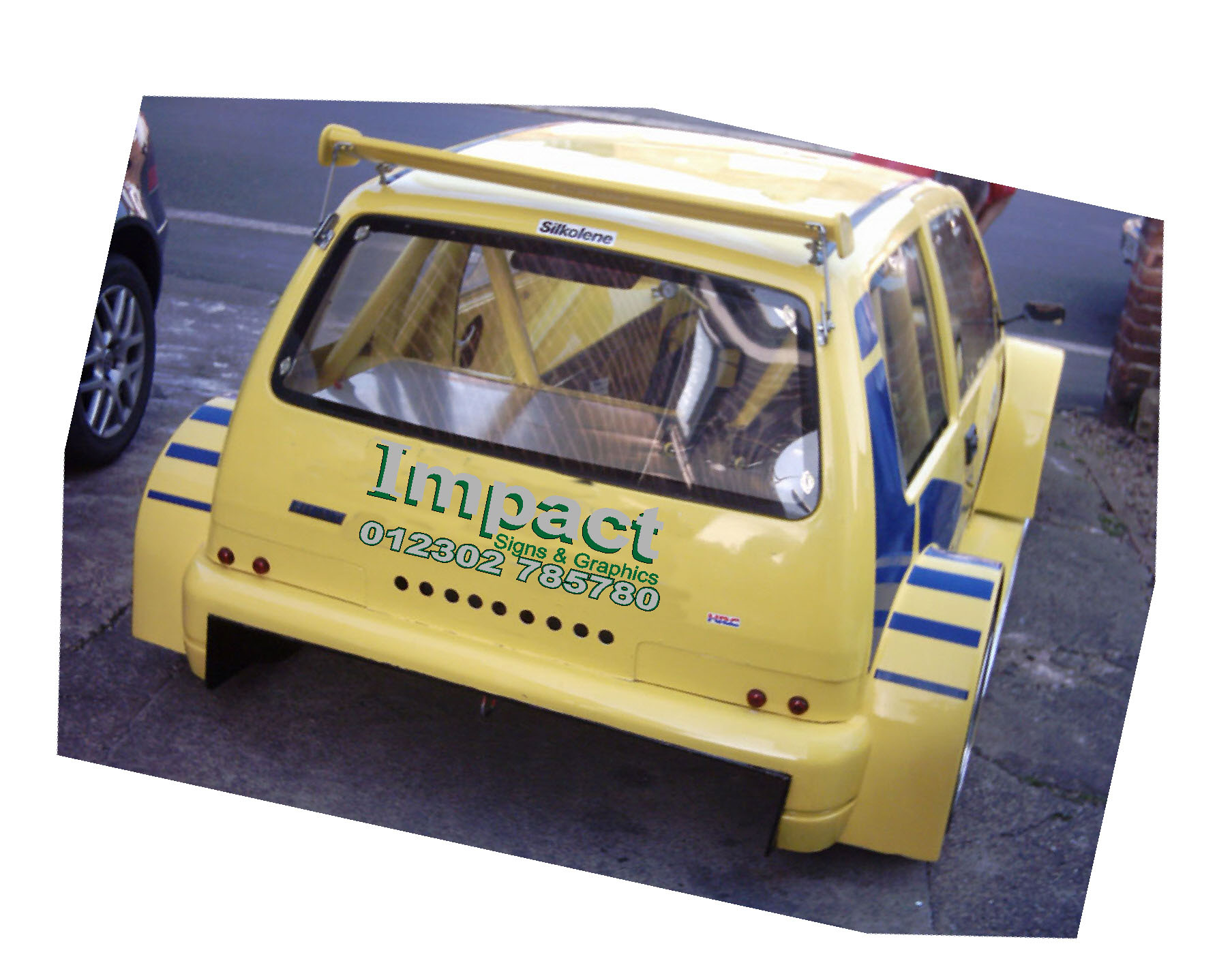
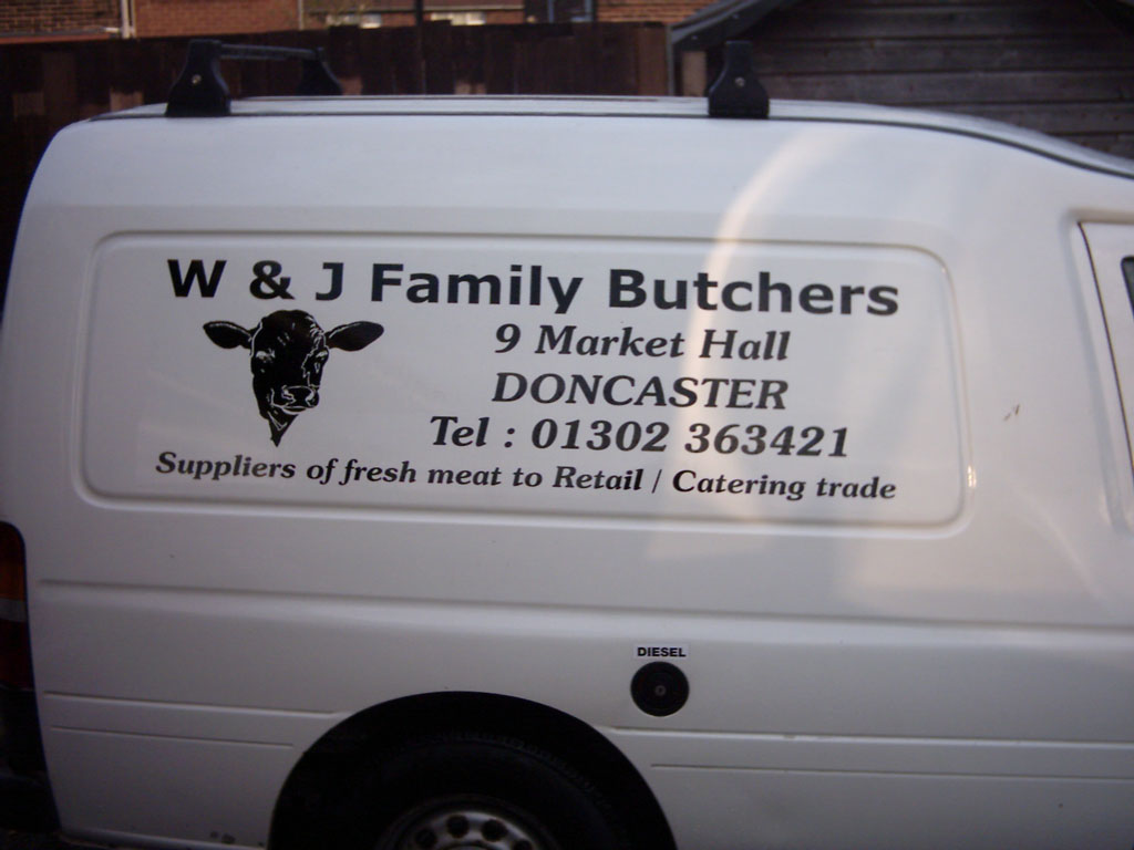
After seeing the high standard of work you guys have completed i thought i would send some pics of my first jobs….
I have only recently started in this field (worked as a rep for a sign company)
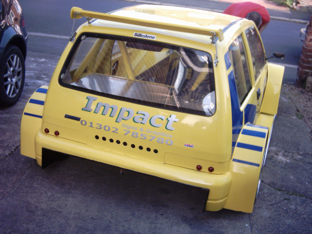
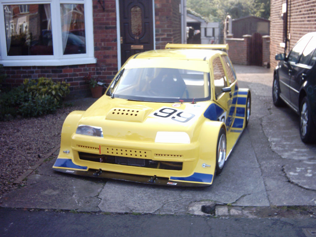
The three pics show my first jobs so constructive feedback is welcomed
Dougie
PS i have replaced the telephone number on the alpha van (fitting in a tight garage so not straight)
Back to top
Attachments:
 Shane Drew replied 20 years, 8 months ago 5 Members · 9 Replies
 -
9 Replies
-

not that im an expert but if you want the sign to be of an impact then i would try putting an outline around the phone no. and a the small wording in green only it stand out more. Work looks really good other than that.
have a look at this just a thought
Attachments:
-

Its good of you to take the plunge and show us all some of you’re stuff 😉
I think they all look good ….. I agree with p4t that an outline on the Impact graphics would make it stand out a lot more … the silver is a bit lost on the yellow.
😀
-

I think you have done well, nice work!
Constructive crit: would be mostly on fitting. Your designs etc seem fine, but little tweaks here and there will sort all that our over time. For the first few jobs you’ve done well.
Fitting, well I noticed a few bits here and there. Again, this will come to you. Nothing happens overnight. One thing you did that can be down to lack of knowledge of software, or the software doesn’t have the feature is “colour welding” the word impact is in two layers. Silver word laid onto green word, slightly offset to create a shadow. In doing this you can now see the outline of the text below the top layer, makes it a bit untidy looking and I think is the reason why you have a couple of visible bubbles. Try finding if you have a weld feature in your software and this will create the shadow that you see for cutting only, then the text impact on its own. Eliminating a doubled up layer. Hope that made sense?Thanks for taking the time to shows your work mate, look forward to seeing more of it.
I think its good that you took the plunge to ask us all, I think folk starting out get much further just asking us were they have/could go wrong. -
cheers everyone just to make sure i am quoting correctly what do you think about the prices i have charged…
1. alpha fire 160
2. butchers 130
3. fiat race car 250i feel that it is important that my prices reflect the market at the moment and at the moment this is my second job so need to make it pay soon!!!! so i can work on it full time.
Good thing is that i am busy due to word of mouth!
Where do you guys advertise????
Dougie
-

personally, all my work is from referals. Cheapest advertising there is. Have not advertised since ’96.
Before that, a personal letter to targeted companies got me started, then took it from there.
Cheers
Shane

Log in to reply.