Home › Forums › Sign Making Discussions › Graphic Design Help › Van Signage : Mind not with it…
-
Van Signage : Mind not with it…
Posted by Craig Ross on 24 January 2012 at 10:01I have "man flu" (the worst type) and my brain isn’t really with it today.
Doing a van signage for a family member (brother) and think I can do so much better but just not putting a creative eye on it today.
Any help would be appreciated.
:police: Mod-Edit
* Please use the "Correct Forum" when posting.
* This post has now been moved.Some things HERE you may wish to think about.
Please take a moment to look over our Board Rules.
.
Michael Wright replied 13 years, 8 months ago 16 Members · 39 Replies -
39 Replies
-

Everything is way too big. Less is more!
And don’t follow the panel lines as it looks wonky. Use a level horizon. -

Mike. See this is the No.1 Rule I always follow when doing vans etc, admittedly I put my hands up, I don’t do that many.
But I think cause its my brother I wanted him to stand out on a little van but I think I went too mad/big.
This was another, I think I need to restart perhaps.
:police: Mod-Edit
* Please use the "Correct Forum" when posting.
* This post has now been moved.Some things HERE you may wish to think about.
Please take a moment to look over our Board Rules.
.
-

Still too much text in that side panel. I’d simplify the whole thing and just have the main stuff bullet pointed.
-

Take the novel for television off the window.
😀
I would make the phone number smaller, and add the tagline on the window.
You could make the number in red with a white outline.
Tagline in white.
The website needs to be closer to the name.
Now I think you have the name too small.
And I would straighten the lettering out.
Love….Jill -
 quote Craig Ross:Mike. See this is the No.1 Rule I always follow when doing vans etc, admittedly I put my hands up, I don’t do that many.
But I think cause its my brother I wanted him to stand out on a little van but I think I went too mad/big.
This was another, I think I need to restart perhaps.
Craig, as with all rules it doesn’t cover every situation, especially when a vehicle doesn’t have one prominent line or the prominent lines are at such an angle.
Other thing is to make sure all your graphics are the same, not some straight & some at an angle unless that is the way it has been designed.
Take each job as an individual job but when designing just remember if it looks wrong at first glance it probably is wrong. -
Thanks!
Well three toilet rolls later, sniffling and feel rubbish.
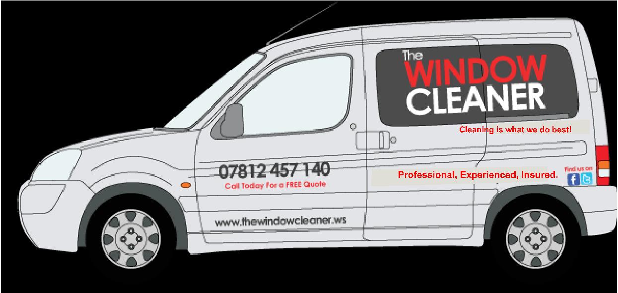
I have done a few, this is the best I believe. The list of services is not ideal but that’s what is required.
-

Hi Craig, sorry but I think the man flu is messing with you 😀
The last one is the worst in my opinion. I know your brother wants all the text, but really, ditch it all.
It is a mobile advert for his business. Whizzing past you, you want:
NAME / WHAT YOU DO – Blam! WINDOW CLEANER
NUMBER – Blam! How to get hold of me
WEB – Blam! Go to the website and get all the small print!
The stripy graphic stands out more than anything on the last one, barbers pole?
Find us on Facebook / Twitter how? Name?
KISS
-
Only trying to help Craig, I would add that the .ws domain extension doesn’t really work, isn’t it Samoa? It isn’t natural for people to remember that when they look at your van.
-
Hi David,
.ws domains stand for website. 🙂 So that’s all fine.
Thing is, the vehicle is near enough always parked when jobs are being completed. Hence I think the list as more services than just window cleaning.
Its a hard one, as its a Berlingo Multispace too therefore more to contend with rather than just a plan panel van.
I don’t do many vehicle livery’s as you can tell. Hands up, I’m struggling.
-
 quote Craig Ross:Hi David,
.ws domains stand for website. 🙂 So that’s all fine.
.
Craig I think this is what David means http://en.wikipedia.org/wiki/.ws
ps is your brother called Craig too?? 😉
-
Gary,
I originally started the business and help him out. Hes Deaf you see therefore hard for him to make phone calls and meet new customers.
I still do it with him too.
-
quote Craig Ross:Gary,
I originally started the business and help him out. Hes Deaf you see therefore hard for him to make phone calls and meet new customers.
I still do it with him too.
No problem Craig. I thought it’d be because it is difficult to answer a mobile up a ladder with wet hands or something like that.
I know this is going slight off topic and sorry for that but do you get much from the website? I would never consider looking for a window cleaner on the Internet that’s all, so just curious
-
Gary,
I was of the same opinion until I created one for the business. It completely finished yet.
But the response has been amazing, pick up at least 5 new customers a week. Its people who search Google for "Window Cleaner" then click onto the relevant page i.e. Yell or another directory. Come across us and then want to find out more, sort of a face to the business rather than just a name and mobile number like some others. 🙂
It works, and surprisingly it makes good money.
Just need to get this van design sorted! ha! Nightmare, I hate being rubbish at something and doesn’t help that I’m ill.
-
That’s good.
Good luck with the design mate. Sorry I have nothing to input on that side. I hate Berlingos they are the devils van to design on.
But take the advice and lose the shopping list 😉 and make things smaller
Cheers
Gary
-
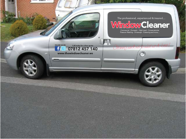
Well got rid of the shopping list and changed it a little but still not sure its right!
How a small job turns into a long drawn out one, plus I want it to be perfect.
-

What do the chevrons symbolise?
They take the eyes away from what you should be noticing very briefly when quickly passing the vehicle and taking information in.
Not a critism, as I have no design experience and have yet to sign write van so I may be completely wrong.
I just thought I would mention it from an ‘outsider’ point of view – similar to how potential customers might look at it?
-

I would run the Fully trained line after the quote.
Move the web up to under it’s what we do….and make it align with the window cleaner to make it look less p*ssed.
-
Appreciated Darren. Thats what I need. I’m here on my own so no other opinions unfortunately and ideally I need to get it done today. This sort of thing shouldn’t take me more than an hour but its taken over my life the last few days. Family Businesses!
Thoughts on this?
Not sure about the "It’s what we do best."
-
Much better from my point of view.
The ‘window cleaner’ is where the eye is drawn now which is what you want. Straight away I know what the service is.
Telephone number is a good size.
I would be inclined to make the web address slightly bigger. But not sure if that is frowned upon or not. I realise it would possibly stretch over the panel gap if enlarged – which is possibly not a good thing to do?
Share the knowledge, what rules do you usually go by when designing? Perhaps writing them down will enforce whether it is right or not. Plus would soon tell me whether I am a good ‘outsider’ or not :lol1:
-

Just a couple of bits that I would change, purely my choice. I think that now you have lost the shopping list your tagline limits you to window cleaning only. Adding ‘cleaning’ opens it up a bit. Didn’t like the ‘fully trained’ either. Sorry.
I see the text is still aligned to the lower trim, so my added text looks wonky!Oh, and enlarge the www. and put social media logos alongside that, then centre the ‘insured’ bit.
Attachments:
-
I would tend to put the shopping list stuff on the back doors along with the company details as then people following the van will have time to read it.
-
It’s better but still very disjointed, the text is all over the place.
Now you need to tighten up your elements.
I’d keep all the text on the body in red, the black looks out of place.
It’s a great idea to keep the laundry list and that twitter/FB thing on the back. -

One thing that definitely need to be done is run everything parallel to the horizontal ignoring the swage lines.
e.g. on Lorraine’s drawing run everything parallel to the "Professional insured part. -

Adding to what has been said "its still not straight" don’t follow the body lines, follow the base line of the van including the main panel. All the text should be on the same level !
-
Were getting there, I think. Simple is key!
The thing I’m unsure about is some of the services offered which people might not realize we undertake.
-
Yeah I like that. Hmmmm. This is why I hate vans.
The Company name is actually "The Window Cleaner" therefore need to ensure that "The" is on there.
-
Stick with Harvey’s design – just add a small ‘The’.
John
-
quote John Hughes:Well done Harvey – neat layout.
John
The new one above is like Harvey’s…
-
Either keep the strap line straight, or put it on an obvious diagonal, this simply looks as though it’s badly applied.
Nice design Harvey, looks good.
-
Parallel it is. 🙂 Changed.
I just want to say, Thank you everyone for your help today and yesterday. All advice has been welcomed and taken on board. I don’t think I have finished it yet but very close.
-
quote Craig Ross:Parallel it is. 🙂 Changed.
I just want to say, Thank you everyone for your help today and yesterday. All advice has been welcomed and taken on board. I don’t think I have finished it yet but very close.
Good on you Bud, some vans are a bitch……sometimes you just have to step back and take a minute too look at the layout. 😀
-
Hi Craig
Sorry, I only just noticed a PM you had sent me. Unfortunately I can’t reply to them. You seem to be on the right tracks now.
Regards
-
Try to understand you can’t put the text at different angles !

Log in to reply.