Home › Forums › Sign Making Discussions › Gallery › VAN : pete scarf electrical
-
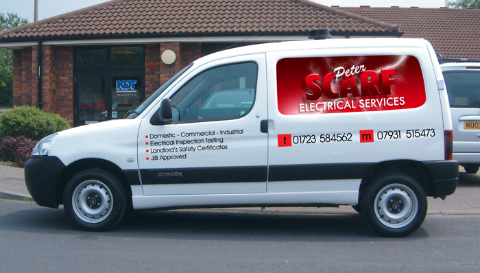
VAN : pete scarf electrical
Posted by Tim Shaw on 14 May 2006 at 15:40Berlingo van, again with v/camm prints on the side panels and both rear windows. Avery 800 for all the other lettering.
45 minutes to fit, prints were cut to exact shape ready for fitting.
Attachments:
 Stevo Chartrand replied 19 years, 7 months ago 5 Members · 5 Replies
 -
5 Replies
-

putting the versa to good use then my only dislike is the word peter else love it
chris
-

Looks good Tim but I agree with Chris about the word Peter. Also I would have lined everything up to black bump strip.
Neil
-

Ooooh sharp!
I like it all, and I like how you went with the body lines…..I’ve just seen it recently on a van out here where they went with a straight line – but against the body contours and it just looked strange to me. looked like the van was ’tilting’ or something.you do some really nice work (hot)
-

well done mate, I would have gone with the bump strip too, but I always get the clients view as well.
Having sich a large picture in the window well, dictated the angle everything else had to go I think.
‘Peter’ is my only crit too. Some great Letterheadfonts script would have been a better option imo.
If the customer was happy then you should be happy too.
thanks for sharing
-

Looks pretty sharp! But I can’t seem to read it very well.
I realize this job’s done already but keep in mind that red and black don’t work, their values are much too close together. A white outline on Scarf would’ve cured it and would’ve tied in better with the white name and electrical services.
The background on it is pretty neat though!Stevo

Log in to reply.