Home › Forums › Sign Making Discussions › Gallery › Van Graphics: The Fish Tank
-
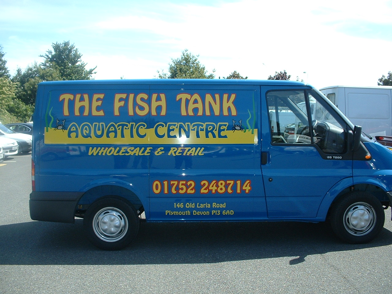
Van Graphics: The Fish Tank
Posted by Roy Roffey on 6 November 2004 at 19:44take a look and let me know what you think 😮 🙁 🙂 😀
Attachments:
 Roy Roffey replied 21 years, 1 month ago 7 Members · 7 Replies
 -
7 Replies
-

Actually I kinda like it.
It has a nice friendly retro-70s feel.
Like how you used the body color of the van
in the secondary copy.
The only things I would have done differently are:
Switch the outline on FISH TANK to black,
no outline needed on the phone #,
and made that panel for the secondary copy a nice light blue.
But it stands well as it is, and will surely get some attention.
Love….Jill 😉 -

I really like it also. Tend to agree with Jill, the red outline looks a little out of place, but other than that, its an attention grabber.
Cheers, Dewi
-

I like it too
One thing though: because the outline on the telephone No.
is bolder and stronger your eyes tend to go to this first.
Perhaps lessening its boldness or add more boldness
to the main text would work.Good judicious use of clipart as well.
Some people go OTT with clipartOverall a nice layout
Thanks for sharing
John
-

I think that really works.
Who’d have thought that such an unusual, 94 years old font would work so well in the 21st century?
-

Never been a huge fan of red on blue, but other than that it is a nice clean look, that looks professional.
The other thing I may have done myself is used the word ‘and’ instead of ‘&’, just to take up a bit more space, because you have plenty of room.
Good job. 😀
-

thanks for all your comments guys
it was a bit of a risk using the red on such a bold blue van but i thought it was a little different.
keep smiling 😀 😀 😀 😀

Log in to reply.