Home › Forums › Sign Making Discussions › Gallery › Van Graphics: Surf Shop
-
Van Graphics: Surf Shop
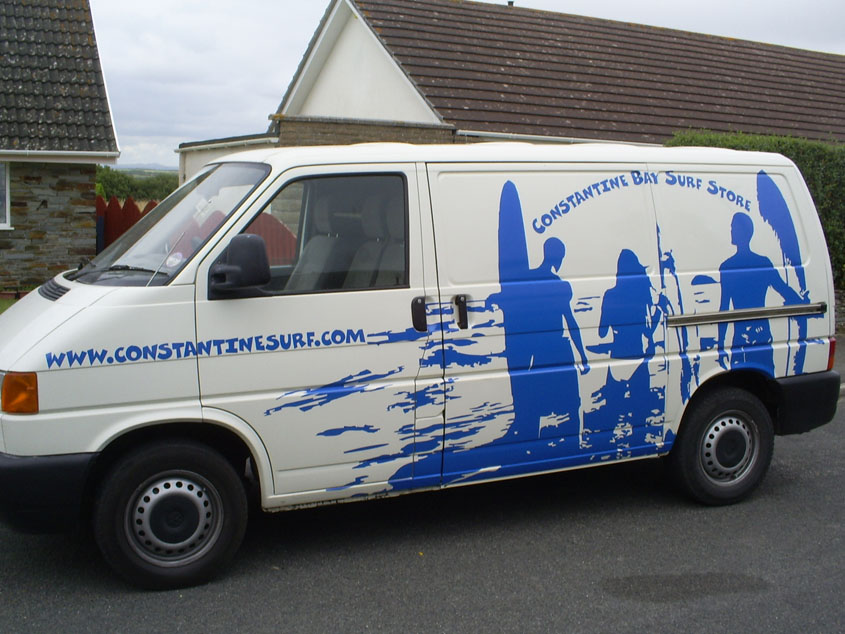
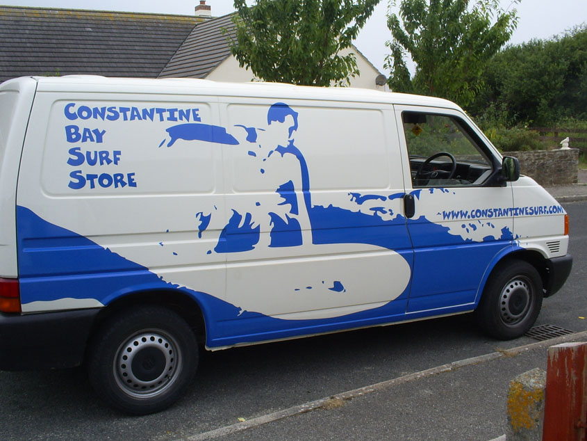
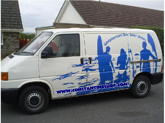
Posted by Alistair Richards on 23 July 2006 at 11:09Hi All,
Did this job yesterday. Took about 7 hours to fit. All 610 wide vinyl Oracal 751c. This is the first time I have done recesses and tiled vinyl. Few little dodgy bits, but customer is delighted. I’m well pleased with it, let me know what you think. Got more to add to the back and front at a later date so will post that up then.
Ali
Attachments:
 Alistair Richards replied 19 years, 5 months ago 8 Members · 8 Replies
 -
8 Replies
-

looks really good dude ! sometimes traces (no offence if that not what it is) work great ! it doesn’t need anything else in my opinion !
-

looks good alistair. nice one mate… 😉
personally i would have kept the silhoette used on the passenger side for both sides. i think it spells allot to you without the words… but of course the words ARE needed.
on that, im not keen on the font used or positioning of text but all in all i think you should be pleased with the result.
vans like this are great to learn from, (by that i mean the fitting of the vinyls)thanks for taking the time to show us your work mate.
-

I like the images, would have done more with the text and layout. Even if just another shade of blue.
-

nice job done alistair 😀 …have to agree with robs comments and also another shade of lighter blue would have been nice to add a bit more definition to the design 😀
nik
-

i think it looks great.
I just dont like the text i think i would have (and not saying this is the right or wrong way)run the web site along the bottom and cut it out from the silhoette with an outline i.e using the colour of the van as the outline where the silhoette is
but thats just me
good work rich
Attachments:
-

I like the overall concept apart from the text, and I don’t think running it through the grahic works well as it takes it to low I think a differant colour would have worked better. apart from that well done 😀
Lynn
-

Thanks for all the comments folks, much appreciated. I had originally used Futura for the text to keep it simple and not to take away from the images, but the customer was set on having this font because he has used it elsewhere. As for the colour, I just took a 751 swatch down to the client and had them choose. I was quite keen on using a light grey myself for the subtle approach, but it was decided between everyone gathering around discussing it that blue was what they wanted, and they ended choosing this colour "sea blue" mainly because of the name, nevermind.
As far as application of vinyl goes though, this project had been a real confidence booster for myself. I only started doing signs in November. It was a very daunting task at first, but I got through.
I would like to thank the boards loads, because without all the advice and topics on here I would never have dreamed of taking on such a task. :2thumbs:
Ali 😀

Log in to reply.