Home › Forums › Sign Making Discussions › Gallery › Van Graphics: morris decorators
-
Van Graphics: morris decorators
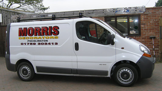
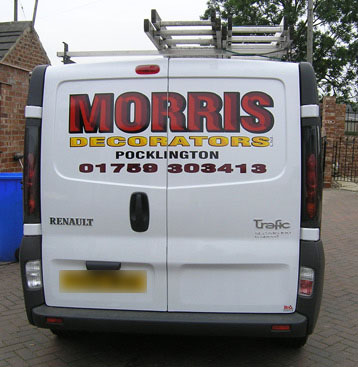
Posted by Ian Higgins on 10 October 2005 at 15:04Just a couple of things we have done over the past couple of weeks. I personally like the van it looks really sharp and simple .. customer over the moon.
Cheers
Ian
Attachments:
 Shane Drew replied 19 years, 11 months ago 9 Members · 15 Replies
 -
15 Replies
-

Oy you spelled my name wrong :lol1:
Looks good, did you use the chisel effect in signlabs to do the Morris Decorators, it looks like it’s printed as well.
Steve
-

Hi Steve,
Yes the chisel was done in signlab but all done in cut vinyl.
The phone number is burgandy on black but does not show up on here.
Cheers
Ian -
I’ve had a play with the chisel effect but never got to grips with it, maybe I should give it another go as the effect is very good.
Did you use 1 shade for the darker reds or 2 shades?
Steve
-
Hi Steve,
I used Burgandy and dark red on a black background and on the decorator I used 2 shades of yellow on black.
Cheers
Ian -

Is it just my eyes or does one line have a different light source than the other on the 3-D letters?
I would have liked to see a secondary yellow or white outline around the red copy, then a bolder black outline around both the red and yellow lettering.
As long as the customer was pleased and you got paid, that’s the main thing!
Love….Jill -

excellent, nice and clean
its amazing what you can do with a few layers of cut vinyl, some imagination and a bit of thought behind it you can pretty much lay up anything.
only crit is the telephone number, i would have used helvetica extended or opened the kerning up a tad more, looks a wee bit stretched.
Great looking van tho’
Andy
-

Hi Ian, thought you had retired with all that money you make. Nice to see you are still alive & kicking mate.
by the way van looks good along with NEC work.L J
-
 quote Higgi29:rear
This kind of Chisel effekt. Can it be made in corel draw or Illustrator 10 wich I use?
Cant really afford Sign lab at this point..
-

Ingram software sell a CD which includes chisel effect fonts 😀
-

how is pumpa`s pic so big ?????????
great work tho, how did you get the nec job, id love to challenge something like that
roffs
-
quote Roy Roffey:how is pumpa`s pic so big ?????????
roffs
It’s not the pic … I am that big…:P
-

Well done Ian. Not much more to be said really, all the other comments are pretty well covered.
I like the van being simple too. Much better than telling a life story 😛


Log in to reply.