Home › Forums › Sign Making Discussions › Gallery › Van graphics: Grove Ceramics
-
Van graphics: Grove Ceramics
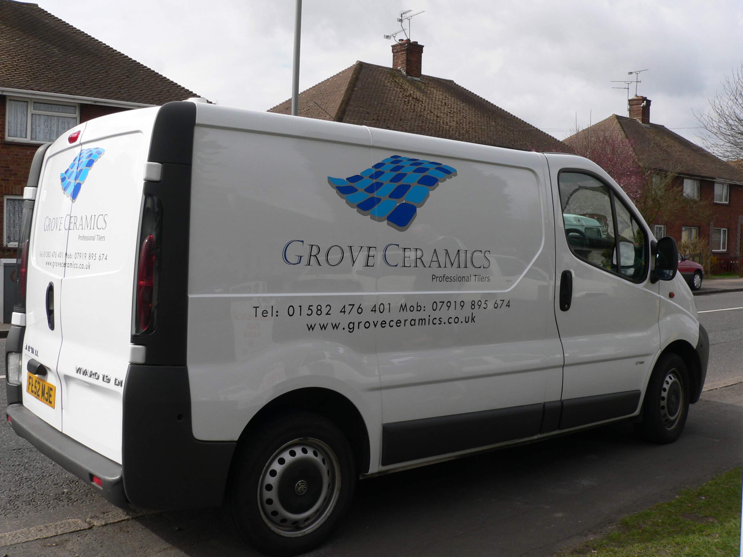
Posted by Peter Normington on 7 April 2006 at 19:12Simple but effective?
Peter
Attachments:
 Shane Drew replied 19 years, 9 months ago 10 Members · 12 Replies
 -
12 Replies
-

It was cut vinyl, easy peasy though, grey with 2 blues.
Peter
-

nice job done peter 😀
my only personal constr. crists is i would have made the kerning of the phone numbers a bit tighter, and made them smaller or in line with the company name 😉
nik
-
Nik, I know you and Jill are a pair of kerners. and if Jill sees it she will also crit the Mob and Tel, Never mind crits are always welcome, I do try my best though
xxx
Peter -

i agree with nic but still like it a lot a clue for my next upmarket one ta
chris
-

Yup, get rid of the MOB and TEL and you have one sharp-looking van.
😉
Nice work.
Love….Jill -
 quote Jill Marie Welsh:Yup, get rid of the MOB and TEL and you have one sharp-looking van.
😉
Nice work.
Love….Jillcouldn’t help ya self could ya Jill 😉

Log in to reply.