Home › Forums › Sign Making Discussions › Gallery › Two Banners, Views & opinions please?
-
Two Banners, Views & opinions please?
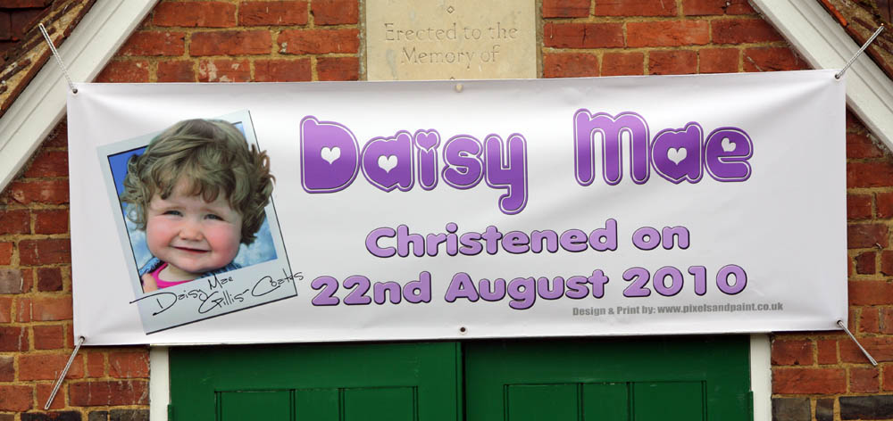
Posted by Mo Gillis-Coates on 27 August 2010 at 12:50Ok, I started this as a hobby 3 years ago, mostly I just do banners and photo enlargements, but working my way through small sign runs at the moment.
Here are a few of my banners, the design is all down to me… yep I own it… I’m Guilty… but also, I’m a negative space fan, less is always more especially when advertising.
How’s this for a start
Attachments:
 Mo Gillis-Coates replied 15 years, 2 months ago 6 Members · 7 Replies
 -
7 Replies
-

nothing much wrong with them at all, nice spacing, no nasty fonts and good quality prints.
at first glance the dragon boat main header is a little hard to read (at distance) and i think i would have tried to do something with the photo’s, maybe blend them rather than a space, not sure what i’d do to be honest.
Daisy mae…. unfortunate positioning of the stone above the banner, otherwise… lovely!
Hugh
-
 quote Hugh Potter:Daisy mae…. unfortunate positioning of the stone above the banner, otherwise… lovely!
Hugh
Oh dear just noticed that, thats a good enough faux pas for some internet site…
-

They look better than some signs I’ve seen by a person years in the business.
(not on UKSB)
😉
Love the Daisy one.
I just had to paint Daisy Mae on an urn for someone’s dog’s ashes.
😳
Like to see you tighten the space between the two words on the headings of both.
Love…..Jill -

Thanks for taking the time to post your work mate, much appreciated.
I think both your banners look good mate. Clean and tidy and fit the bill…Purely as way of nitty gritty constructive criticism, and just “personal preference” based on what you have done for the Daisy Mae banner only.
Daisy Mae Banner:
Banner itself… looks to be hemmed by tape, which is fine. But your eyelets are too close to the edge of the banner. You want to be about 6-10mm minimum from the edge of the eyelet to edge of banner. This will help prevent the eyelet being ripped from the edge of the banner.
Design:
* the border margins are not same left to right, top to bottom.
They don’t have to be same all round but really should be sale left and right, same top and bottom.
* Your kerning looks off, 2010 looks inconsistent kerning, whereas the rest of the text looks too tight.
The lavender text looks stretched by about 15% extra. Rather than stretching which really shouldn’t be done, try opening the kerning by 5-15%. It actually helps legibility when viewed from a distance.
the grey web text below… a nice open sanserif font text & right justified/aligned to the end of the “e” in Mae would mke it better balanced and legibility clearer.
Picture, really like the way you have done the picture as the polaroid snap, like the signature too… is that a font or did you sign over it?the above is nothing but my personal preference based on what you have done mate… really just went into depth a bit because you are looking for advice and pointers. on the whole, the banners are good, much better than many we see on the high streets today…
-

yeah…. what rob said…..
Good job tho Mo.
We have lots of peeps on here that started with the same level of experience, and they get better and better when they take the critique to heart from here.
I agree with Jills coments too. I’m a believer in negative space too. The spacing does need to be a bit tighter though
-
quote Robert Lambie:TYou want to be about 6-10mm minimum from the edge of the eyelet to edge of banner. This will help prevent the eyelet being ripped from the edge of the banner.
Design:Picture, really like the way you have done the picture as the polaroid snap, like the signature too… is that a font or did you sign over it?
Hi Rob (looks like the post has been modded somewhat, hey censorship has it’s place I guess, was getting off top tho)
The eyelets are a bit further in than 10mm the banner is very large so it appears closer.
That is actually a font on the signature, i use it a lot under licence of course, I think it’s called hand of Sean
Thanks for the comments I’ll keep working on it, I did the banner for my daughters christening, normally I don’t put blatant advertising on customers signs unless I’m doing a charity or a contra job.

Log in to reply.