Home › Forums › Sign Making Discussions › Traditional › third paid job! comments and advice please!
-
third paid job! comments and advice please!
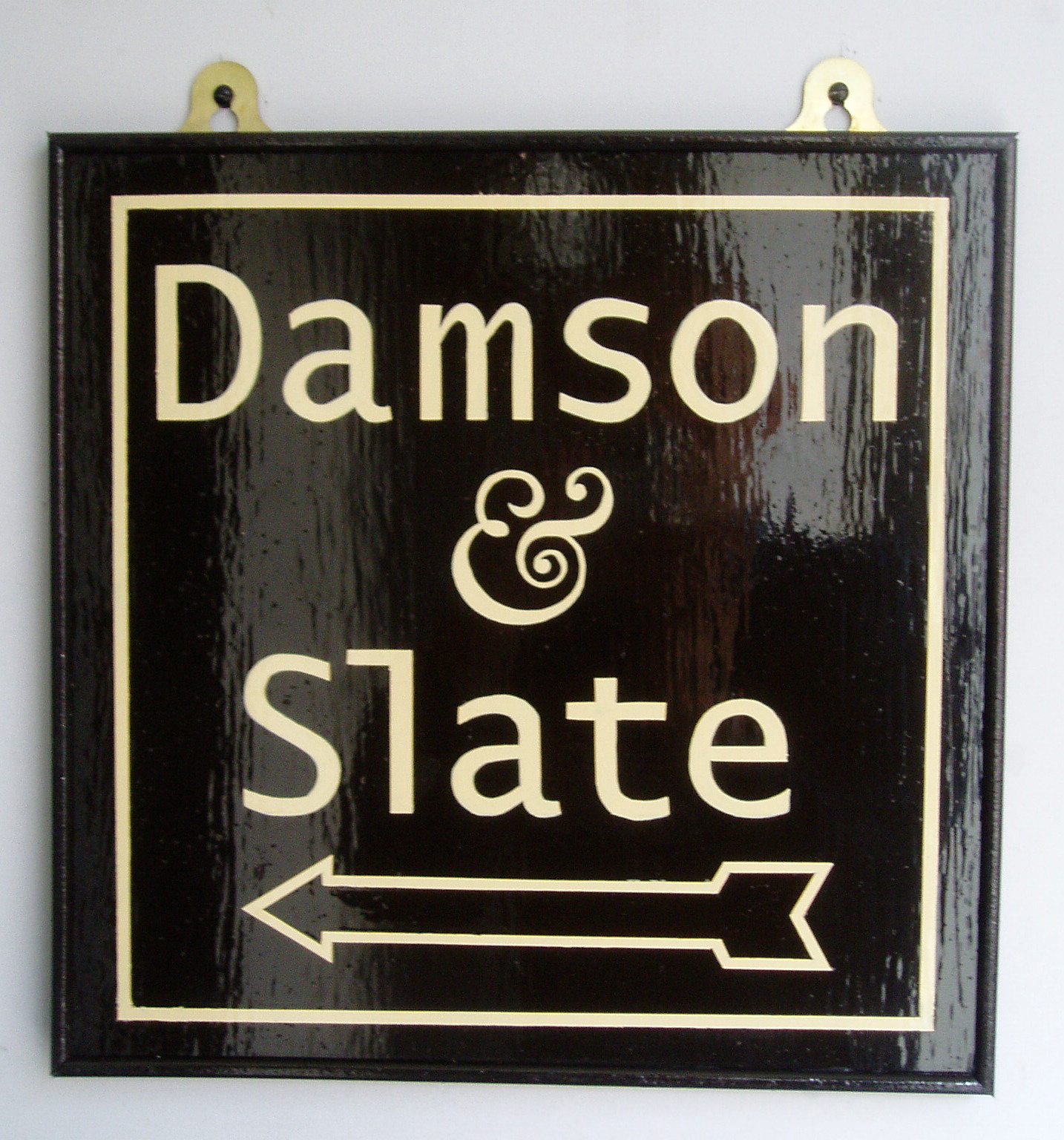
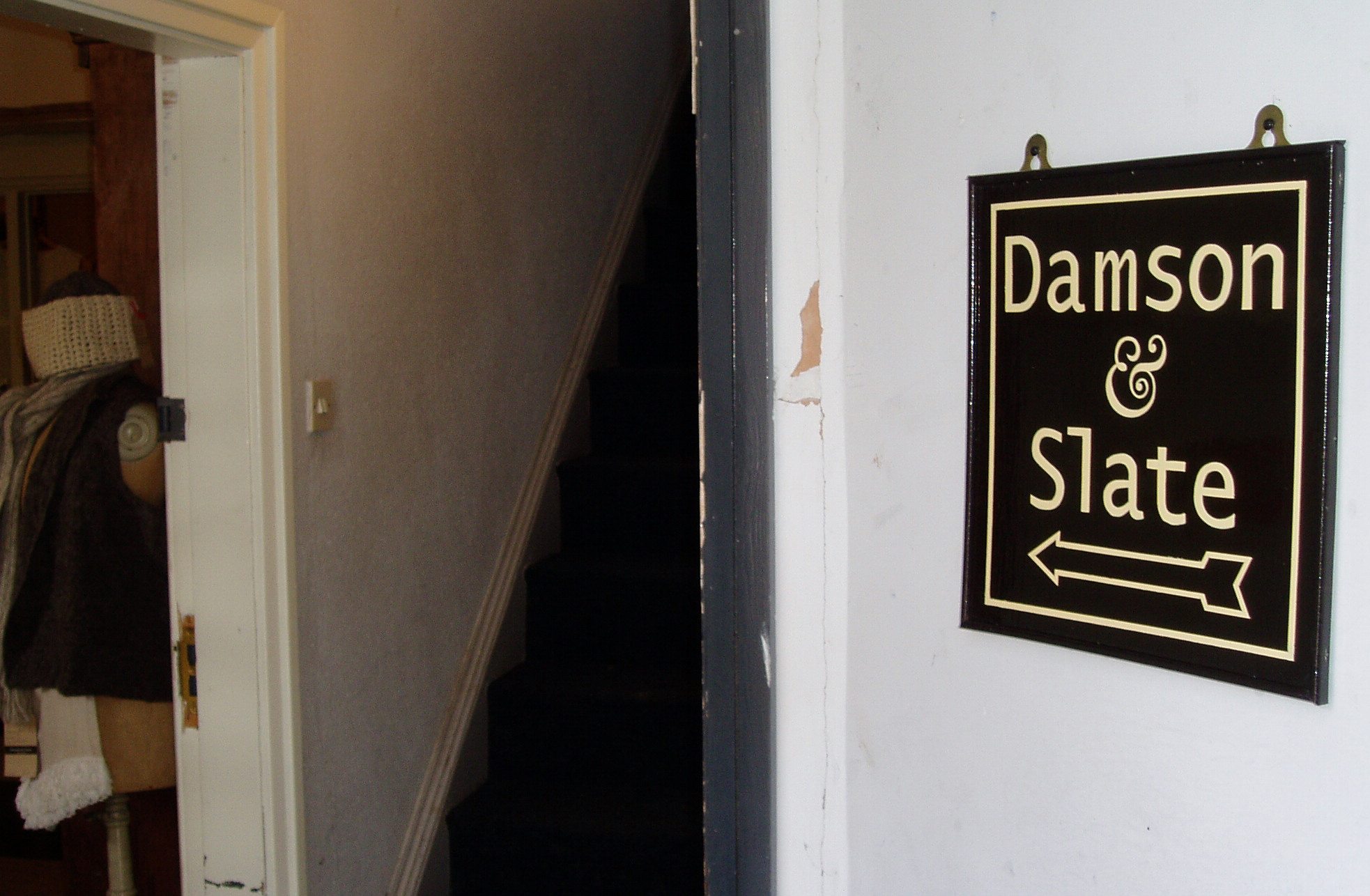
Posted by PatrickBoothman on 1 October 2009 at 18:54The client for the previous jobs wanted an interior sign to direct customers into her shop. I think the spacing is a bit better. All done with sable no.2 and wright it paint! comments please. . .
Phillip Newell replied 16 years, 2 months ago 6 Members · 9 Replies -
9 Replies
-

Its got a very blank look to it, sorry mate don’t think the attachment worked
-

Patrick not being a brushie that looks well done to me but I have to say the L looks like a 1 maybe it’s just the font ?
Lynn
-

Nice job Patrick…one thing though….my dad used tell me to make my curves ‘sweet’…..have you practised using the mahlstick like a compass…really helps to get the flow.
-

cheers everybody. The L is horrid but thats the font! Not my choice. Harry, thank you very much, I have not tried that with the mahl stick. Still earlt days and my style has yet to develop any sort of fluidity or sweetness! maybe one day.
-

Patrick, I’m not a brushie either yet, but I’m impressed. Those letters look really nice. You give me some inspiration as I’m also going to pick up some brushes now and start practicing. Keep posting your stuff!

Log in to reply.