Home › Forums › Sign Making Discussions › Graphic Design Help › Stich-up : Logo design help & advice
-
Stich-up : Logo design help & advice
Posted by John Cooper on 10 January 2010 at 11:47I struggle with my own logo so don’t even attempt to design for others. Fortunately, we’re most often asked to create an embroidery pattern from a logo provide by the customer.
Anyway, I feel the need to change our logo for several reasons:
1. It was hastily conceived in the first place.
2. We don’t just do embroidery now, we’ve started producing decals, labels and some dye-sub.The upshot of this is, I’ve been doing a lot of reading and I wonder what a logo should convey to the viewer? Take the Nike logo as an example, unless I was aware of the products Nike produce, the logo doesn’t tell me much except the tick means good.
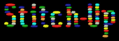
When I first produced our logo I felt the need to try and convey what we do and this is what I came up with. Even the business name was hastily conceived and sometimes, I even struggle with this!!
Having done a lot of reading I’m still bewildered how the more creative amongst us must see things differently. So what is the thought process of you, more creative people? Presumably you’d need to know what the business makes or what service they offer – how does that fit into the Nike logo?
I know I’m waffling, I just wish I had that creative mindset or could just listen into the thought process of a graphic designer.
Attachments:
 Matt Hammond replied 15 years, 11 months ago 17 Members · 51 Replies
 -
51 Replies
-

Your logo might convey that you can create clever stitching but to me it’s quite an assault on the eyes and difficult to read.
A bit like using every font on a system for a single sign, it appears to have every available colour in it.
Depending on the background it is used on, there is always going to be an indistinct part to it (dark blue in this case).
But then if you like it, stick with it. 😀 -

Hi Peter
Thanks for the comments and to be honest, I hate it! Odd how once I liked it, geez (:) !
I’m trying to come up with something effective just now. Any ideas 😮
John
-

try keeping away from the stitching gimmic when designing your logo.
the bad thing about your name is it includes the word "stitch". now your trying to push other products, it will be hard for folk to see by the word stich-up. i guess its the same for most of us with the name "Signs" in our logo/name. then move into sub and digital printing…
anyway, try keep away from the stitch gimmic i think and also include a strapline below the logo to tie in other products you do, if possible.hope that made sense… 😀
-

John, just my opinion but I don’t think you can make the comparison between a small business and a multi national like Nike when it comes to logo design. Nike didn’t always have the tick as their logo, like a lot of large companies they have changed their branding as they have grown and today they could use almost any logo and people would know who they were so it doesn’t have to reflect what they do in the same way that a small companies does.
I wouldn’t say I was great at design and try to avoid designing logo’s for customers if I can help it, like you I am quite happy to take an existing company logo and use that with any sign work I might be asked to do.
Like Robert has said though a good strap line along with a logo goes a long way to helping customers understand what you do.
When I have had to do logo’s for customers I have tried to design them in a way that is relevant to their business.Not much help I know but at least you know that you aren’t the only one that struggles with things like this :lol1:
-

Hi Martin, I think you’ll find that the tick was their original logo, designed by Carolyn Davidson in 1971 for a new brand of footwear. This started out as a small company and has continued to grow to the company we know today with the same symbol. I always find this a useful comparison because of the simplicity of the design and the brief.
Jason
-

We were also in the same dilemma not so long ago John. Similar to yourself we offer embroidery, garment printing, sublimation but also business stamps & some engraving. To stop us being pigeon-holed we thought our only option was to come up with a memorable blanket business name & half decent tag-line & this combined with the face image we now use hopefully does this……………..only time will tell 😕
-
Jason, thanks for correcting my error, I’m often wrong so it’s no surprise 😳
It still doesn’t change what I believe and the fact that a lot of big brands have changed their image and branding as they have grown and some that have started had a lot of money behind them from the start and were able to spend lots of money on advertising to get known.John if your not sure about the name either then maybe now is the time for a complete change, I’m not sure about the name myself as I keep thinking about the negative side of "Stitch-up"
Perhaps it would be nice to hear more from Neil as he has just been through something similar, do you feel the change cost you any business Neil or do people realise they are still dealing with the same people? -
quote Martin:Perhaps it would be nice to hear more from Neil as he has just been through something similar, do you feel the change cost you any business Neil or do people realise they are still dealing with the same people?
Can’t really say Martin because I’ve went from a high street shop mainly doing one offs for joe bloggs to a back-lane workshop now focusing on B2B, schools, clubs etc. So it’s been more than just a name change for us
-
Yes, we have considered a change of name but decided that as embroidery is our main business to stick with Stitch-Up. I know what ‘Stitch-Up’ can infer but I guess it was meant to be a bit light-hearted, perhaps make people smile.
There’s little point me trying to design our logo because I just know I’ll get it hopelessly wrong – again! I don’t think I have the mindset of a designer so I’m best off leaving it to a designer. They see things differently to me and I’m presently awaiting some feedback from them.
I’ll keep you posted.
John
-

how bout a design competition on the boards? Should be fun. You can donate to a charity of the winners choice?
Just a thought
-

Just a quick attempt – kept it simple for reproduction on print and embroidery.
Cheers John
-

I can say that a name change can be a good thing, I changed my business name after about 18 months of trading. I used to be "Hold Up Signs" and yes some did like it and some found it humorous but more and more I found out that some of the humour was negative towards it and that is never a good thing. I am now "Mint Signs" and many people ask me if I am a franchise or national company just by the name and appearance. I have no tag line and a very simple logo and it might be coincidence but since then business has gone from strength to strength.
Funny names are not always bad and sometimes very good in fact but if there can be any negative thoughts to it then it should be considered carefully and also done sooner rather than later.
Just my take and experience on it.
cheers
Warren
-
Warren I think I made the same comment about your name at the time either on the forum or in a PM.
Your Business name says what you do which is probably why you don’t need a tag line but John’s doesn’t really which is why I think the tag line is important.Shane’s idea is a good one, if John is up for it, I know I would be as having seen some of the work on here I know there are a lot of people who could do a much better job than I ever could.
-

any of these any use ignore the last one just a jokey one.
-
quote Matt Hammond:any of these any use ignore the last one just a jokey one.
Like the second one Matt, very classy & to the point 😉
-
I like the 2nd one too Matt, but it may lose definition when embroidered? Johns design would remain true if embroidered tho. Simple can sometimes be best when the logo will be small.
-

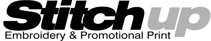
can’t take credit for this but preferred the kerning
Chris
Attachments:
-
Sorry I took sometime to reply – work is just hectic off the scale at the moment!
Love the thread and some of the ideas put forward. I didn’t intend this to be a discussion about my particular logo but I’m very thankful for the ideas and suggestions – even a little embarrassed!
Of course I love the idea of a competition and if my logo was to be the focus, I’d be more than willing to make a contribution to charity.
I’d still like to know the thought process and workflow a designer goes through in creating logos.
John
-
quote John Cooper:I’d still like to know the thought process and workflow a designer goes through in creating logos.
John
Hi mate, the thought process varies from person to person.
I’ll ask the client what they actually want. Full colour, 2 colour etc. What are they going to do with it – web, print etc,
I see if they have any colour choice. If the colours don’t work well together I try and steer them to colours that will work better that their choice.
Then I may doodle for a while to see if anything takes my fancy. I may look at other similar business and see if I get some inspiration, but that can bite you, because you tend to subconsciously ‘copy’ the design instead of creating your own. Always goods to see what principal the designers have used tho.
If the client is not sure what they want, I’ll look on the vector sites to see if I can make something ‘fit’, by getting a background and adding or deleting to make it more individual.
Other than that, once you get the client to tell you what they like and don’t like, its an easier process.
Secret is not to get too complicated in the early stages. Some of the best logos today are simple. Selling the client on the idea is often the hardest part of the whole design.
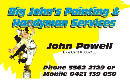
As an example, the card here took me 15 minutes tops. I determined that the colours he liked needed to be bright, he was obviously a painter, and he liked bold text.
I grabbed the vector from istock, changed the colours to suit, and added blocky text. He approved it in 5 minutes, I then signed his car, supplied business cards and all sorts of stuff.
It wasn’t hard because he knew what he wanted in truth, just didn’t know how to express it. Ask the right questions and the design comes together pretty quickly.
Hope that helps
Attachments:
-
Thanks Shane, excellent explanation.
My problem is born out of acting to quickly and finding it hard to open my mind! The original logo was just to cmplicated and the use of all those damn colours was aptly described as an assault on the eyes.
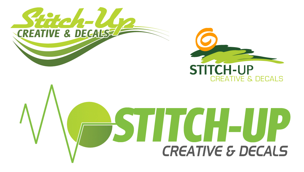
A designer did send me some ideas, but I don’t like them and the use of the words ‘Creative & Decals’ is just wrong. When we started out, we just used Stitch Up then, when I started looking for a domain name, I introduced the ‘-‘ between Stitch & Up (Stitch-Up). We then started doing some printing, decals, sublimation & labels so we started to use Stitch-Up Creative and I guess the strap line, Embroidery & Print.
I plan on signing my car with a logo and I think ‘Stitch-Up Creative’ is what I’ll use. The ‘-‘ symbol isn’t that important because if someone see the sign and remembers Stitch Up Creative and then Googles it, it comes out near the top of the 1st page. Googling Stitch Up and we’re way down the list! So is this important in the design? Am I over complicating things?
To be honest, in someway I’d prefer someone with a ‘good eye’ or consensus of opinion from those with design experience – not me , to tell me what’s good.
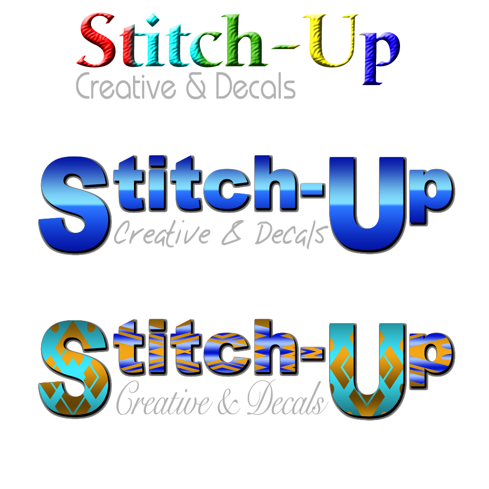
These are the ideas I received this afternoon. 🙄
Attachments:
-
The problem with the above is they would be difficult, or time consuming, to embroider. Surely your after 1 design that covers all bases – embroidery, print and cut. Just my opinion. 😀
Cheers John
-
That is a consideration and I could, if need be, simplify the design for embroidery or I could use printed heat pressed textile vinyl.
-
Hi John, Yes I would incorporate the "Creative" into the design as its working in Google.
-

John,
Firstly the designs you were sent, without offending the person look amateurish and don’t suit your needs/company.
A good logo is highly important and often your company will be judged upon it, same with signage. Websites are the same, if I click on a naff looking website I click off within seconds.
Small companies need all the help they can get and a good image is a hell of a head start.With the likes of Nike etc, we are talking brands their logos usually change only slightly over the years and are rarely more than 1 or 2 colours. Still doesn’t say they are good logos, look at ‘ScS’ furniture company not quite the league of Nike or Coca Cola, but has to be the worst by a country mile, I’ll bet my bottom dollar it was designed by the original owners kids…(if not it sure looks like it was)
To come up with a half descent logo you should have a reasonable eye for design. It’s ‘horses for courses’ if you can’t design get someone who can to do it. It amazes me how many people don’t and end up with poor logos.
My process of designing is how large the company is, what they do and if they have a colour theme.
I type the name out in a simple font and just play around trying fonts that suit the name, ( I’m a great believer in every word has a font that suits it ). When I have the font that suits I judge weather it looks good alone in the correct colour or it needs more , lines swirls clip art shadows etc.
Design is is also very subliminal, When out and about I study every sign logo etc, I love design where I think how did they come up with that.
If I see something I like it’s amazing how when you next design you incorporate parts of it without realising.Anyway I hope I have sought of answered your question 😕
Finally, have we not come up with ideas for your logo John I’m sure I had a bash at something as the name sounds familiar.
-
Thanks for the reply Martin, very interesting reading.
I agree with your comments about a good logo being important and a good website. The problem for small businesses is that most things ‘good’ cost! Certainly a good website, particularly one that allows online transactions can be very costly to set-up. I’ve tried several of the osCommerce systems but unless you’re conversant with PHP programming, their very difficult to design as you want.
I did post a message somewhile ago about advertising on the side of a trailer we haul gear around in, maybe you replied to this post. I didn’t actually proceed with this because I needed to get various things in place first – domain – website – email – logo. I’ve sorted the domain and the email, I’m working on the website and the logo.
If I had the money, I could get it all sorted in a few weeks I guess – but there’s also other equipement I’d like to buy 😮 I’m sure you know the feeling.
Cheers
john
-

Nice work there, John MacD.
And good words from Martin C.
Love….Jill -
I forgot to say ….
Quite often I see artwork/logos posted on the forum and I think, WoW, that looks great. And then the critics wade in and pull it apart 😀 – the kerning is wrong, don’t use ‘Tel:’, use a different font for this and that …… When I look at the redo – the small changes make a huge difference.
I used to hastily reply to the original image and say how much I like it – now I’ve learned to wait :lol1: :lol1: :lol1:
-

Sure i done a design for a stitched up trailer once what happened to those
Terry -
quote Terry:Sure i done a design for a stitched up trailer once what happened to those
Terrythis one terry?
http://www.uksignboards.com/viewtopic.p … ed+trailer
Grub-up?
-
No not that Rob ,it was a layout proposal for an show event trailer submitted in response to a request, ill see if i can find it and repost
Terry
-
I do recall the post about our trailer – I remember someone came up with a design of predominantly black & yellow.
We haven’t moved the trailer since because Angie had a crash in the towing vehicle – someone smashed into the back of her vehicle and the force was so great, it distorted the whole of the back end!
I’ll see if I can find the post.
Just taken a trip to your websites (John & Martin) – some amazing work
I love some of the ideas already posted here and I’m so grateful for work – amazing.
John 😀
-
quote Terry:Sure i done a design for a stitched up trailer once what happened to those
TerryHere is that said thread
http://www.uksignboards.com/viewtopic.p … sc&start=0Some nice ideas on it, love the green oval one 😀
John if there are any you like on the threads and there are some descent efforts why don’t you ask the people if they will let you have the file, if you did like the one I did I will email the file to you and I would be happy for you to use it as maybe some of the others would 😉
I know some frown upon artwork being designed and given away on site but I think if the person is a full member and a regular contributor then no harm done. I Help with design as I don’t contribute much in the technical threads….that dept I’m a complete dunce 😥
Anyway Don’t be afraid to ask if someone comes up with something you like.
Martin
I forgot to add to see some exceptional talent check Terry’s website out above me, truly awsome work
-
Martin Cole wrote:
Design is is also very subliminal, When out and about I study every sign logo etc, I love design where I think how did they come up with that.
If I see something I like it’s amazing how when you next design you incorporate parts of it without realising.Martin that is really sad, going round shops looking at signs when your out……
BUT…
I’m glad to know I’m not the only one that does it :lol1: I do it all the time, everywhere I go I will look about to see how things have been made, study the design and ask myself if it could be improved and what would I have done different. No wonder I now live on my own and no one want’s me to go shopping with them 😳
-
 quote Martin:I’m glad to know I’m not the only one that does it :lol1: I do it all the time, everywhere I go I will look about to see how things have been made, study the design and ask myself if it could be improved and what would I have done different. No wonder I now live on my own and no one want’s me to go shopping with them 😳
Don’t worry Martin – ther’s a few of us "geeks" here :lol1:
-
quote Martin Cole:John if there are any you like on the threads and there are some descent efforts why don’t you ask the people if they will let you have the file, if you did like the one I did I will email the file to you and I would be happy for you to use it as maybe some of the others would 😉
Hi Martin,
Angie is the boss so I’ll get her to make a decision this weekend – I think she liked the design incorporating the T shirt best, but I’ll make sure.
Thanks all for the tips and effort.
John
-
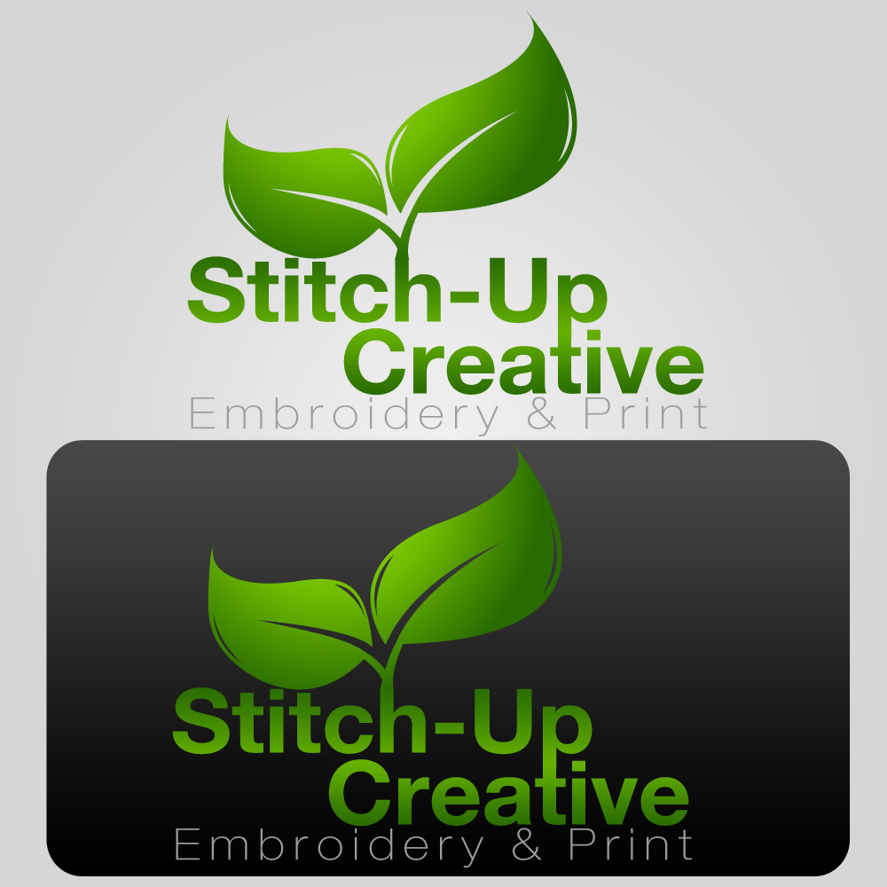
Here’s the latest from a graphic designed. I’m a little confused by the use of leaves!
Attachments:
-
John, just out of interest as we are discussing logo design and the thought process that goes with it. What info did the Graphic Designer ask you for or what info did you give to them to allow them to start designing a logo for you, I am curious especially after your last post where you say you have no idea where the leaves came from.
-
Hi Martin
I sent the designer the logo we’d been using to date and told them I disliked it 🙂 Told them what we do:
For a few years, my partner & I have run a business called Stitch-up.
We started out embroidering logos onto clothing – mainly for the car/bike enthusiasts market. We’ve extended our product base into creating decals/labels. As a consequence of extending our product base we changed the name of the business to Stitch-Up Creative. The – (minus sign or hyphen) in stitch-up is important as our website includes it in the domain name. However, it might not be so important in the logo – I’m not to sure on this.
Because the business name Stitch-Up defines the business more towards the embroidery side of things, the logo will require a good ‘strap line’ to include Embroidery& Print. I’m not sure how this could be effectively included.
Our existing logo doesn’t excite me and therefore needs changing.
I’m looking for something simple but exciting, something I can use on signage, letterheads, website, labels and general branding.
The business name is Stitch-Up Creative and a Google of that brings us up on the first page.
They’ve not asked any further questions.
-
It’s a nice logo but I think you would need a tagline to try tie it in with your business
"Helping your business grow" 🙄
-
I agree, to me it does look attractive, far better than the previous one. I just had difficulty in understanding how the leaves got into it.
-
quote John Cooper:I agree, to me it does look attractive, far better than the previous one. I just had difficulty in understanding how the leaves got into it.
maybe they were smoking some (rainbow)
-
I’d hire John Mac, his stuff all looked nicer than that one.
Not that I think it’s that bad, other than the leaves (huh?) and the secondary copy being very weak and too tight to the name. -
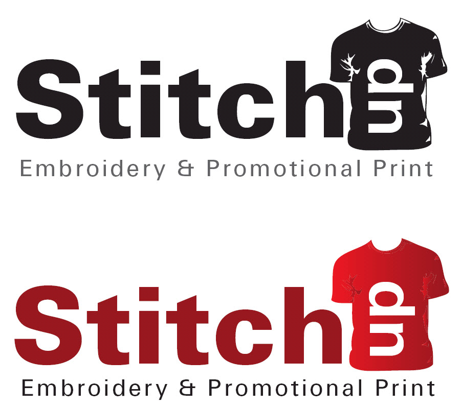
Probably not what you had in mind, maybe not even for me, but my point in this one is to show how i have tried to keep the name, but drag the whole "stitching/embroidery" focus out of the picture… if that makes sense?
if your adding sublimation, vinyls etc to the business, you may also add digital printing at a later statge and be back to square one with a relevent company image.Hope ive made some sense here… 😀

.
-
Yup, we’ve got to move away from the specific ‘stitching’ theme – difficult when the business name is Stitch-Up!!
Angie has been through all the design ideas posted here and the ones she likes best, at the moment are those by Matt Hammond.
Just a few comments.
We’ve got it so wrong in the past, just look at the logo we’ve been using!!! Are we getting it wrong again?The deesigns featuring a sewing needle in the design are great – if we wanted to emphasize the embroidery. We probably would have chosen one of these.
This is the most important part for me.
We’re unlikely to be doing much advertising outside our local area. At first the logo will be seen on our cars – my car being quite distinctive! If someone was to see our cars, what would they remember (if anything)?They won’t remember the telephone number.
They won’t remember the www,blah.blah.
At best, they might remember Stitch Up – based on using Matt’s design.So, they go home and at best, Google Stitch Up. Yes we’re there somewhere, probably 20 pages in! Useless. However, if they Google Stitch Up Creative – we’re top on the first page displayed. This is why I think it would be best to include the word Creative in the logo and it needs to be predominant.
Am I right in my thinking? If so, how can the word Creative be ‘cleverly’ included in Matt’s design remembering what we do? Probably getting into the psychology of advertising now!
The logo we’ve been using to date was conceived in about 5 minutes and it shows!! This time, I’m trying to get it right so apologies if I’m dragging this one out.
Thanks for all the help.
John
Attachments:
-
don’t apologise for trying to get it right.
Yes, you need the ‘creative’ part included IMO
Perhaps change the tag to ‘creative embroidery and print? with the creative in a bold text?
-
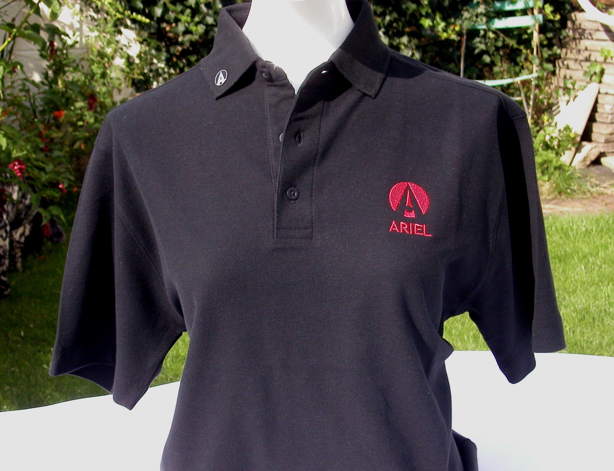
Not really related but interesting nonetheless. One of my fellow Atom owning friends used to head up an advertising agency in London.
He retired on the phrase "Volvo + Volvo = Volvo"
I also believe he was part of the team that created the "Want mash get smash" TV ad.
When I last asked him for ideas, he said; "You can’t afford to talk to me". He was right too 😀
He designed the Atomclub logo and we have a licence to produce clothing bearing this logo and also the Ariel logo.
Attachments:
-

Log in to reply.