-
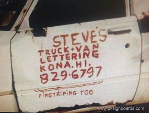
Steve’s Truck & Van Lettering – Photo
Well other than the word "Steves" not being centred over the rest, I think this guy has it nailed… I particularly liked the two little pin stripes. Nice touch Steve! 😀
Attachments:

Log in to reply.
Well other than the word "Steves" not being centred over the rest, I think this guy has it nailed… I particularly liked the two little pin stripes. Nice touch Steve! 😀
Attachments:
Log in to reply.
Please confirm you want to block this member.
You will no longer be able to:
Please note: This action will also remove this member from your connections and send a report to the site admin. Please allow a few minutes for this process to complete.