Home › Forums › Sign Making Discussions › Gallery › Signs: Restaurant Menu
-
Signs: Restaurant Menu
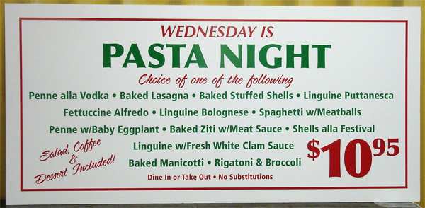
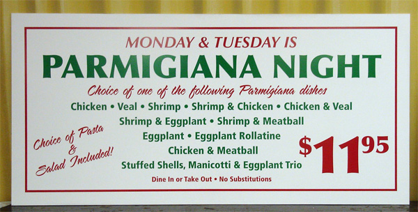
Posted by Bryan Cabrera on 21 November 2005 at 00:42Haven’t had time to post much so here is couple of signs I did today.
46″ x 22″ Komatex, 2 sides.
Comments and suggestions appreciated.
Bryan
Attachments:
 Bryan Cabrera replied 20 years ago 7 Members · 10 Replies
 -
10 Replies
-

I like those, they are really smart and easy to read, love the colours too.
Just one question, what is Komatex? -
 quote Jayne Marsh:I like those, they are really smart and easy to read, love the colours too.
Just one question, what is Komatex?Thank you.
Komatexis a brand name for pvc foam board.
-

nice signs Bryan what’s happened to your picture ?
Lynn
-

Nice work Bryan, they look good to me so dont really have any suggestions for improvement 😉
😀
-

Look OK Bryan
There’s not much space for creativity when they want so much on the board
Legibility is important when there’s a ton of words and you’ve done that -

nice signs bryan 😀
look great….i would have used red dots, instead of green..just breaks it up abit….but thats just my opinion i have a thing about dots. 😀
nik
-
I have a thing about dots too Nik
….especially when I sneeze -
quote John Singh:I have a thing about dots too Nik
….especially when I sneeze:lol1: :lol1: great to see your still on form john 😀
nik
-
quote Nicola McIntosh:nice signs bryan 😀
look great….i would have used red dots, instead of green..just breaks it up abit….but thats just my opinion i have a thing about dots. 😀
nik
Thought crossed my mind, but I see a lot of signs where color is just used all over the place for no apparent reason and I wanted to avoid that. In this case I do agree with you that the red bullets would have helped separate the items better.
I may have 2 more to do, if so I will suggest it to the client.
Thanks for the advice.
Bryan

Log in to reply.