Home › Forums › Sign Making Discussions › Graphic Design Help › sign design advice please for this shop sign?
-
sign design advice please for this shop sign?
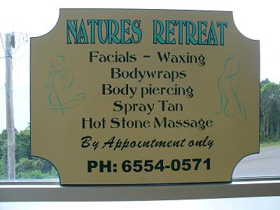
Posted by graham stewart on 7 November 2007 at 12:05Hello to all that look…
this is my Second sign in a week ,Ill be rich before i know it. Ha Ha
Could you please tell me what you all think please.Thanks for looking
Graham 🙄PS Its made out of what we call SIGN BOARD corners cut with jig saw and then i used the router on the edge, then applyed two coats of undercoat and one coat of Gloss Enamel and then put the trim on .
Attachments:
 Hugh Potter replied 18 years, 1 month ago 7 Members · 8 Replies
 -
8 Replies
-

Probably shows up better in daylight / brighter light to get a contrast on the ‘green/aqua’ and gold/cream.
Shouldn’t it maybe be NATURE’S RETREAT? (Unless it’s plural nature). And the ‘tittle’ (dot over the ‘I’) is missing on the brush script, and By Appointment only (lower case ‘O’) looks a bit odd.
Other than that – well laid out, good use of space and you didn’t go nuts with too many fonts…although brush script is probably my most hated – ever.
Nice touch with the routered edges.
Keep it up…
Dave
-

HI,
Im not too sure about the "By appointment" font, could be the line spacing is too precise. I could be wrong, but I would have moved the by appointment closer to the phone number and switched lines 2 and 3 of the services round to provide a more pleasing outline. On first looking my eye is drawn briefly to the company name before jumping to the phone number, possibly compressing the lines slightly would have created a more dense area of text with a bit more clear space round it.
More aimed at your customer Spray Tan does not convey the right image and may people offering this service now refer to it as "Airbrush Tanning" as it portrays a more sophisticated application rather than just an aerosol.
I like the simple line, and slightly abstract graphics on either side and as you have seen with my first sample work well.
Wish you every success in the future.
-

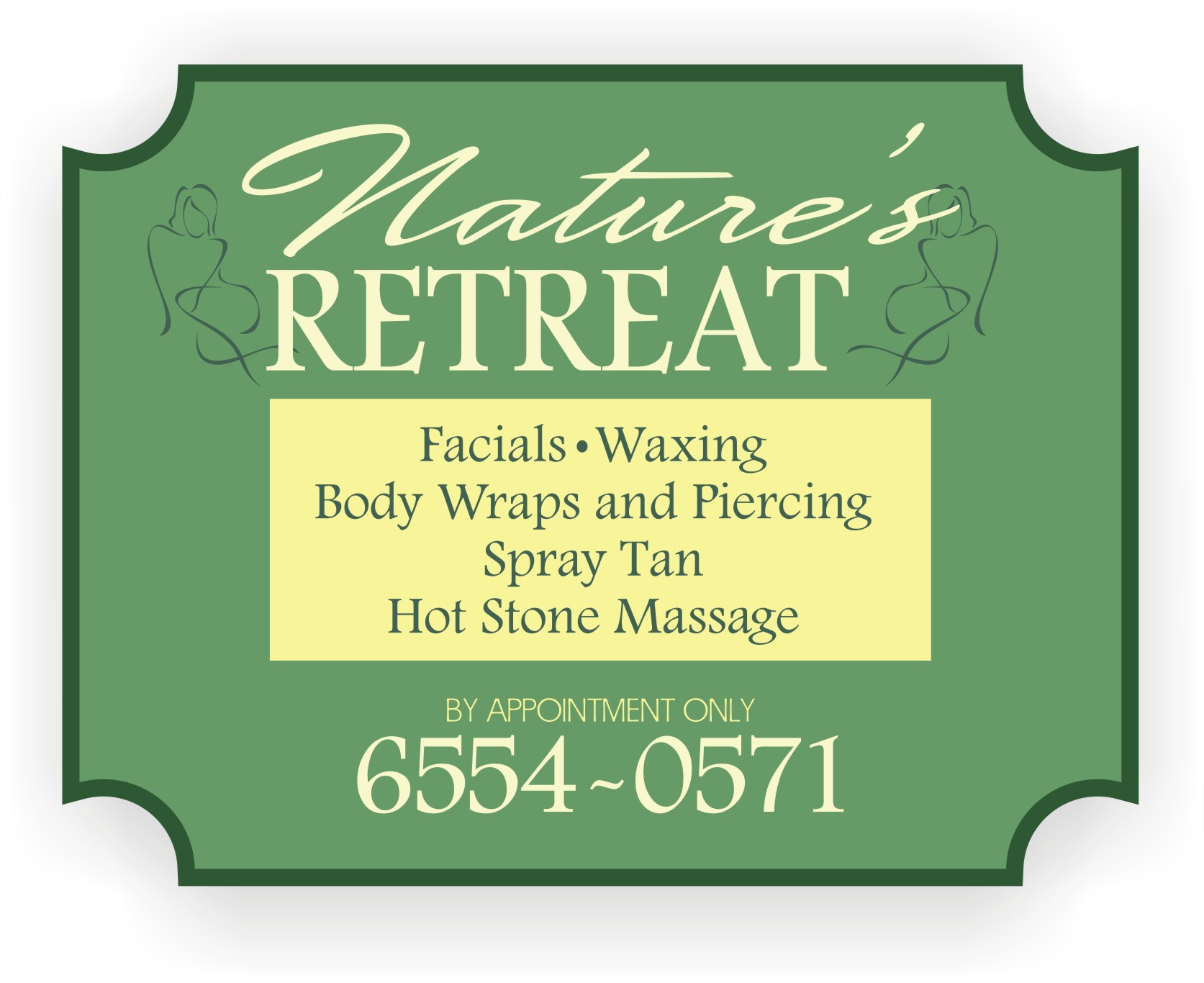
I think if you had used a darker green on the name it may have had more contrast.
(I think it’s the pic that’s making the colors look dull)
I like to use a dark background with lighter colors for the text.
It’s not bad, but it needs more space around the edges, and I think the name could have been highlighted more.
I also like to put in a panel to break things up.
Love….Jill
Attachments:
-

I think its ok.
Jills is clearer and fresher but that could just be the pic.
Is the material called sign board or is the template for the corners called a ‘sign broard corner’
If it the subsrate could you not get it in the right colour to save you painting it?
-

Thanks all for your constructive criticism all comments taken on board. James in reply to your question, the board is called Sign Board it is like Masonite and is pre-primed and I cut the corners out, just to try to make it look different, you cannot buy this particular product pre finished that I know of.
Thanks every-one
Graham
-

natures or nature’s ?
i’d go with the former, the ‘s would make it read ‘nature is’ or similar, this is always a grey area with my grammatical conscience!!
I quite like the sign though,
-

Hugh, an apostrophe only ever denotes a missing letter or possession.
so its the retreat of nature… I don’t think its comes under the plural possession rule cos there is only one nature.if you are ever confused with the us of an apostrophe, have a peek here
http://www.apostrophe.fsnet.co.uk/
Peter
-
yes yes yes, but am i right ? lol !
thanks for the link, i’ll have a look’s shorly

Log in to reply.