Home Forums Sign Making Discussions Gallery shop signage: skelmanthorpe news

  • shop signage: skelmanthorpe news

    Posted by Mark Pack on 9 June 2005 at 19:26

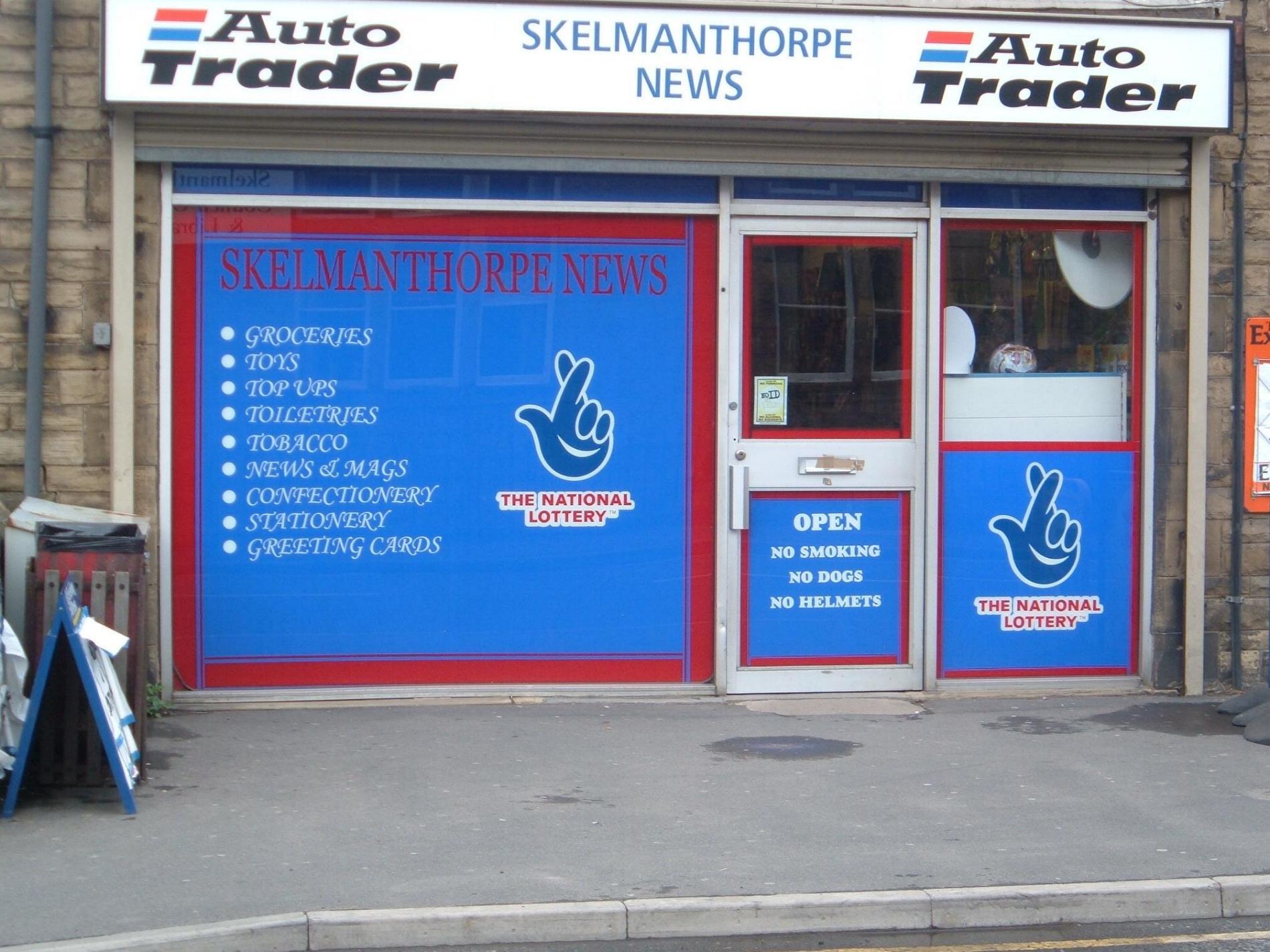
    I recently posted a topic about how to flood coat a shop window, and thanks to especially Dewi and Rob, I’ve pulled it off. Cheers lads :lol1:

    It’s my first shop window, so I would appreciate any criticism, but please be gentle.

    I wasn’t overly impressed with the name of the shop in red, but that was the customers choice, I tried to persuade him to have white, but he won.

    So please let me know how I did, or if there is anything wrong and I will know for next time.

    I think I did OK, cause I’ve got another 4 jobs lined up, 3 shops and a van.


    Attachments:

    David Rowland replied 20 years, 5 months ago 5 Members · 6 Replies
  • 6 Replies
  • Mark Pack

    Member
    9 June 2005 at 19:28

    Here’s before if you were interested.


    Attachments:

  • Paul Franklin

    Member
    9 June 2005 at 19:50

    On the whole looks pretty good.
    Have to agree with you on the red text.
    The font following the bullet points doesn’t really do it for me and then there is yet another font type on the door.
    I like the red borders which look like they have been put on straight. I hate doing the narrow pin stripes especially if they are next to a wider one as you will certainly notice if they are not parallel.
    Was the flood coat on all in one piece (main window) or did you have to tile it?
    On the whole it is certainly a vast improvement and if the customer is happy and has given you more work of the back of it, can’t be bad.

  • Lynn Normington

    Member
    9 June 2005 at 19:55

    must say that is a big improvement pity you couldn’t talk him out of the red

    Lynn 🙂

  • Jill Marie Welsh

    Member
    9 June 2005 at 20:19

    While it is a big improvement,
    and I agree about the red,
    the font that you used for the list of services
    should have been caps & lower case.
    Just me being picky!
    Lettering is often easier to read when not all caps
    or over-condensed.
    Love….Jill

  • Mark Pack

    Member
    9 June 2005 at 20:45

    The flood coating was in 2 pieces for the main window. I used 2 lengths of 1220mm and joined in the middle.

    I agree about the full caps text, but again, what the customer wanted. He was a bit of a tricky customer to please.

  • David Rowland

    Member
    9 June 2005 at 21:31

    the bullet point font and the red clashing with the blue but appart from that you have made the shop tidy and it feels like it has a larger advert to the passer by to attract the trade.

    not bad though

Log in to reply.