Home › Forums › Sign Making Discussions › Gallery › shop signage: pet shop
-
shop signage: pet shop
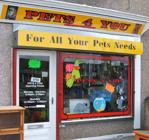
Posted by Mark B on 18 August 2006 at 09:53A while since I have posted anything so heres a pet shop I did sometime ago.
Attachments:
 Mark B replied 19 years, 4 months ago 5 Members · 6 Replies
 -
6 Replies
-

nothin’ wrong with that mark.
I probably would not have used such a thick outline on the window text, but thats just me
cheers
-

Ditto what Shane said about the outline…the red would have stood out better on its own.
I personally would have used that bright yellow for better contrast.
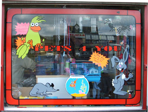
I think the critters in the window are cute!
Kids will like that andd bug their folks to go into the shop.
One question…
Should that yellow sign with the black letters read "PETS NEEDS" or "PETS’ NEEDS"?
On the main sign text I would have stepped off the black outline so that there was a fine yellow pinline between the black and red.
But overall, the job is clean and eye-catching.
love….Jill -

My head hurts now Jill, Pets Needs or Pets needs mmmmm grasped what your on about got me saying it to myself over and over again and then remind myself his choice of wording, yeah looking at it again a yellow background would have helped it stand out better, and as for attracting the kids to the shop that was my whole idear, got something right at last :jump:
-

i like this,its a funky looking shop
and i think my kids would take one look and go dad can we go in therei like the use of the cut vinyl i think when used in this way for this type of look its far better than i digital print
rich 😀 😀 -

the only thing i would have changed there mark is put a gap between the black outline and the red letter . sometimes red and black can clash …..but as always its a personal opinion
apart from that i like it
regards Brian
-
Thanx for the comments guyz, all taken on board, just glad you like it

Log in to reply.