Home › Forums › Sign Making Discussions › Gallery › shop signage: Golden Swallow
-
shop signage: Golden Swallow
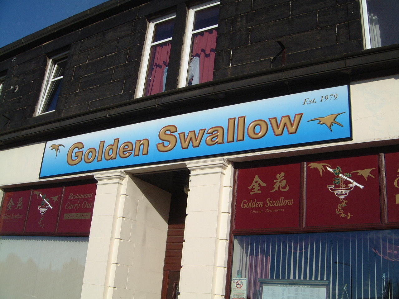
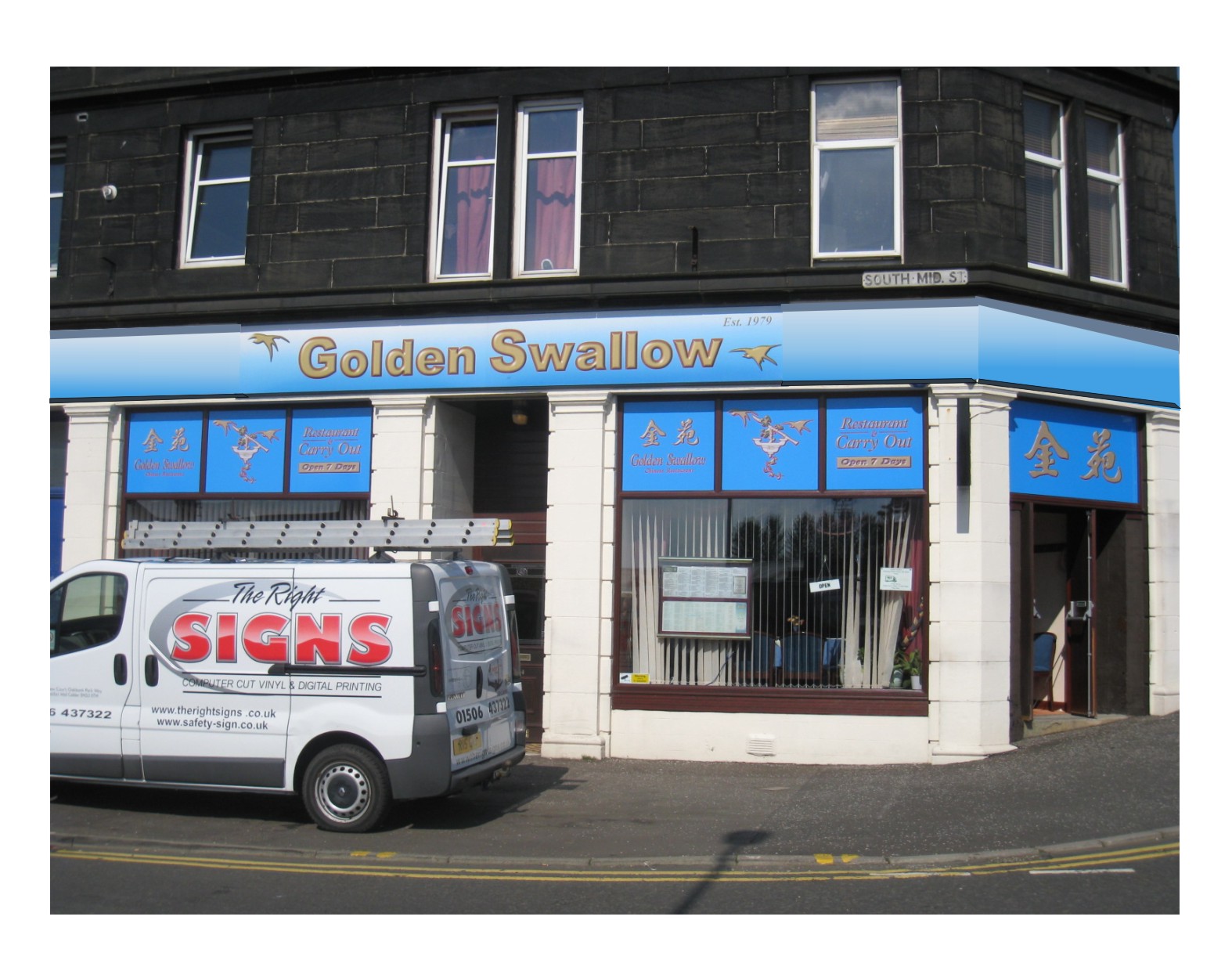
Posted by Phill Fenton on 4 March 2008 at 15:54I just finished fitting this today. The sign was designed using Signlab and I used the eyecandy feature to give the lettering a 3 dimensional look to the lettering. The background was given a graduated tint from blue to white. The whole thing was printed out on my cadet, applied to Forrex, laminated with clear vinyl and fitted inside a powder coated black Unitrim frame. Overall size is 6M x 800mm.
The windows underneath (maroon vinyl with gold vinyl lettering) were fitted by me 8 years ago so have survived pretty well. I suspect these may be getting re-done soon.
Attachments:
 Jill Marie Welsh replied 16 years, 5 months ago 19 Members · 30 Replies
 -
30 Replies
-

nice sign Phill.
Although I have to admit it was the title of the thread that made me look ………! :lol1: 😳 -
 quote Marcella:I have to admit it was the title of the thread that made me look ………! :lol1: 😳
Yeah. Me too. 😀
It is a nice sign nevertheless. 😀
-

yep sweet enough,
think i would dump the plotter of a otherwise nice looking van 😉shris
-
 quote Marcella:nice sign Phill.
Although I have to admit it was the title of the thread that made me look ………! :lol1: 😳I don’t get it 😕
Chris – you’re right about the Colorcam – it was printed on the colorcam and applied a few years ago – I tend to forget it’s there :lol1:
-
quote Phill:I don’t get it 😕
JC ………… do you want to comment on that or shall I? :lol1: :lol1: :lol1: :lol1:
-
quote Marcella:JC ………… do you want to comment on that or shall I? :lol1: :lol1: :lol1: :lol1:
I think it might be better if neither of us did. 😀
At least the sign is high enough so that no-one can spit on it. 😀
Sorry for the hi-jack Phill. It IS a nice clean sign and shows a printer put to good use.
I know I don’t do a lot of signs, but I doubt whether I’d have thought about using prints like that. I’m more likely to have stuck to boring old cut vinyl.
-

Nice Phill
How do you get the forrex into the frame without taring the print.
I’m assuming its in at least 2 bits at 6 meters in length..
-
quote John Childs:At least the sign is high enough so that no-one can spit on it. 😀
:rofl: :rofl: :rofl:
-
The clear laminate helped to protect the print. The panels were fitted with hanging rails and slid in from the side.
And if I caught anyone spitting on my nice new sign I would have gone mental :lol1: :lol1:
-

nice looking sign Phill, and the windows look good as well
Lynn
-
 quote Marcella:Although I have to admit it was the title of the thread that made me look
me too… 😕 😳 :lol1: :lol1:
good use of the printer on gaining a bevel effect on flat letters phill. i think many folk forget the possibilities are endless with a solvent printer. after all, it was the bevelled fonts and the like that made the edge printer what it is today. and that was limited to about 20 fonts and only 13inches wide…
-

I like that too…..very effective
Is the sky not upside down though 😉
-

I wonder what they do in there then Phill…. I hope you secured a deposit on this one? 😮
-
I be honest with you phill, why didnt you stick to Red and Gold look? I like the styles but i dont like the sky background .. sorry mate
-
 quote Marcella:Although I have to admit it was the title of the thread that made me look ………! :lol1: 😳
Me too, I’m afraid, I’ll have to dig that video out, I’m sure Ron Jeremy is in it 😀
Back to the sign, Lettering with bevel is good stuff, have to agree with Dave on the blue, not over sure on it.
All in all nice sign though Phil.
-
 quote Dave Rowland:I be honest with you phill, why didnt you stick to Red and Gold look? I like the styles but i dont like the sky background .. sorry mate
I think he is banking on the owners getting him to change the red and gold to match the new sign. :lol1:
-
It was the restaurant owners that chose the colour scheme. They wanted gold lettering on a blue background. Originaly I was going to print and cut the lettering and fit these to blue coloured boards. Then I decided to introduce the colour gradient (blue to white) and rather than print and cut – I could just print the whole sign instead (including the background). I thought the gradient looked appropriate for Swallows flying in the sky. Anyway – that was my thought processes and the reason why the sign ended up the way it is.
I agree though that the gold lettering would have looked better set against a red background. The red would have complemented the gold colouring much better.
Thanks for the feedback everyone 😀
-
 quote Marcella:nice sign Phill.
Although I have to admit it was the title of the thread that made me look ………! :lol1: 😳me too!!! oh dear 😳
love the effect on the letters Phil. looks impressive. not too sure on the swallows though, we have swallows / swifts around here in the summer, they’re not quite that shape, even in sillhouette and tumbling from the sky!!!
still, nice job. just out of interest.. why forrex ? purely price or another reason?
Hugh
-

Certainly an imaginative title…..only reason I clicked too.
Anyhoo, great sign Phil
-

Thread title made me look as well, we’re all just sad children really :lol1:
I like the fade the way it is, good job Phill
Steve
-

Is this a restaurant or massage parlour? 🙂 Great name I must say 😀
graeme
-
Well I’ve just googled "Golden Swallow" to see if I could figure out what all you pervs are banging on about. All I could find were Chinese Restaurants (including this one) and some Kung Fu Film. 😮
Hugh – I chose Forrex basically because of price. It’s in a frame anyway so using Forrex is not a problem. Allied to that it has a solvent printed vinyl covering and an overlaminate for protection. The nice thing about Forrex is it’s soft texture which means any small particles that are on the surface when the print is applied disappear when you press these down onto the material. Forrex is also lighweight which helps when fitting.
-
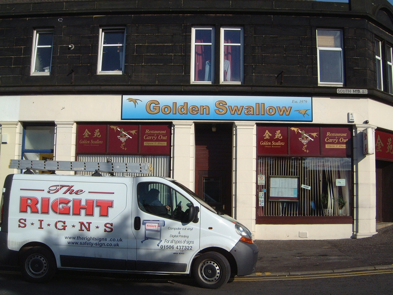
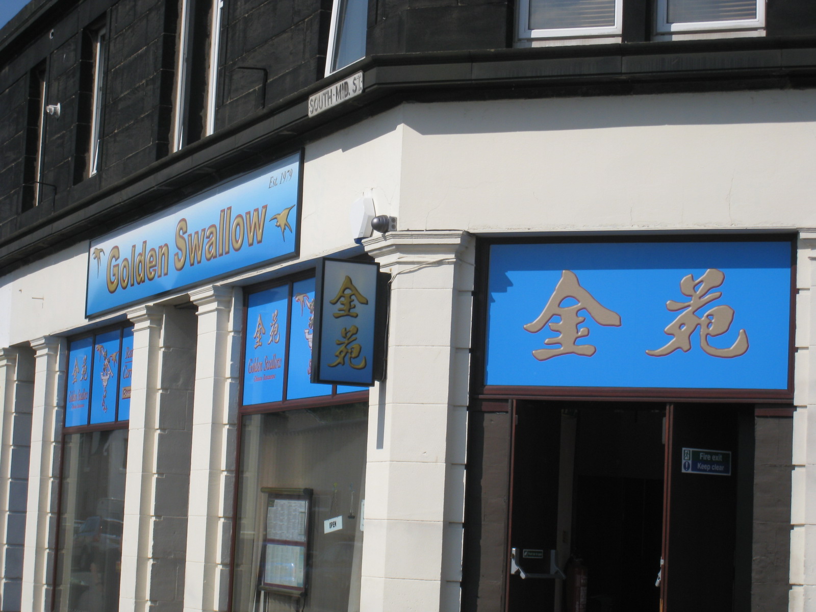
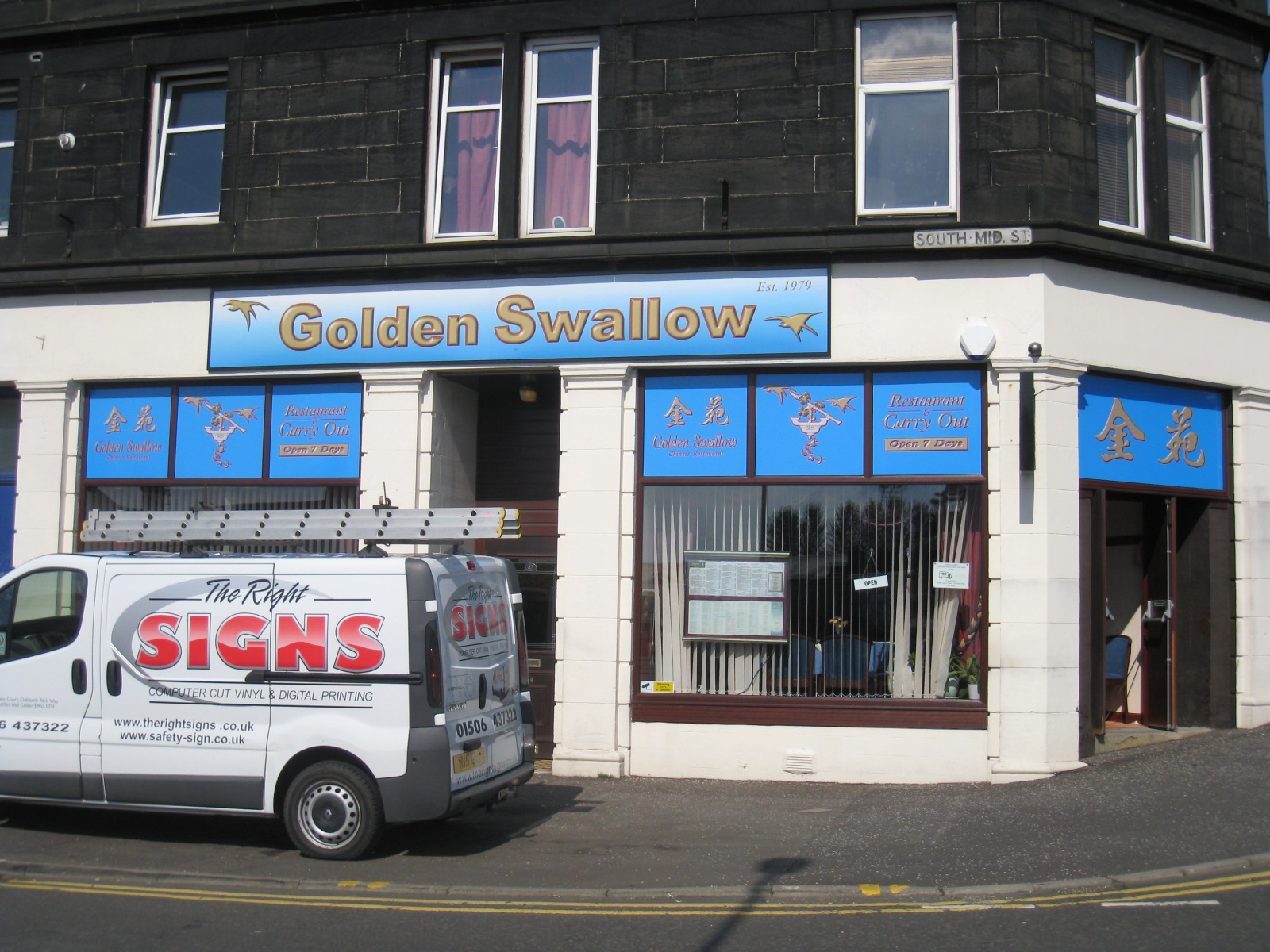
This update (on a job originally done last year) has been hanging around for the last 6 months. Back in December I was asked to remove the old red vinyl signs from the windows and replace these with print and cut to match the main sign that I fitted last year. I persuaded them to wait for the warmer weather to allow me to get the old vinyl off. I spent most of Friday removing the old vinyls and all afternoon today fitting the blue vinyl and contour cut prints to the new windows. All done in glorious sunshine (which made the removal of the old vinyl easy – but ended up being a hot exhausting job.) The owner was well pleased with the end result though.
I’m away home for a cold beer now (drink1)
Attachments:
-
looks better but, i’m ashamed to say that once again, it was the title that caught my eye 😳
-

Nice work Phill
But I have reservations about using print on fascias, due to the expected life, especially if only protected with clear vinyl and not uv laminate.
In my experience light blues do tend to fade quickly anyway,
which fine is if the client is working to a budget, and is aware of the expected life of the print.Shop signs in general I consider to be a long term application, and owners tend to expect them to last for many years,
Peter
-
looks good Phil
You just need to talk them in to extending the fascias now I reckon 😉
Attachments:
-

It’s too late but that would have really popped on a navy background with no gradient.
😉
Love….Jill

Log in to reply.