Home › Forums › Sign Making Discussions › Gallery › shop signage: fantasy hair salon
-
shop signage: fantasy hair salon
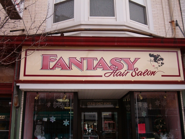
Posted by Leigh on 28 February 2005 at 15:09Just to show you all a bit of our work….here was something we finished up a while ago.
Owner wanted “pretty” colors, so I stuck with the pink family
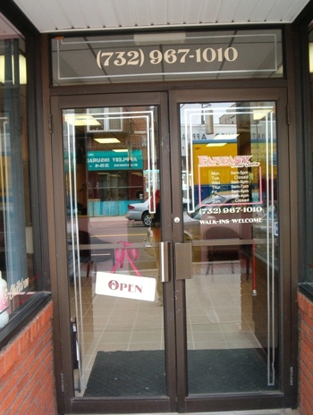
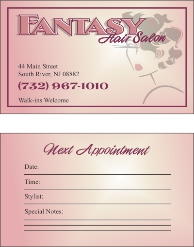
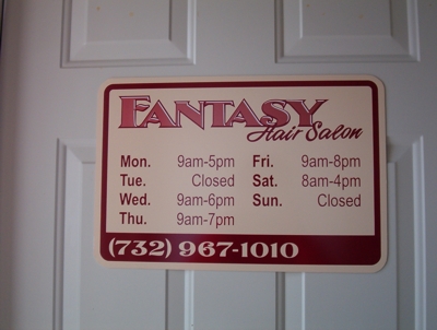
We did her entrance sign, back door sign, front door sign (open/close…it hangs from a ribbon we encased between 2 AL panels), and some window lettering, and business cards.
a menu board should be next, waiting to here.
Attachments:
 Shane Drew replied 20 years, 10 months ago 15 Members · 18 Replies
 -
18 Replies
-

Love the designs the shadows and highlights on the Fantasy are excellent.
It is always nice to get a few different jobs out of the same design, saves on time and more profit.thanks for sharing
Dave
-

VERY impressive!
I really like your style.
Love…..Jill -

Very nice stuff. I especially like the lighter version of the face on the business card.
Thanks for showing.
-

Really smart stuff Leigh! 😀 Like Big G, I think the business card is brilliant. Also like the diddy interior sign, clean and well laid out 😀 Can’t wait to see more!
Cheers, Dewi
-

That looks really nice. It’s always good when you can provide a whole image for a customer, business cards, multiple signs, etc..
-Marek -

really nice leigh 😀
same as jill…..i like your style too!! 😀Nik
-

Very Nice Work Leigh! Excellent use of color! I’m impressed.
Stevo
-

I really like your designs.
One question is the main sign just layered vinyl ?Goop.
-

It looks like it.
it has a gradient though, so I’m guessing it was spray-painted?
-

Thanks everyone for taking a look and the comments –
appreciated 😀and I take them as true compliments, for I’ve now seen all of your work…and am blown away – great talent!!
No paint…all vinyl on Ivory AL
the only gradient is in the biz card.sorry so big! Now I know to scale them down a bit.
-
they’re not too big, if they are to anyone, they’re using a low resolution (tut tut).
It’s amazing how much that looks like a gradient. must be just the way the light reflects.
Great design. did you create the woman by yourself?
-

great work!
but we all know god created woman from adams rib 😉 -

hi Leigh
great work there, very nice indeed.
i like the fonts used for the main name and script, seems to fit just fine.. great use of cut vinyl effect to create the 3d/beveled effect on the title.hope to see more of your work & thank you for taking the time to post. 😉

Log in to reply.