Home › Forums › Sign Making Discussions › Gallery › Shop Sign: Jeans Station
-
Shop Sign: Jeans Station
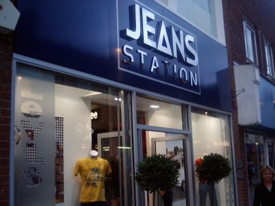
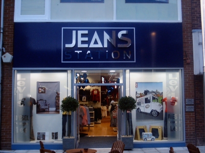
Posted by Carrie Brown on 31 October 2005 at 16:08We designed the logo. Powder coated sign trays, 3d polished s.steel letters, flat cut s.steel letters and vinyl pinstripe. Etch window graphics, we also did a ton of pos stuff for inside and outside.
This is one of our very good customers who we like to look after … he is such a pleasure to deal with and has been with us since we first opened.
Sorry about quality of pics really do need to get a new camera sorted … the camera is making the colours in the image blend into each other? …. it must have been all the x-rated calendar poses it was exposed to :lol1:
Attachments:
 Jayne Marsh replied 20 years ago 20 Members · 20 Replies
 -
20 Replies
-

I like it Carrie, and your customer obviously does too.
-

Very nice clean design.
Are the steel letters reflecting that much or is it camera error?JJ
-
 quote J_J_O:Are the steel letters reflecting that much or is it camera error?JJ
The letters are polished stainless steel so are very shiney … they look very nice. We have just done another job aswell using them and again very nice finish on them. Will take pics once the shop is finished.
The camera seems to have made the blue in the image blend over the silver in some places like on the word Station. We took a few pics but they came out terrible all dotty and patchy in places … time for new cam!!
Thanks for the comments everyone 😀
-

That’s a lovely job and I love the logo!
Money definitely well spent by the customer. -

wow what a nice looking sign
very clean and very pleasing to the eye
nice work
rich
😀 -

Wow that’s posh.
Do these kinds of thing need to be polished regularly to keep them shiney? -

Nice looking job Carrie, makes the place look like it is part of a national chain I think.
JJ the letters probably are reflecting that much, its the main problem with polished stainless. If I have jobs like this to do I tend to use brushed stainless if it is to be front lit and polished if it is backlit. -

i echo everyones thoughts here, work looks very smart, well done! 😛
-

Very nice signage
great look you gave them with the logo and signage choice….looks very upscale 🙂 -

Very classy job looks really good. Did you buy in the letters or make them yourself?

Log in to reply.