Home › Forums › Sign Making Discussions › Graphic Design Help › Own van help
-
Own van help
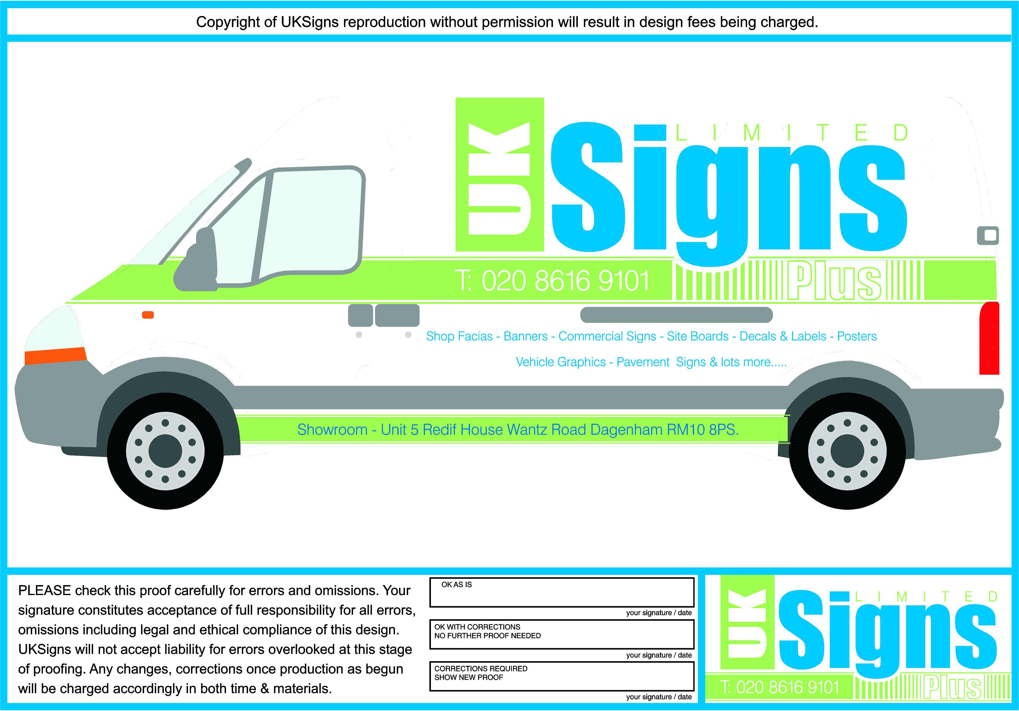
Posted by Kevin Flowers on 15 July 2013 at 14:32Can’t get my head around this 1 minute i like it next minute i want something different so feel free to offer views (as brutal as you like) new ideas really need to get something on the van its gone really quite in my area.
So a bit more advertising will comein handyKev
Jonathan P McGovern replied 12 years, 5 months ago 7 Members · 7 Replies -
7 Replies
-

Without maximising it, all I can read is "UK SIGNS". The phone number is barely visible with those colours. I think you need a darker colour against the green.
I am very much an amatuer so I hope you don’t mind my opinions -

At a quick glance, there is very little contrast.
Your colors need to be much darker, and there are way too many small words in that laundry list.
I’d put that on the back only. I would not put the address on there unless you must, and if so, throw that on the back as well because it’s lost way down there on the bottom.
Take the T out of the phone number, it is just not needed.
If you went with a darker blue the slime green may be OK to use, but for right now, this is a wasted message.
Love….Jill -

Everything Jill says, but lack of contrast is the biggest problem. Had a quick look at your website and it looks good – why not mimic the dark background on the van. Not a full wrap perhaps, but maybe a diagonal slash from the front of the front wheel arch back to around the top of the "UK" block – dividing the van, front/top remaining white and back/bottom charcoal grey (let the UK block cut through the top of the diagonal border). Maybe cut out the horizontal strip and use the tel number and PLUS to create the impression of a strip. The products list might sit comfortable in a single line of condensed type right along the space you have it in.
Just thinking out loud, Kev – hope it helps get the creative juices flowing…
-

HI KEV,Id go with your design but with darker blue and green or 2 colours with more contrast. also move the address to the door from the sill i think it will be lost there.Again as ewan said im very much an amatuer hope you dont mind me giving my opinion.j 🙂
-

As neil said maybe colours closer to your web site ie incorporate that slate grey/charcoal colour of the web background maybe.
And am I missing something or shouldn’t the most prominent thing on the van along with your name/what you do should be the web site address!!
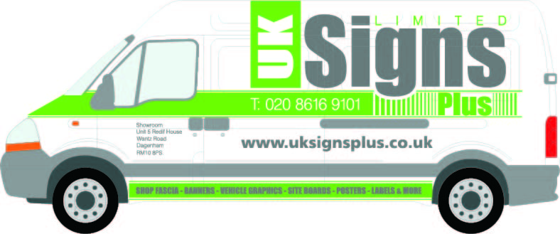
anyways heres a tweak on your design
although the grey wont convey my thoughts I was thinking along the lines of the metallic charcoal which many suppliers offer
John 😀
-

Cheers for the thoughts guys i will say the green isn’t as light as it shows on the picture more of an apple green. Will have another look at it and post the results at a later date
Kevin
-

John’s colours are more stronger and big improvement. However, it all seems very disjointed. The eye is being pulled in different directions. Especially the words ‘signs limited and plus’
Jof

Log in to reply.