Home › Forums › Sign Making Discussions › Gallery › Our new sign – Finally!
-
Our new sign – Finally!
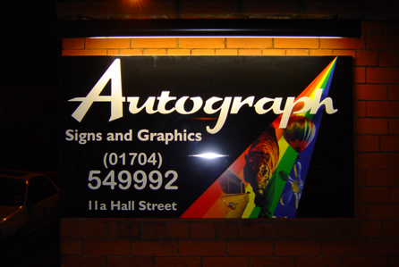
Posted by Kate and Danny on 26 January 2006 at 15:25We finally got round to changing our sign.
1)Black aluminium sign tray
2)cnc routed acrylic letters ( Autograph )
3) printed and laminated full colour ( versacamm ) vinyl.
4) SignLux from Portland lighting.
We’re debating if we should put something in the black space above
‘Autograph’ ( such as a ‘tagline ), or if we should just leave it in its simplicity.Would love to hear your opinions
Danny
Attachments:

 Robert Lambie replied 19 years, 11 months ago 21 Members · 25 Replies
 -
25 Replies
-

I like it a lot – I think the use of all the different mediums have come together well.
I would leave it as it is – don’t over-crowd it
Nice job
-

I like the colours. I wouldn’t add to it, I think it would make it look fussy and spoil it.
-

looks good, Iwould leave it alone as well.
Only other comment, It dosnt look very high, hope some little sh1t dosnt nick the flat cuts!
Peter
-

thanks for the positive replies. Haven’t posted any of our work before, so its nice that the first piece we post gets a kind response!
the wall isn’t high you’re right peter, didnt think about anyone nicking them. i’m gonna have to go out and patrol with my baseball bat!
Kate 😀
-

looks good I wouldn’t add any more as Andy says its done 😎
Lynn
-

my first reaction was what peter said….it just looks too good for some so and so to leave it alone…..
how about covering it with some kind of pespex sheet? to cut down on vandals…….. but this may ruin the effect of the sign
when i say perspex i mean the strong hard to break stuff…..cant remember the name at this moment
-

Very nice Kate & Danny, looks great, you should be really pleased with it. I agree with everyone else, the sign is fine as it is … if you add anything else it will look cluttered.
Look forward to seeing more of your work.
😀
-

looks great
i nice sign that makes you want to look at it
as for adding any more no way its great jsut like that
well done the both of yourich
-

Stick a fork in it cuz it’s done.
Very vibrant and attractive.
Love…..Jill -

yeah.. all done, little low… but could you turn the light upside down and put the sign ‘posted’ above the wall and double sided sort of thing?
Maybe next year then.
-

If your worried the chavs may steal the lettering – pump the locaters with some Araldite or other top notch glue stuff. They’ll probably cut their grubby little mitts on the edges of the lettering trying to get them off.
Kev
The sign looks the dogs!
-

I think you both have done a great job, you should be proud of it.
Nice colours, sharp and clean looking…As has been said, the local yobs may love it too, but in the wrong way!
Constructive crit:
just a couple of things and only a “self preference”
The text below the “autograph”, ide scale it all down a bit, but more so phone number.im not sure about the pictures in the rainbow, i like the rainbow on it as it works well with the colours… just the images… tiger etc do/can we associate them with signage/design?
Again, just mentioning it as a self preference, the sign is very smart.
Thank you both for taking the time to post your work, i look forward to seeing more of it.
-

nice sign folks looks great 😀
seen you wanted our opinions…..i would have moved the ‘autograph signs & graphics’ over a bit to the right to fill the space…and made the 549992 a bit smaller it seems to over power your company name, just my const. crits 😉
nik
-

I would have chosen a different name :lol1:
sign looks good
-
quote Andrew Boyle:I would have chosen a different name :lol1:
sign looks good
:lol1: :lol1: :lol1: :lol1: :lol1: you know, i just looked at that 2 secs ago and thought, “im sure andrews company is called that also” refreshed page and you were in there… 😉 :lol1: :lol1:
-
Thanks once again guys for the comments, and observations.
Couldn’t resist popping past at night to see what it looks like lit up in the dark.
As for the little sh.ts – The cnc router is ours so if they start nicking the letters, i’ll just keep replacing them until they get bored…
As for the name, sorry Andrew. We noticed a while ago that we were called the same as you, and just decided to keep quiet… 😉
Thanks again
Danny
Attachments:
-

Looks really cool
….and the UFO is a terrific last minute touch
😉
-

I like it too, really nice job. Can’t add anymore to what has been said already
Don’t be shy tho, post some more when you get a chance.
-

I agree with everone, looks great, any more and it will look cluttered.
If the letters do get damaged, you could always fit them back to the panel, so they cant get anything under them! Or wire them to the mains! Guess thats a little extreme lol
-
quote Vince Francis:I agree with ever one, looks great, any more and it will look cluttered.
If the letters do get damaged, you could always fit them back to the panel, so they cant get anything under them! Or wire them to the mains! Guess that’s a little extreme lol
i remember way back in the days on the beastie boys, (first time round) kids would all pinch the VW badges off cars and vans and attache to chains round their necks (no not me 😀 ) some guy was done for wiring the badge to the battery, just a little sting but a sting none the less. these days its forbidden and we stand a charge for such precautions. 👿
get real… nd they say crime doesn’t pay! 👿 😕

Log in to reply.