-
New logo, thoughts
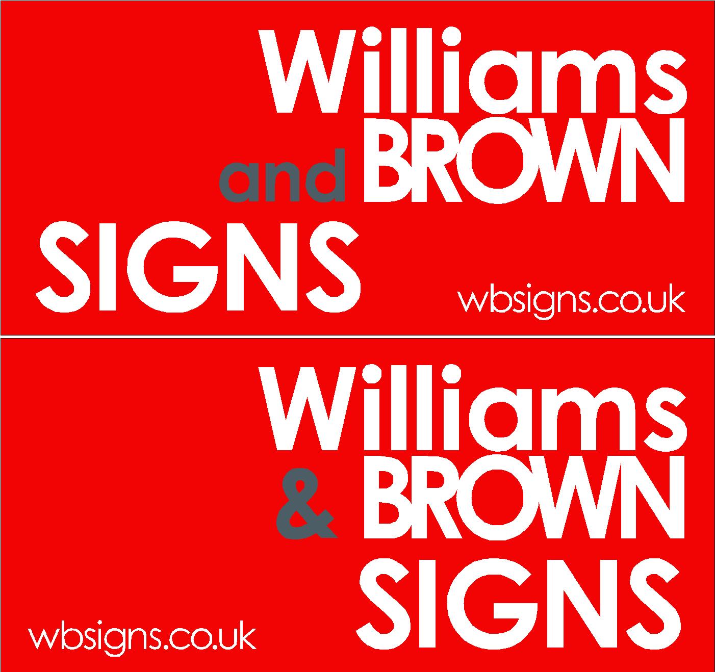
Hi guys
You are a clever lot, so thought I’d see what you thought of this design for our new logo.
I didn’t want anything fancy, it’s pretty basic really.
Be brutal………

Log in to reply.
Hi guys
You are a clever lot, so thought I’d see what you thought of this design for our new logo.
I didn’t want anything fancy, it’s pretty basic really.
Be brutal………
Log in to reply.
Please confirm you want to block this member.
You will no longer be able to:
Please note: This action will also remove this member from your connections and send a report to the site admin. Please allow a few minutes for this process to complete.