Home › Forums › Sign Making Discussions › Graphic Design Help › Lowe: Logo Design help needed?
-
Lowe: Logo Design help needed?
Posted by John Harding on 17 September 2012 at 13:02Hi All
Have been doing some signage for a pal for a number of years now but the time has come to modernise his logo and im hoping to get your input as I have hit a dead end.
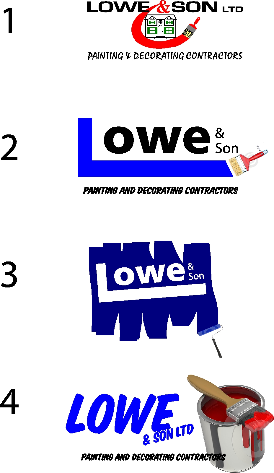
1 The attached first image is the original logo in use
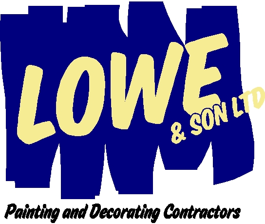
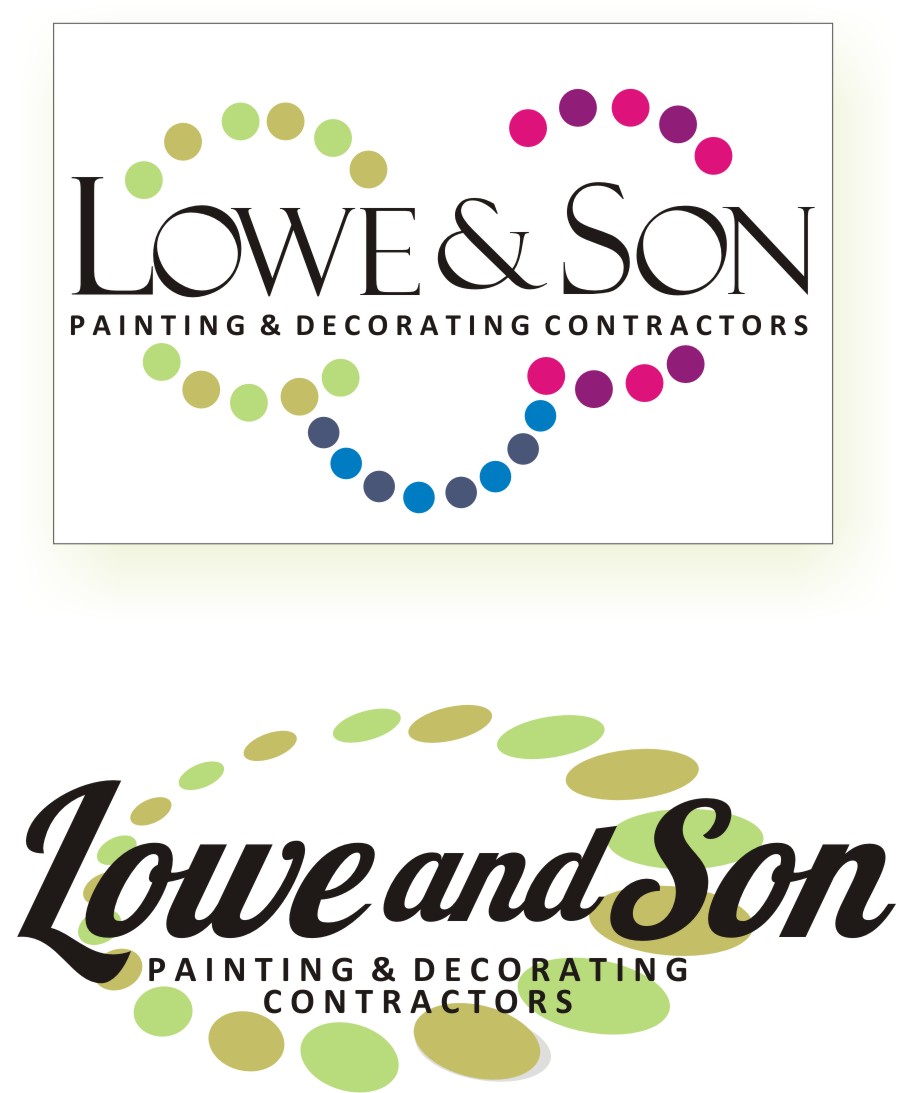
2 & 3 are interprepted drwgs of the clients ideas
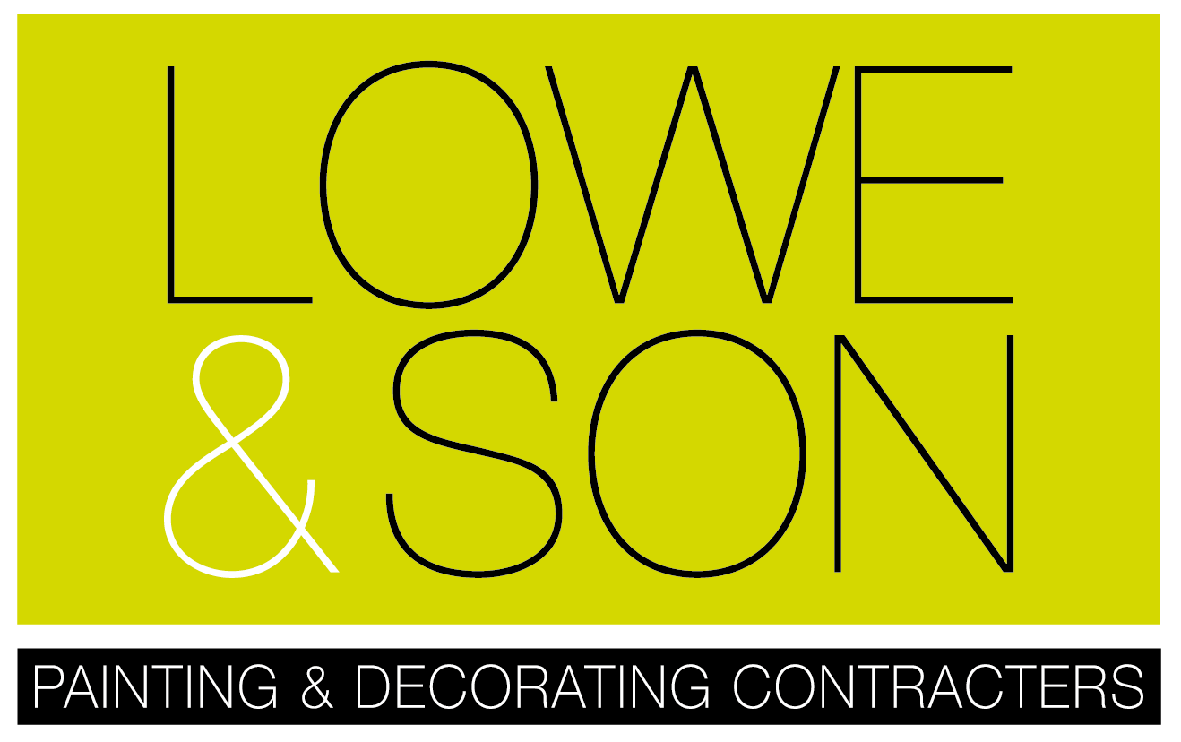
4 is my own take trying to simplify and modernise the look, whilst he is not sold on my idea I would like to get away from 2 & 3 which I feel are a bit dated but what do you guys think???
The logo will go on all the normal stuff van, hi viz, banners, stationery etc
any input greatfully received 😀
Thanks in advance – John 😀
Attachments:
 Jack Hendrie replied 13 years, 3 months ago 19 Members · 39 Replies
 -
39 Replies
-

I actually like #3 and feel it has the most potential.
It’s clean and simple and implies paint without the over-used paint brush image.
I’d work on slightly better fonts and run with it.
Love….Jill -

I’d go with number three as well. Different font (?) and slope the brush/roller strokes a bit.
-

I reckon number 3 looks good, but without the roller. I bet there will still be ‘painting and decorating’ on the van/stationery somewhere so people would still get it. Plus it would be really tiny on a business card and might get lost, whereas the rest of the logo is really bold.
John
-

Firstly thanks all for the input,
Jill I agree about the fonts this was just a quick draft from the client brief – I have redone now using the fonts from option 4 which is better but you may have other suggestions font wise
Neil I know what you mean about the brush strokes and can improve the form of which later on.
John I agree about the roller/size but having removed the roller does the background lose its identity ie does it still suggest brushed on paint albeit not finalised as Neil suggests.
Maybe its me but I think this is not really contemporary – logos of this style have been around for a good while now and im not feeling it but im not sure of the way forward 😕
John
Attachments:
-

I think your struggling there John…..
here’s another angle on it from me..may be of some help. 😕
just noticed i forgot the ‘Ltd’
Attachments:
-
Some food for thought there martin thank you certainly more contemporary 😀
What do others think? -

Martin’s first one nails it for me. Colourful, modern, classy and smiling too!
-

okay just made one myself in my coffeebreak
Attachments:
-

Love Martins top one but with the red pink dots on top right brought to balance with the left ones as underneath…very nice and modern.
-

Like Martins top one, although I can see 2 eyes and a nose… :lol1:
-
quote Tim Painter:Like Martins top one, although I can see 2 eyes and a nose… :lol1:
how about sun sea and sand with a million tiny paint pots… :crazy: :crazy: :crazy: :crazy: :crazy: :crazy:
-
quote Cheryl Smith:quote Tim Painter:Like Martins top one, although I can see 2 eyes and a nose… :lol1:
how about sun sea and sand with a million tiny paint pots… :crazy: :crazy: :crazy: :crazy: :crazy: :crazy:
sorry about that …im a bit nuts today….
-
quote Cheryl Smith:quote Tim Painter:Like Martins top one, although I can see 2 eyes and a nose… :lol1:
how about sun sea and sand with a million tiny paint pots… :crazy: :crazy: :crazy: :crazy: :crazy: :crazy:
How about just heading for the sun, sea and sand and forgetting all about John’s logo!!! 😀
(sorry about that John – couldn’t resist :D)
-
Tim Thanks very much for the design input its much appreciated however client came in yesterday and was sold on Martins effort although I will show him yours also – will post again later on the outcome.
Thanks all – cheryl youre mad for sure 🙂
-
quote John Harding:Thanks all – cheryl youre mad for sure 🙂
why thanks very much John 😀 😀 😀
-

Martin that top ones very nice along with Tims design.
-
quote :how about sun sea and sand with a million tiny paint pots…
Must be too much lemsip for me today….lol
-
quote Tim Painter:quote :how about sun sea and sand with a million tiny paint pots…
Must be too much lemsip for me today….lol
ooo must try some of that…sun sea and lemsip.
-
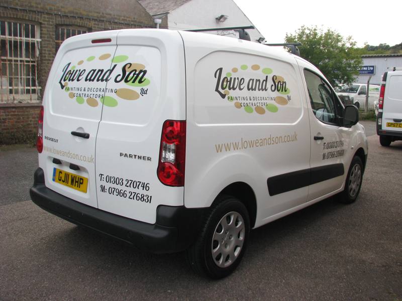
Thanks again all for your input – client went for one of Martins choices which i preffered to although I didnt steer the client it was his choice.
Martin being a good mate didnt want to charge but I insisted and he looked after me with a good rate which I duly coughed up so everyones a winner 😀
John
Attachments:
-
great how the signboards get us all pulling together
:love: :love: :love: :love: :love: :love: :love: :love:
-
That suits the van really well John.
As Harry says always nice to see the finished article.
-
quote Cheryl Smith:great how the signboards get us all pulling together
:love: :love: :love: :love: :love: :love: :love: :love:
😮 😮 Close your curtains George! 😀
-

Very nice.
Did you print and plot this, or cut vinyl?
All done in 4days as well. I usually work on 5day turnaround.
-

Good job, i still can’t make up my mind if lettering looks better to go with the alignment of the panels/mouldings of the van or to go with applying lettering with eye/spirit level
-
 quote John McCrorie:Good job, i still can’t make up my mind if lettering looks better to go with the alignment of the panels/mouldings of the van or to go with applying lettering with eye/spirit level
have to agree i prefer all lettering to run level together on a vehicle 😀
-
 quote Nicola McIntosh:quote John McCrorie:Good job, i still can’t make up my mind if lettering looks better to go with the alignment of the panels/mouldings of the van or to go with applying lettering with eye/spirit level
have to agree i prefer all lettering to run level together on a vehicle 😀
Yeah, spirit level approach doesnt work too well when applying on a slope 🙂
-

I pretty much always go with the bump strip.
On that van I’d level everything to the bottom edge and usually I measure up and string fine line tape the length of the van and use that as my level.
Oh and this method would work on a hill 😀 -
Going back – vans used to be fairly square/rectangular shapes and I never found any problem with them. Then in the 80s they produced the Peugept 306 (I think?) van. The roof sort of sloped off towards the back and caused the entire back half to be wedge shaped. Could be a total nightmare depending on the actual design. However there was a line running through the entire side from headlamp to tail and I used to line everything up to that. Never had any problem with finished look after that.
That’s what I would look for now – a feature that is carried through the major part of the body, and align everything to it. I’ve found in most cases (apart from ‘super graphic’ design) that it is best to keep everything aligned to a common base line reference.
Nice job John/Martin by the way. It really suites the shape of that model.
-
 quote NeilRoss:Going back – vans used to be fairly square/rectangular shapes and I never found any problem with them. Then in the 80s they produced the Peugept 306 (I think?) van. The roof sort of sloped off towards the back and caused the entire back half to be wedge shaped. Could be a total nightmare depending on the actual design. However there was a line running through the entire side from headlamp to tail and I used to line everything up to that. Never had any problem with finished look after that.
That’s what I would look for now – a feature that is carried through the major part of the body, and align everything to it. I’ve found in most cases (apart from ‘super graphic’ design) that it is best to keep everything aligned to a common base line reference.
Nice job John/Martin by the way. It really suites the shape of that model.
That’s what I have always done Neil but some of the newer vans don’t seem to have one line that your eye is drawn to which I find very difficult to know what looks right.
Great job John by the way. How did the customer feel about making a change & did he go for the new design straight away or take a bit of talking round? I sometimes find it difficult because the customer feels that everyone already knows his old logo & if they change things to much people won’t know who they are.
-
well we did the clients older peugeot partner today and that looked great too alas no photos taken
@ David all print and cut except the telephone nos in std cut black vinyl
re the bump alignment we normally gowith the bump strip but on his vehicle it has a pronounce curve so alignment was done to the base of the doors with a small tweakon the door graphics to make it look right.
@ Martin – the client approached me for a logo revamp he knew it was time we went through lots of options before i persuaded him a move away from the whole house paintbrush was the order of the day, hes well chuffed with the final outcome now though 😀
-

having just had a look at this thread i have to say "i love how our online community" can quickly pull together and help advise as well as give examples of their own work. Martins work is always good and i think in this instance the version used is probably best to suit johns customers needs, but also liked Tim’s twist on his version.
great stuff all round folks and great to see your customer happy John! 😀 -
@ Martin – the client approached me for a logo revamp he knew it was time we went through lots of options before i persuaded him a move away from the whole house paintbrush was the order of the day, hes well chuffed with the final outcome now though
So he should be John, youve done an excellent job as I have already said :lol1: :lol1:
-
saw this drive by as I was out walking yesterday…made me smile 😀

Log in to reply.