Home › Forums › Sign Making Discussions › Graphic Design Help › Looking for suggestions of a new company name
-
Looking for suggestions of a new company name
Nicola McIntosh replied 18 years ago 34 Members · 142 Replies
-

AND ROB WHERE IS MY AVATAR, I HAVE ATTACHED IT TWICE NOW (hot)
-
 quote DaveBruce:AND ROB WHERE IS MY AVATAR, I HAVE ATTACHED IT TWICE NOW (hot)
no you have not… you have attached it about 10 times in the last month and your still getting the wee red cross. 😉 :lol1: :lol1:
then again… maybe your actually a wee red cross? 😕 :lol1: :lol1: :lol1:send me it if you are having bother and ill load it for you mate. 😀
-

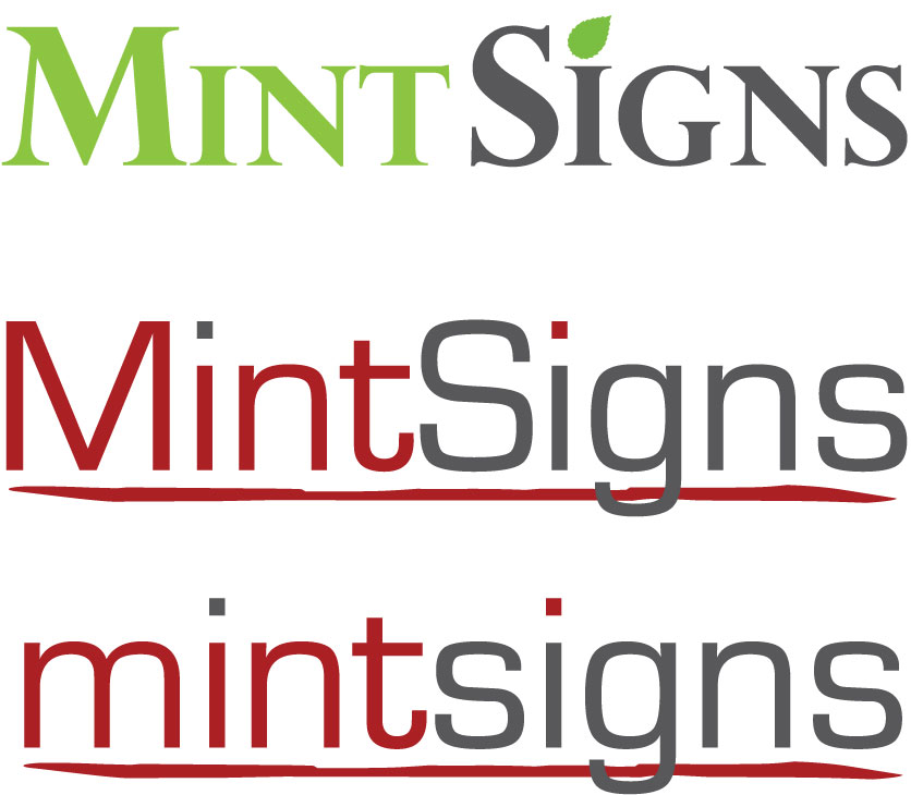
Thanks for the comments and designs guys, I also like Martins top one and I like David’s idea but not sure about the entire "i" a different colour, I will play with that and see if I like any options of it, otherwise I am still thinking of going for a much simpler design with only 1 or 2 colours.
Appreciate all the help guys
Thanks
Warren
-

martins 1st bottom one and 2nd top one stand out for me.
The 3 above look a bit too broken up, kind of like a crossword.
and the mint looks too spaced out.Edit: only just noticed it wasnt you who posted those 3, sorry I have the flu, not paying attention.
-
Hi All
Thinking of going in this sort of direction, similar to old designs posted but slightly altered according to your opinions (ie: no italic text, reduced cap sizes etc)
Looks like it’s going to be Mint Signs after all 😉
Cheers
Warren
Attachments:
-
New top one best of 3, (the underline on the bottom 2 looks a bit rough)
The 2 shades of green go really nice together.:thumbup2:
Just curious why is there no spacing between mint and signs, can I see it with one?
Sorry I haven’t posted anything of my own but I’m not in the mood for brain stuff tonight, maybe after a few more lemsips. -
Space between 😕 just thought it looked tighter without the space and seeing as it was 2 different colours didn’t really need it 😕
Attachments:

-
Only my preference but I do prefer it with the space, love the colours and the mint leaf, looking good it is.
Plus the fact using just 2 colours gives you a better scope of what stuff you can put it onto without anything clashing with a background. -
Yeah, when I added the space and changed the colour I thought much better, think that might be it now. 😉
Thanks everyone :thanks2:
-

I like it without a gap…..the leaf could be a mark…etc
nice though
😀
Attachments:

-
Nice colours those Andrew, I actually also reduced the gap as the normal space was huge so it was a bit of a gap but not a full space. Also like the idea of the leaf in 2 colours.
Cheers Andrew
Warren
-

andrews nailed it again lovely choice of font weight.
top marks to martin and davidchris
-
 quote Andrew Boyle:I like it without a gap…..the leaf could be a mark…etc
nice though
😀
Warren, think you are on a winner there, its got a good clean classic line without being too plain. Definitely like the two tone leaf, as it brings both elements together.
-
 quote Andrew Boyle:I like it without a gap…..the leaf could be a mark…etc
nice though
😀
“Take the obvious, add a cupful of brains, a generous pinch of imagination, a bucketful of courage and daring, stir well and bring to A. Boyle.” 😀 😀
Fascinating thread! 😀 -
 quote Harry Cleary:“Take the obvious, add a cupful of brains, a generous pinch of imagination, a bucketful of courage and daring, stir well and bring to A. Boyle.” 😀 😀
Fascinating thread! 😀😉
nik
-
What font is that Andrew and what version? My thin is very thing and my bold is as per my last attachment, I wanted an in between but could not find one (wanted to use a font and not add a line if possible)
I thought I was maybe on to a winner with this style and thanks to Andrew to help get it right 😉
cheers one and all
Warren
-

this thread should be kept as a scrap book……plenty of good ideas for ideas up there for future reference
-
I have trajan pro, after seeing that I may dig it out again.
Nice job, the leaf in 2 colours looks nice. -

Andrew Boyle super star 😀 😀 😀 will you do mine as well
Lynn
-

That’s bang on the nail Mr Boyle.
Warren that’s the one to use. Superb!
-
A big big thank you to everyone who helped (again 😉 😛 ) an extra thank you to Andrew for a slightly better font choice than mine and also a great idea with the leaf.
Andrews final one is what I will be using but not with those colours, although I really like those colours there does not seem to be a vinyl that come close to it so that might make it difficult going forward.
So another big thanks to all and to Andrew for tweeking my design to perfection.
Lots of drinks to buy next year at SignUK
:thanks2: :thanks2: :thanks2: :thanks2: :thanks2: :thanks2: :thanks2: :thanks2: :thanks2: :thanks2:
Cheers
Warren
Attachments:

-

Hi Warren, its red! you cant have red and mint together without green, just doesn’t work mate… any way I prefer original company name
-
i do prefer andrews olive and sorta dark petrol blue colours better mate. i think the colours are a bit more tasteful but unusual at the same time.
im not a lover of the font but i think its a good choice none the less. -
I also like the colours but like I said I had a look through my swatches and there is nothing close to that sort of green, the bluey/green sort of has something similar but it will be a huge problem if I can’t get the right colour vinyls 😕
😕 😥
-

‘mint’ does scream green ……… Oracal 751 608 petrol and 064 yellow green (not a perfect match to Andrews layout but nice nonetheless)
-
Warren,
I think the colours Andrew has used make it that bit more special, not quite the same effect in red.I would suggest getting hold of all the vinyl swatches you can including Avery there must be something out there close. May be ridiculously expensive but it’s only for your own use, I think it will be well worth the effort.
Phone Spandex for a full sets of vinyl colours, if you don’t already have one.The web site and stationary will look top notch if applied correctly.
Good Luck 😀
Just read Marcella’s post, maybe your nearly there.
-
i just made this in seconds… using a strong green which i should have in an avery range and strong black. Doesn’t have t obe subtle colours.
Just remember that Christmas doesn’t look right or Easter. Or even Red text mixed with White background
Anyway Football on
update: i don’t have my colours here, but we use Avery because of the colour range.
Attachments:

-
i have read this thread a few times, when i look at your last one Warren im not over keen on it at al… then i scroll up and see Andrews and it appeals more to me. (i dont just mean the colour) having looked at them both a few times i recon its more down to the amount of negative white space around Andrews, then coupled by the colours makes it much more appealing. i am merely pointing this out to you before you begin work on your branding. i know its often something we all do, "oversize" our graphics to get it as big as possible… but i think you should really try and make sure you keep this design spaced and sized tastefully or you could kill it. (i know i am hopeless at explaining things) 😕 😳
what i mean is… some designs work when splattered up the side of a van, car etc whilst others that are perfectly good designs, "dont". i recon this design is good, but i think you be careful not to overkill.sorry if that hasn’t made much sense… 🙄 :lol1:
-
 quote Warren Beard:Andrews final one is what I will be using but not with those colours, although I really like those colours there does not seem to be a vinyl that come close to it so that might make it difficult going forward.
Warren
warren i hate to say it but Andrew is right :lol1: :lol1:
, for the blue use avery 733 pf blue, ( near as dam) havent got the swatch to hand but from memory one of the 3m 10yrs cast are very close to the green
Ian
-
I agree too petrol and olive and the logo always in an area of space with the colours doing some work elsewhere…… 😀
-
quote Robert Lambie:its more down to the amount of negative white space around Andrews
Hi Guys
Firsty, when I make a jpeg it only makes a jpeg of actual image area and that is why there is no white space around the logo I posted.
Like I said I do like Andrews colours but could not find a suitable green, petrol was the bluey/green colour I thought would be good but it needs to have a dirty olive green to compliment it and I could not find one in about 8 swatches, I will get an Avery swatch as I don’t have one of those, I don’t think it would be a great idea to have gone with these colours if I could not find suitable coloured vinyls, if I can then great as I do like them.
Will keep you posted.
Cheers
Warren
Attachments:

-
Warren….obviously the final decision is down to you but I can’t understand where the red comes in to it….there are plenty of colour combinations available in vinyl that would work…. In my opinion the word "mint" has to be in green….two shades of green would work just as nicely but the red just seems to clash
-
i have to agree with others…green it has to be, andrew has given you a very classy idea….go for it 😀
nik
-
I agree, I just thought that from the comments I got about people thinking of the mint herb if I made it any colour but green then they would not (or not so many anyway 😉 )
I am a converted man as long as I can find the right colour vinyls 😀
I am using my website as a guide to see what the colours (and negative spacing 😉 ) will be like, I attached a screen capture, compare it to my earlier one 😮 😮 😮 It just shows how great this forum actually is 😉
Cheers guys (and girls of course)
Warren
Attachments:
-

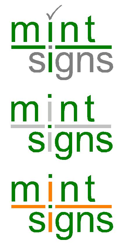
With 2 identical letter "I"s but only one with a leaf, I keep feeling something is missing.
Shouldn’t the Mint have the leaf rather than signs if anything?
Also, should the Mint be green rather than word signs? -
quote David Glen:Shouldn’t the Mint have the leaf rather than signs if anything?
Also, should the Mint be green rather than word signs?i think its perfect…the word ‘signs’ needs the leaf, as signs is whats being sold…..the mint is green, just a different shade 😀
nik


Log in to reply.