Home › Forums › Sign Making Discussions › Graphic Design Help › Looking for suggestions of a new company name
-
Looking for suggestions of a new company name
Posted by Warren Beard on 14 November 2007 at 19:58Hi All
Looking for suggestions of a new company name or opinions on my current attempt.
Anything goes 😉
But please keep it serious and constructive.
Thanks all 😀
Warren
Attachments:
 Nicola McIntosh replied 18 years ago 34 Members · 142 Replies
 -
142 Replies
-

Warren, what is you’re connection with "mint" or is it just a phrase you have picked up on. If its based on the slang usage of the word i.e. best, fantastic blinging etc then I would stay clear as this will be lost in time.
What about "Caergwintwg Signs" its the Roman name for Winchester!!!!! It may get people asking about the name!
-
 quote Graeme Harrold:What about “Caergwintwg Signs” its the Roman name for Winchester!!!!! It may get people asking about the name!
they have to be able to say it first!!!
-
 quote Graeme Harrold:Warren, what is you’re connection with “mint” or is it just a phrase you have picked up on. If its based on the slang usage of the word i.e. best, fantastic blinging etc then I would stay clear as this will be lost in time.
What about “Caergwintwg Signs” its the Roman name for Winchester!!!!! It may get people asking about the name!
😮 😮 😮 It would take me ages to learn to pronounce it first :lol1: :lol1: :lol1:
Zulu signs was one of the very first names I thought of about a year ago but to be honest I did not want to have a foreign name for my company and this is why I never gave it any further thought.
Cigna Signs was another because "Cigna" means "signs" in a few languages (French is one of them) so decided against this one too.
Another close one was g&g signs, it had a nice ring to it and is very neutral, too neutral I think to the degree it would not be memorable at all, it came about as green and grey due to the colours I wanted to use for the name, but for the website it would have to be gandgsigns.co.uk which looks far too weird.
I thought I was clever when I thought up "The BIG sign company" all on my own and then found it was already used 😕 as were the other 500 I thought of 😕 :lol1:
Keep the suggestions coming though
cheers
Warren
-

Wot about
A-free-Kar Signs
or
A-free-Kah Signs
or
Free-Car Signs (for the boy racer market)
-
for no other reason than i’m typing them as i think of them (ie most are rubbish!)
‘Signed’
The little sign shop (.com is gone in NY usa, but none here)
Galactic Signs
Lunar Signs
Quantum signs (again, in usa but not here)
Chaos signs
Atom Signs
lol… do i read new scientist too often ?
-
quote Ian Bingham:How about WBS?
Drat its taken
I think all of the 3 and 4 letter domain names were registered a few years ago.
Warren
If you have access to your hold up account, I just sent another possibility that is available as a domain name. -

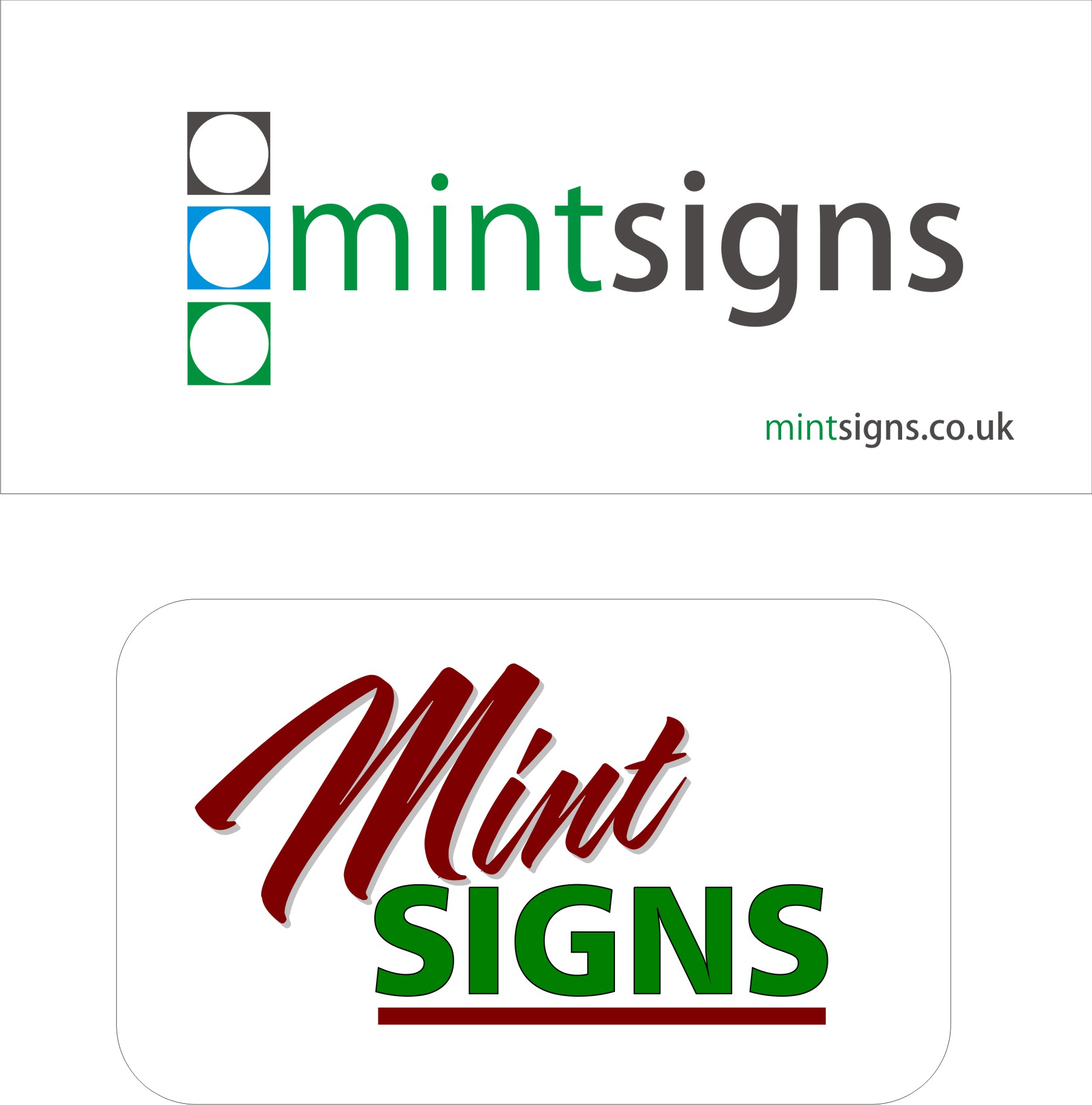
Contrary to everyone else
I think Mint is a good name
Easy to say ,easy to remember conjors up a fresh and modern impression
two short equal sized words easy to create a logo from
can be visually linked by colourmint signs
Still ,what do i know i was TerryBull Signs
-

I have to agree with Terry, I like Mint signs :thumbsup:
The name doesn’t have to have any real meaning but I would read it as quality signs.
My only fear would be as Steve mentioned in the other post as how it would sound when answering the phone etc.
But on the whole I like it. I agree I would change your name now as your still relatively new to the business.
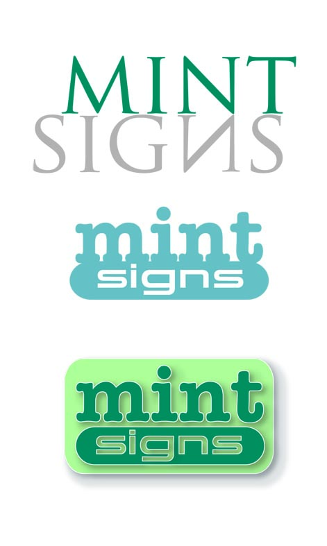
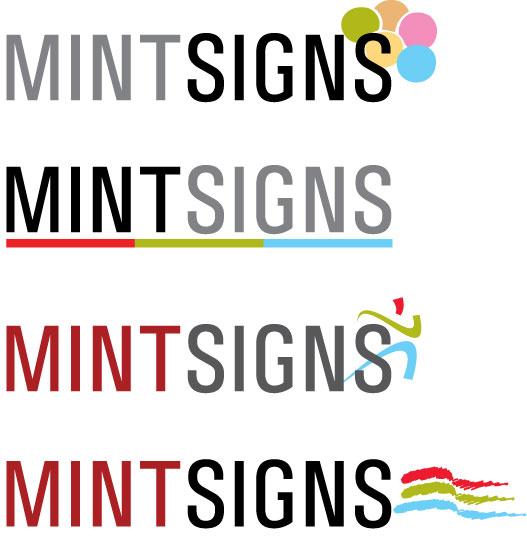
Logo wise I like the one with the black background the best but would straighten the word mint.
One other thing I would do Warren is delete that script font from your system that’s a big no no.
Hang on just seen Glenn’s logo that changes everything beard signs it is 😀
-
Got it thanks Graeme 😉
I keep buying domain names in case so want to make sure this time, I think I still prefer mint signs to be honest.
Terry, love the name, is your real name Terry Bull? what were your parents thinking :lol1: 😉 How did you find growing up?
glenn, you leave me speechless :lol1: :lol1: :lol1:
-
Thanks Martin, you are on the same lines as me then 😉
Why is that font such a big no no? I use it on my website 😕
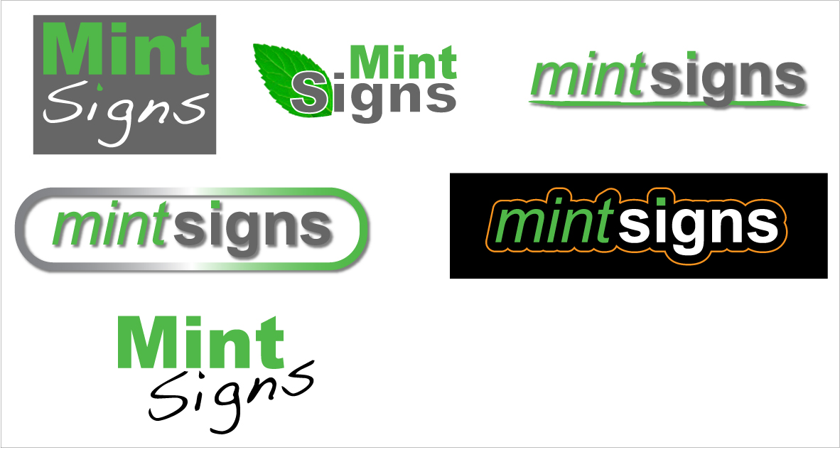
My favorite logo was the top right as it was clean and simple, also why would you say no to the italic text?
cheers
Warren
-
as i’ve already said Warren, i quite like Mint Signs, i only added a few options as you asked!
-
quote Warren Beard:Why is that font such a big no no? I use it on my website 😕
Just don’t like it Warren it looks very weak there are far better alternatives out there, I’m not a fan of unlinked script fonts.
The slanted Mint..again personal preference would just prefer it straight.
Couple of quick efforts below, I know both in Aerial, again there are better alternatives.
Attachments:
-
I forgive you Hugh :lol1: :lol1: :lol1:
I like those Martin, I was going to make the dot on the mint grey because I had made the dot on the signs green but though if I left it like I had it it would draw more attention to the word signs, there’s always a method in my madness but might always be right 😉
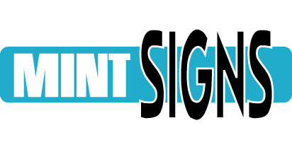
Mint Signs is still my 1st choice even though some others are OK, If nothing tops it I will be using it in the next week or 2 as my new corporate image 😉 😛
cheers
Warren
-

Warren it is your choice no matter what any one says you will do what you want , and I’m sure you will make the right choice, looking forward to seeing it 😀
Lynn
-

I agree Mint would be fine………
I would answer the phone "Mint" elongating the i…….
I also agree about the script font it’s unprofessionalWarren….Labyrinth…..??
Beard….War & Signs
Give Us A Sign Lord -
 quote Andrew Boyle:I would answer the phone “Mint” elongating the i…….
:lol1: :lol1: :lol1:
have to agree with lynn, i look forward to the finished layout 😀
nik
-
next will be another marathon logo design thread again 😉
-
the more you get into mint ideas flow
Love the retro fontss in Ian’s post
silver.. greys.. charcoal.. pastels nice colours for a white or silver van
dont go too mad on big and bold but more on tastful clean lines and contrasts
in type weights
clever use of coiour.
Martins lozenge logo is on the right lines,add a phone no and it would look great as a little tag sticker for your signworkWarren i was christened Terence but the vicar was the last to call me it
I pity some kids these days with some of the wacky names about now
-
Hi Terry
I know, some of the names these days are terrybull 😉 😉 😉 :lol1: sorry, couldn’t resist 😳
Regarding design, I agree with you 100%, that is why my first choice logo was going to be the top right hand side logo in my first post, simple and clean, underlined to enhance with a slight soft shadow, job done I thought 😉
Cheers
Warren
-

Beard is a synonym of challenge……..Challenge Signs?????? Just a thought. don’t really have a problem with Mint Signs.
And I would take that script outside and beat it with a sledge hammer 😀 😀
-

Well-Hung Signs…erection specialists.
🙂
Seriously, mint is OK.
You will have to worry about people wondering if you have a "hint of mint" (slang for gay similar to "light in the loafers")You’ve come a long way in a short while, but you still have time to change your name. I would try other fonts than helvetica, however.
Love….Jill -

Sexy Signs
"If our competition doesn’t f#*k you… We will" -

Mint signs sounds fine to me.
My eye goes straight to the middle top logo.The most difficult thing for a new name is getting a sensible web name.
I presume you have the co.uk registered. -
quote Peter Dee:I presume you have the co.uk registered.
Yip 😉
Thanks for the comments and suggestions guys, I think the next thing to do now is finalise the logo 😮 😉
I will try some different fonts, any suggestions?
Cheers
Warren
-
quote Peter Dee:Mint signs sounds fine to me.
My eye goes straight to the middle top logo.
.i’d agree with that, top centre would be my first choice, followed perhaps by left centre.
-
I agree with Hughs choice and order. Both would need digital printing though.
-
quote Phill:Both would need digital printing though.
Everytime you want to use the logo which would be a pain.
I like Martin Cole second idea…..with two different fonts maybe?
-

This is only a thought, and in no way an assumption or suchlike.
Seeing as Mint are well known for credit cards and loans etc, is there any way they could get funny with you calling yourself mint?
Their logo isnt even similar or anything but
I know these big companies do get funny over people with similar names etc and I know you are not trading in a similar field but these people have the money and power to shut you down before you start.
I would imagine they have no grounds for this but it might be worth at least checking out first before you lay out loads of cash only to find out they have managed to copyright the word mint or something.
Like I said I wouldn’t know but you do have to think about these things.P.S I like the top middle and left middle too.
-
quote Phill:I agree with Hughs choice and order. Both would need digital printing though.
Surely a decent cut vinyl leaf would be easy to produce if needed.
-

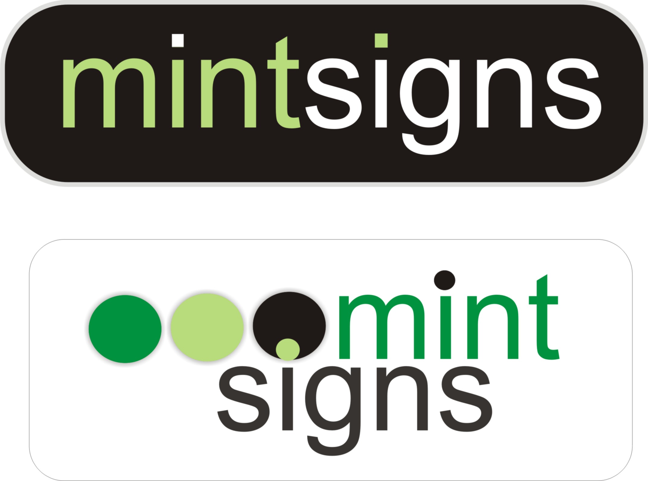
seeing as you didn’t like my first attempt Warren 😉 …
Attachments:
-
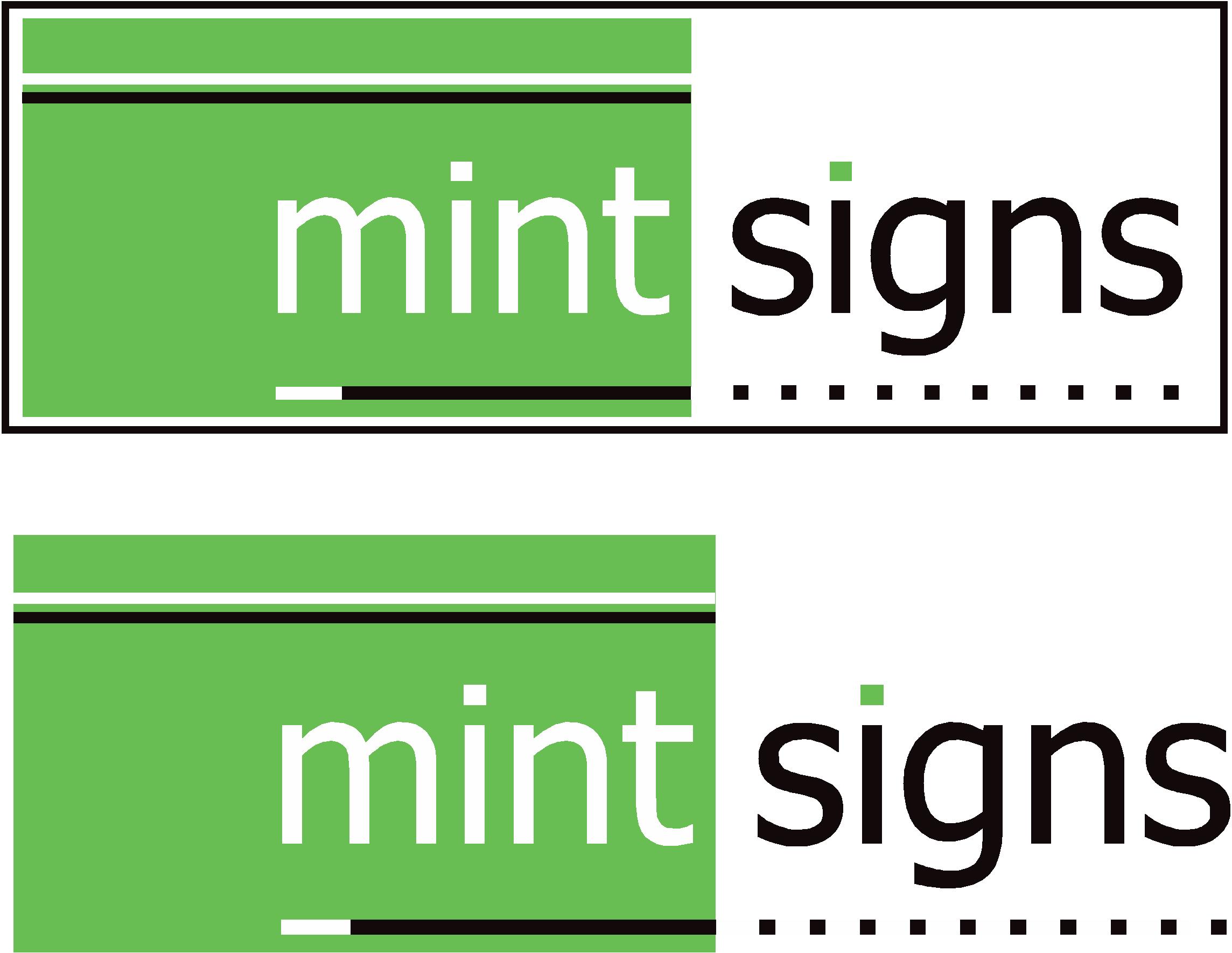
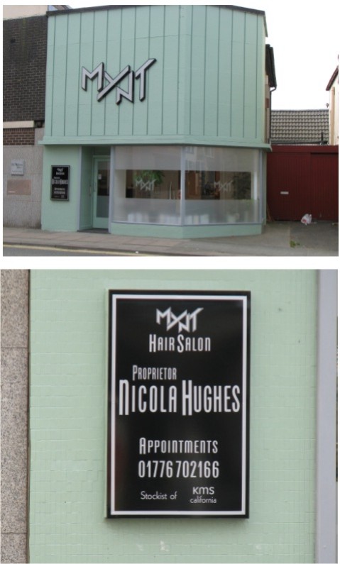
OK, at the moment I’m sticking with mint signs, I will develop it over the next week or 2 and continue thinking about alternatives, if none come up then mint signs it is which I will be happy with and should not deter any potential customers.
I need font options, if you don’t like any of these you are more than welcome to submit your own 😉
I’m quiet liking the bottom one, so you know my opinion :lol1:
Warren
Attachments:
-

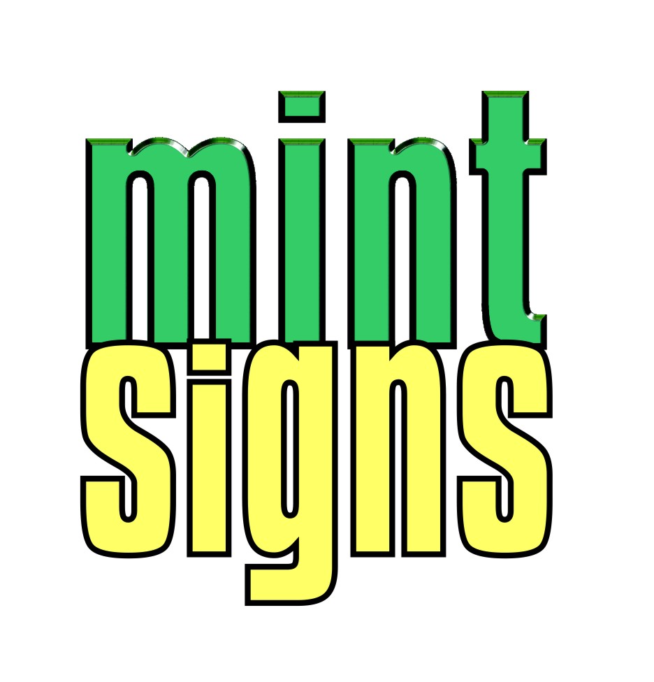
I agree I like #6 counting down from the top. Did you consider the word mint being tied to money and postage? Just wondering.
Attachments:
-
I like that top one a lot Andrew. Definitely a clean and modern look with a nice splash of color.
-
That is very nice Andrew, I like the colour a lot, do you think it would stand out enough on the side of a big van though?
-
When I think of the mint hand symbol I think of the + symbol.
It would look great with a bit of space on white with bleeding off + symbol if you know what I mean…….i would work the symbol to appear to be a transparent overlap (!) 😕
Cheers
-
was just doodling with the idea….instead of just plain text one with border one without 😀
nik
Attachments:
-
quote Andrew Boyle:another idea using colours 😀
Whats the idea?
A headache inducing Kilt?Or is that not what the bottom picture is meant to be,.
:lol1: -
Just f@rting about……. I like funny patters 😀
Attachments:

-
quote Andrew Boyle:Just f@rting about…….
me too…chemist? :peek:
nik
-
quote Andrew Boyle:outside the open box (lisa)
:lol1: :lol1: :lol1: :lol1:
nik
-
heres another one….big space but great to add digital graphics within in it 😉
nik
Attachments:
-
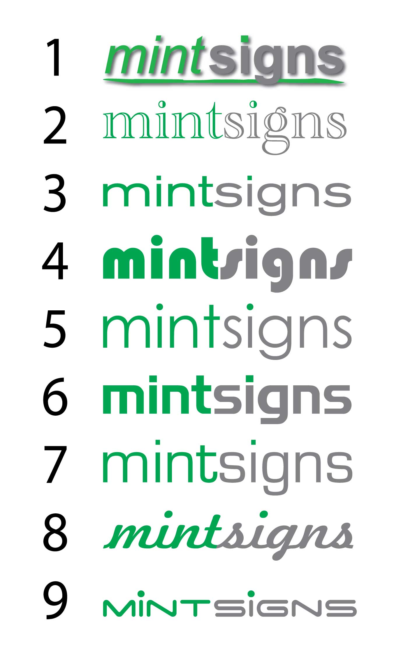
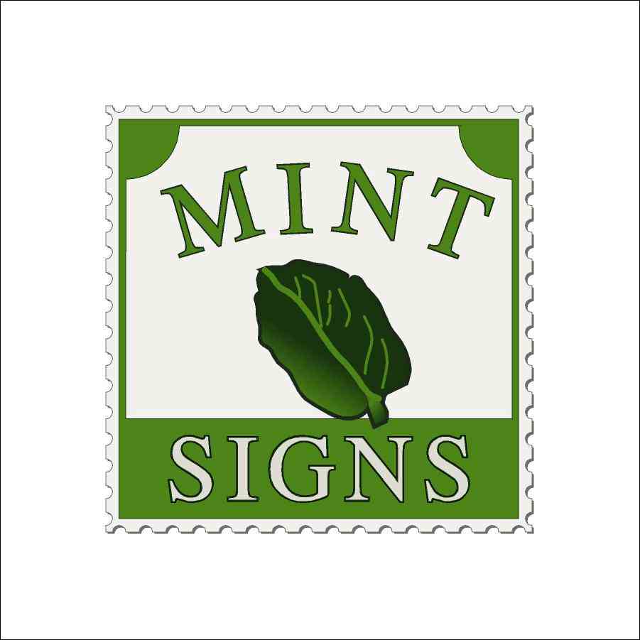
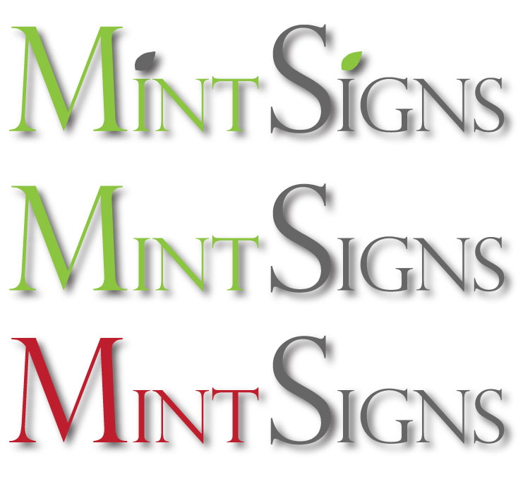
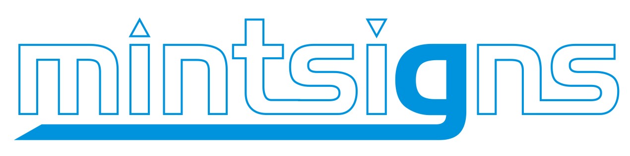
Number 9 Warren.
Change the dot on the "i" in mint to grey?
I still like the original one with the leaf.
Sometimes I think it’s possible to fiddle about too much.When explaining to people "why mint signs" you can choose from any of these:
http://en.wikipedia.org/wiki/Mint -
I agree with changing the green dot on the i also.
will look much neater and in keeping with the rest. -
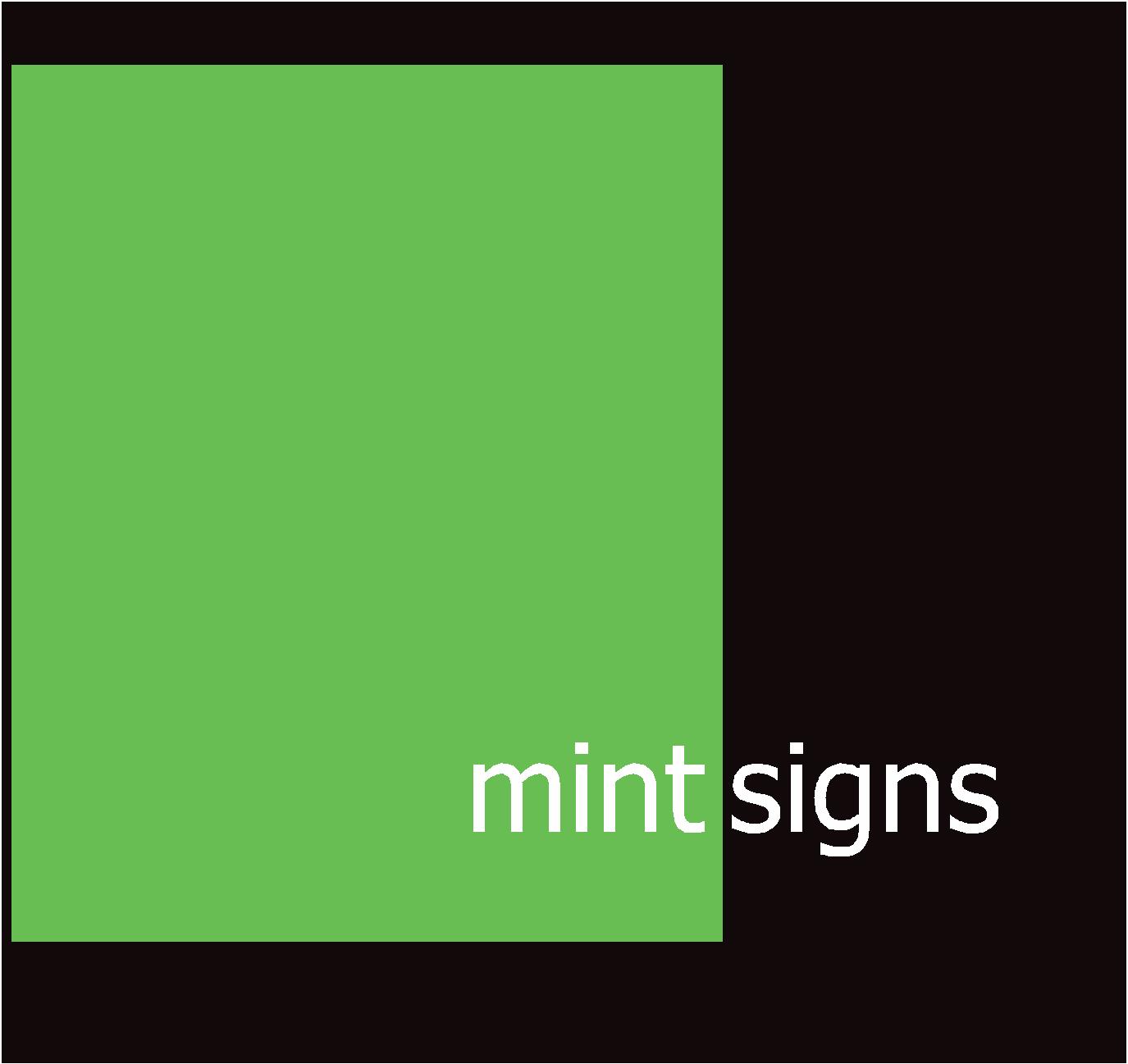
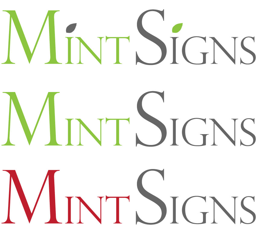
Hi Guys
I purposely left it off as I feel it keeps your eye drawn to the word "signs" more, as this is what I want people to know as it’s what I do?
I might be wrong with my thinking :lol1: 😉
Here are both close up.
cheers
Warren
Attachments:
-
quote Steve Underhill:Show us with it one green & one grey
😕
Isn’t that what I did ?
confused.com 😕
Warren
-
No, its not.
The green on the green writing and the grey dot on the grey writingnotconfusedatall.com :lol1:
-
Warren to highlight the SIGNS you could use a bolder version for that part but I don’t think it will work with that font (could be a bit obscure from a distance). Might work better with your version 3.
I like the dots reversed out. -

Hi Warren
I LIKE the name – Mint!
Here is the contribution from the Irish entry…
One new and a couple of ‘Old-School’ type layouts for you to crit.
Martin
Attachments:
-
Here’s my take on it. It’s definitely not perfect though.
Attachments:
-
Thanks guys for the efforts, some nice ones there but I am thinking of going a little more modern / contemporary with the branding and I think this font will go well. It looks good with a shadow on it so website and printed materials will be great, either leave off the shadow for cut vinyl or use a light grey or silver.
I am working on a few ideas at the moment and will post them later.
Keep the inspiration coming in the mean time. 😉
Cheers
Warren
-
Yeah I agree with you. A simple modern approach would work great. This isn’t exactly related, but there’s a distribution of Linux called Linux Mint. http://linuxmint.com/
-

warren I like the look of niks one
very nice nik very simple but it works for me !! 😀
the last one she posted black and green square -
Have a look at Peter Dee’s link above, there are so many mint references.
Now there’s a new one. 😉
I also liked Niks one as it is my sort of style, if you remember how my last logo began it was a very similar design, I just found that the large squares and rectangles can make designing stationary and own vehicles much harder so thought I would simplify and modernise this time around.
Cheers
Warren
-

all the designs so far are very good. though the two Andrew has submitted appeal more to me. as you know I’m not a lover of the name and even when i was thinking about designing for it, i couldn’t get away from the word mint meaning the flavour or the leaf out of my head. designing with this in mind, i think is the wrong direction because that side of it has no association with signs, so i feel there has to be some form of detachment of thinking Mint as we do and to actually see it as just a word within the design. (if that makes sense?) 😕
-
Hi Rob
I think I sort of get you 😕
I do agree as well and that is why I personally do not like the designs with the leaf I posted at the beginning even though many others did 😕 I want to keep it simple and "FRESH" so what I am trying to do is get no matter who reads it will think fresh weather fresh mint leaves, fresh peppermint or whatever. At the end of the day it says signs right next to the word mint so they will know what I do…………… I suppose 😉
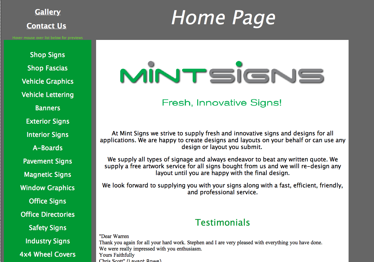
I have been working on my website with this in mind and there’s a screen shot here to show you it’s clean, crisp and fresh looking.
Still working on ideas though, I can’t quiet decide on what shade of green though 😕
cheers
Warren
Attachments:
-
i agree with you in ways warren, and without trying to come across as forcing my views. to me, it is the word mint itself that is causing confusion. by that i mean, you are trying to portray what you want people to think (and i do see the logic in it) but by using this word it is adding to the confusion. again, this is just what i think when i see it…
i know naming a business is not an easy task… at the end of the day it is going to be decided by you only. im just trying to throw the negative at you as well as positive…and again, this is just my opinion mate… which go’s for nothing at the end of the day. 😕 :lol1:
-
Warren I hope you take this the right way, but I think that font you are using is very outdated…..and a lazy way to look modern…..the dots look akward and clumsy……I think both Nik and Andrew are on the right path here……..they look truly modern. Just my tuppence worth, interesting thread
-
I think Iv’e got it what do you reckon 😀
I do agree with Harry, the font is only ok and the dots are to OVERPOWERING.
Nik’s second effort wins for me. Very crisp clean and modern.
Attachments:
-
Hi Rob and Harry
Thanks for the opinions but you are wrong…….. just joking :lol1: :lol1: :lol1:
No seriously, I do see where you are coming from and understand but with all things we are limited to what we can do and understand and then transfer to paper (or screen 😉 ) I do think Andrew’s designs are very modern (as they always are with him) but I just think to me personally they lack a little bit of oomph. and notability on the street, I’m trying to think of it on the side of a van or on a sign over my unit (one day 😉 ) even on my uniforms. We do all see things differently and I don’t think any of us are right or wrong because it is all subjective isn’t it. I also know your experience can help lead me on a better path but I also have to be happy and comfortable with that path, hence the change in name now. I can only design to my ability unless somebody posts something I can use or adapt so if what I think is modern isn’t quiet modern it is just my ignorance to it and not trying to be lazy (I know you meant it constructively) but I am more of a doer than a designer.
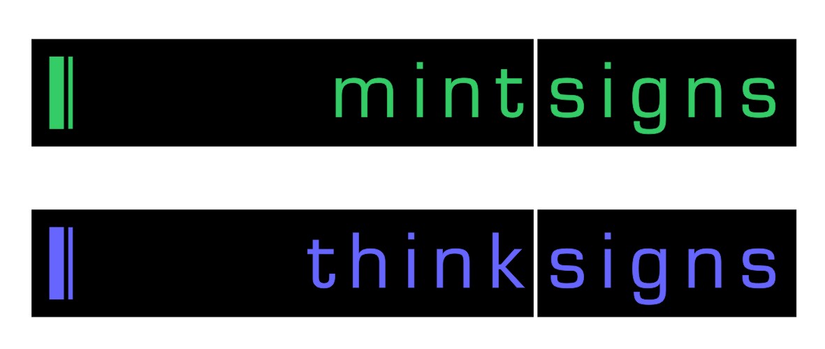
I had a toss up between Mint Signs, Think Signs or WB Signs and thought WB Signs was not memorable enough, Think Signs was good but also had a weird tongue twister ring to it and not overly excited about the .eu web address, so Mint Signs was still a little ahead. I also think the colour scheme goes well with the name and not sure if the thought of the mint herb will do any damage to business. So as much as I won’t be promoting It using any mint leaf images or anything like that I don’t think it will hurt if somebody thinks of it.
Anyway as I said it is not finished or finalised so am hoping some more ideas still come and I will keep adapting and tweeking until I fall over
😉 :lol1:I do appreciate all comments and do not get offended and am never to proud to admit I’m wrong.
Cheers
Warren
-

Warren,
the layout for the web looks ok to me, but I hope you are going to review the copy, it makes it sound sound like you are desperate for work.Never suggest that you will (endeavor to) beat a quote,
or say you will redesign until the client is happy….you will be making a rod for your own back….Peter
-
This is the font in it’s original state, I added the dots to be different 😕
Also will have the drop shadow
I’m still open to suggestions
Attachments:

-
Warren…………….I have to jump in here, there’s components to my doodle that could give you the most noticeable van in town yet it would still be clean, fresh and professional although maybe a little too corporate.
I do agree with Harry about the font and the circles on the i however I think it’s going places and could be great with a few changes, [ I do not want to push my views because I try to be fair… but deep down I’m very opinionated]…..you know what I mean!
😀
-
quote Peter Normington:Warren,
the layout for the web looks ok to me, but I hope you are going to review the copy, it makes it sound sound like you are desperate for work.Never suggest that you will (endeavor to) beat a quote,
or say you will redesign until the client is happy….you will be making a rod for your own back….Peter
Hi Peter
The copy changes all the time :lol1:
But I am actually a little bit desperate for work so added that in to entice, I purposely put "endeavor to beat" so I can hopefully at least get a chance to review others quotes and see if it is worth while to reduce my price or even to ensure we are quoting like for like, I recently lost 2 jobs because of it and it made me mad, I am not going to win them all (which would mean my prices are too low) but when I get asked to quote one way and then 2 weeks later I see their signs up and are cheaper versions or not as requested I get annoyed as I might of had a chance if quoted like for like.
Just my thinking of it.
As for designs, while I am not 100% busy yet I have time to design and do more layouts so do what I can, as I get busier I will remove that from my site. Doing your own website has it’s advantages 😉
But thanks for the heads up, I will keep my eye on it.
Warren
-
quote Warren Beard:No seriously, I do see where you are coming from and understand but with all things we are limited to what we can do and understand and then transfer to paper (or screen 😉 ) I do think Andrew’s designs are very modern (as they always are with him) but I just think to me personally they lack a little bit of oomph. and notability on the street, I’m trying to think of it on the side of a van or on a sign over my unit (one day 😉 ) even on my uniforms. We do all see things differently and I don’t think any of us are right or wrong because it is all subjective isn’t it. I also know your experience can help lead me on a better path but I also have to be happy and comfortable with that path, hence the change in name now. I can only design to my ability unless somebody posts something I can use or adapt so if what I think is modern isn’t quiet modern it is just my ignorance to it and not trying to be lazy (I know you meant it constructively) but I am more of a doer than a designer.
Well said Warren!
You should feel comfortable with your logo. We all put our 2punce in but it’s ultimately down to you, if people like very modern it doesn’t mean you have to, so should not be swayed, which I don’t think you would.
Having now seen a lot of your work it deserves a respectable name and logo so give it much thought to achieve a result your completely happy with.
-
 quote Andrew Boyle:[ I do not want to push my views because I try to be fair… but deep down I’m very opinionated]…..you know what I mean!
😀
you don’t say!!!!!!!!!!! 😉 :lol1:
-
sorry folks….having problems loading the image
Attachments:
-

Hi Warren,
I liked the top right in the first picture you posted. I agree I would prefer letters straight.
Like the white background, green and silver combination. Also love the name, I think of mint like something in "Mint condition".
Just Simple and Nice!Good luck!
Best Regards,
Patty.
-
I was also thinking of "Mint"
they make money, as in the royal mint, they make coins you make signs.maybe next year you might be called "minted" signs
-
Hi All
What about;
Sign Sensations
or
Sign Sensation
Cheers
Warren
-
Yup – I prefer Sign Sensations to Mint signs
Or wot about Sensational Signs 😀
-
i agree, i think its better than mint signs. however, i think its a bit tacky also… i dont mean that bad, it’s just how i would look on it if i saw it in yellow pages. at the end of the day its down to you… but look on it as how a variety of customer may look on it. i.e. from mrs bloggs to the corporate firms.
nice new pic mr f! 😀
-
Thanks guys
Wow Rob, you are a very hard man to please :lol1: :lol1: :lol1: Do you mean this name sounds a bit too "soft" and would not be corporate enough?
I like this font I have used but is similar to a style Andrew posted where my concerns are the thinness of the letters for cut vinyl, at 1m wide the "N" leg stroke is only 2.5mm thick 😮 stationary would look great but on a van or sign?
Anybody have some font suggestions or logo options for this name?
And more opinions on the name please 😉
Cheers
Warren
Attachments:
-
OK name but a bit of a mouthful.
US firm has the domains but sign-sensations.com and co.uk are available.
Still think Mint Signs is fresh, simple and memorable. -
Hi Peter
I agree with you, it is a bit of a mouthful but not a bad mouthful and rolls off the tounge a bit easier than Mint Signs. I like both of these but need to decide which is better for business if I can’t think of anything else 😉
A slight variation on logo for Mint Signs using same font as Sign Sensations, I am also liking the dark red and dark gray colour scheme at the moment.
Still not sure how well this font will work on a fascia or van?
And I have the signsensations.co.uk web address 😉
cheers
Warren
Attachments:
-
Warren….do you have a thing about sweets? 😀
What about Spangles Signs……Toffos Signs……X Strong Signs…..Juicy Fruit Signs 😉
-
quote Robert Lambie:. but look on it as how a variety of customer may look on it. i.e. from mrs bloggs to the corporate firms.
As above this is important to do.
It also comes down to the kind of work your aiming for as to how your logo can look. Must be looked at from all angles (<(
Personally I don’t like sign sensations, still preferring Mint Signs.
Still not sure about your designs Warren, IMO may be wrong fonts and would loose the soft shadow, it would always need to be printed. A solid very light grey would suit better.
I like Glenn’s 2 layouts further up. The think signs colour is superb.
Have you disbanded Think Signs? I quite liked that.”Spangle signs” hmmm I feel some holographic vinyl coming on.
😀
-
Hi Martin
I’m trying to find something memorable but not jokey or too quirky as my current name. As you might imagine I am finding this hard but so far the best 2 I think are Mint Signs and Sign Sensations. I want it to be fairly corporate but also "inviting" if that makes sence 😕 Think Signs is not bad but the .co.uk web address is taken and I have just checked out who has it and it is another sign company about 20 miles from me so that is obviously definitely out.
So far it is between these 2 and now just to find a font that somebody other than me likes 😉
Here is Mint Signs logo without any shadows, I was going to use a solid gray if doing cut vinyl but a soft shadow for all printed materials.
I also thought using the dark red and gray colour scheme would stop more people thinking of the mint herb but I also like those colours.
Cheers
Warren
Attachments:
-
quote Warren Beard:.
So far it is between these 2 and now just to find a font that somebody other than me likes 😉
Ultimately it’s down to you Warren, if you like it then that’s fine. We are but a team of advisors to give our opinions.
I do like the font above I just think it may be the Caps are just to over powering, dropping them down a few points may help.See where your coming from on the shadow, although I would still prefer it without the soft one.
Also Deep reds and greys go well together so other colour combos would work to take away the mint /herb connection.
It is a toughy getting the name right, I pondered for days on end before coming up with what suited by business. 😕
-
A few more attempts at a logo trying to get inspiration from Andrew’s designs, I’m still having a tough time choosing a font.
Andrew, what font did you use?
cheers
Warren
Attachments:
-

Just a quick try, was bored anyways.. I think its modern.
Attachments:
-

got this love affair with impact at the moment
chris
Attachments:
-

I just thought I would post an opinion about names in general. While you are deliberating your name I would suggest that your name is not as important as building your reputation and quality, particularly as you are a very small company.
To back up this opinion I offer a couple of examples:
1. Just when the UK was used to Marathon, the choc bar was globalised to Snickers. I think most people didn’t like the new name but it didn’t affect sales and we don’t even think twice about it now.
2. If you were starting out in a "certain business", would you ever choose the name Marks & Spencer?
So the name is subservient to the brand reputation and quality which is what people buy.
Of course, this doesn’t apply to names such as "Wanker Signs" !!
Peter
-

If I could just add to the non specific information…
I’m in the process of trying to get a design tied up for a large organisation and it’s a committee involved. When I met the women who I will be dealing with I mentioned that showing a layout to a committee is a very dangerous business. She said your right they may all hate it. My reply – no they will all say ‘we love it, but can we just change this or that and add this and take that away’.
My advice to her was to have one person (her) to make the final decision based on all the input given to her and the options we supply. But to be very weary of trying to make everyone happy!
Gavin
-

Gavin, I have had just that, thankfully the lady came in and spent 1.5hrs thrashing through the design as she realised it was going to take weeks for everyone on the committee to come to a decision, apparently she was a ‘designer’ and her husband (also came with her) was an architect, can’t think of anything worse.
Sorry to highjack the post.
I would still go with Mint Signs and like the mint leaf idea as a dot or martins latest top idea.Cheers
Dave


Log in to reply.