Home › Forums › Sign Making Discussions › Graphic Design Help › Just wanted comments on van graphics before printing thanks
-
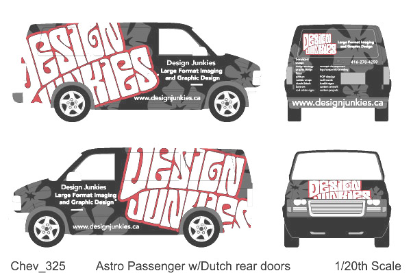
Just wanted comments on van graphics before printing thanks
Posted by zoomo on 25 April 2006 at 17:09Hi everybody!
Just wanted comments and opinions on the van graphics before I print it up!
Thanks,
Mark
Design Junkies
Attachments:
 Russ replied 19 years, 8 months ago 7 Members · 9 Replies
 -
9 Replies
-

Although very eye-catching, I would worry slightly that the company name doesn’t immediately jump out at you on the sides. Maybe if it could be altered in such a way that the text wasn’t "lost" so much in the wheels.
Dawn
-

I to am slighly concerned that the ONLY place where you appear to have a complete logo/name is a small one on the rear. At first glance it’s completely lost, it takes an extended look to read the rest of the van to see it’s meant to be DESIGN JUNKIES and not DESIGN JUNIORS or something similar.
Your logo works well as a funky/quirky designers element, especially on the web, but unless you already have an established and easily recognised brand identity (where you can afford to chop out sections of your trading name), a slight move around might help convey to ‘the average person’ who you are slightly better.
Of course, if the van is simply to transport items / deliver goods to existing clients and not as a form of additional advertising – then it’ll work just fine!
Best of luck with it anyway. 😀
Dave
-

have to agree with comments made….but i like it 😀 😀
as the name is repeated again on the van which is readable, and because it will really make people look at the van….if people cant make the wording out…they will if possible go up further and find out, and then the company name will stick in their minds!! 😀 😀
nik
-

Well I like it! It’s got that Mystery Machine look about it!!! 😀 😀 😀
Really different from the norm, go for it!
Marcella
-
quote Marcella:Well I like it! It’s got that Mystery Machine look about !
I KNEW I’d seen it somewhere…..
I DO like it too, it’s quirky and gets a (required) second look.
Slightly O/T: I’ll keep an eye out for it scooting round the ‘Torona’ area as I’m on holiday in a few weeks….. might drive past Scarborough (don’t you just love ‘Scarborough Town Centre’ 😕 ), I visited friends there a couple of years ago. Looking forward to walking along the boardwalk (The Beaches) with my wife as she loved staying there, and man, I’m getting desparate for Tim’s and good, cheap food eh.
-

Thanks for the comments! Great point about the brand recognition bit. I was debating about the size of the logo as well. There is a fine line between eyecatching and unrecognizable on this.
LOL. David, I live about 10 min from Scarborough Town Center. If you are in the area and you want to go for a beer we can meet up.
Thanks
Mark -
quote zoomo:Thanks for the comments! Great point about the brand recognition bit. I was debating about the size of the logo as well. There is a fine line between eyecatching and unrecognizable on this.
LOL. David, I live about 10 min from Scarborough Town Center. If you are in the area and you want to go for a beer we can meet up.
Thanks
MarkMight take you up on that…. 🙂
-

I like the concept but must confess I don’t like the BIG in your face design, not saying it is not a good idea, just that I think the logo is lost because of its size…
I think people will pidgeon hole you with doing outrageous style when in truth, I think it will be a small % of people that may go for that style of thing. Of course your market may be different to mine here. I find people absolutely love these concepts, until they get the quote. Then they start back peddling pretty fast. :lol1:
-

I like it and would be pleased to see it if it WAS a moblie sandwich van in my area a shaggy buttie would be my order 😀
Russ

Log in to reply.