Home Forums Software Discussions General Software Topics Impact Health & Safety sign library

  • Impact Health & Safety sign library

    Posted by R.Lamerton on 22 August 2011 at 20:09

    Hi,

    Does anyone use this safety sign library? when importing into Signlab which I use, then i scale to required size and print.
    A customer today has picked me up saying that the red triangle around the men at work symbol is too orangy. All I did was import and print to versaworks using sign and display setting. Is this correct or am I doing something wrong. Also he said it needed more detail – why? you cannot alter a road sign which is a national recognised symbol?
    Even on the sign I did had the customers logo on the bottom that was orange the men at work symbol was no where near the orange colour below it! 🙁

    R.Lamerton replied 14 years, 2 months ago 5 Members · 10 Replies
  • 10 Replies
  • Kevin Flowers

    Member
    22 August 2011 at 21:24

    Hi
    run it on max impact should help the problem, i actually adjust the red to 100% m and 100% y & use max impact. However i use Lyson inks. If he can’t explain what detail is missing how does he know its missing.

    Kev

  • David Hammond

    Member
    23 August 2011 at 08:11

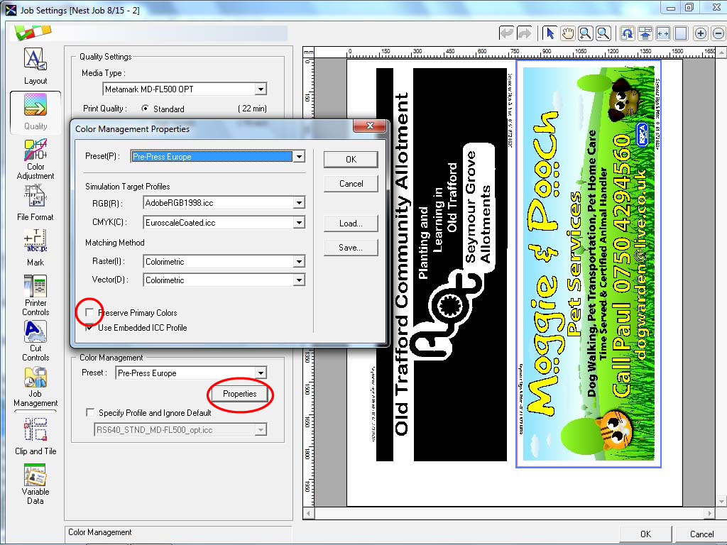
    In the colour settings in versa works select ‘preserve primary colours’

  • Lorraine Clinch

    Member
    25 August 2011 at 00:24
    quote David Hammond:

    In the colour settings in versa works select ‘preserve primary colours’

    Ohh, now there is a tip!

    I have the same problem with yellows, whether on My printer (VC 300v) or my local trade printer, the yellow goes from my printer as yellow, and comes back as a greeny yellow, almost ‘dirty’ in colour. I will be looking for that setting tomorrow David, thanks!

    Lorraine

  • Mo Gillis-Coates

    Member
    25 August 2011 at 06:52

    I use it and have a few varied problem, sometimes the text comes out funny in versaworks and often some are blank….

    one big prolem I have found is spelling mistakes in some of the signs… a bit embarrassing when customers point it out in your advertising 😳

  • David Hammond

    Member
    25 August 2011 at 08:24

    Just a screen shot of where the setting is Lorraine.

    I’ll probably get told my other settings are all wrong- TBH I don’t really get colour management.


    Attachments:

  • Kevin Flowers

    Member
    25 August 2011 at 08:29

    David
    Using the Sign & Display colour management automatically selects Preserve Primary Colours

    Kev

  • David Hammond

    Member
    25 August 2011 at 08:34

    When I had an engineer here last, he suggested using Pre-Press Europe as that is the same CMYK Colour space used in production.

    He did explain the other settings but it’s not really something I mess with and the prints come out fine.

    I’m one of those geeky people though who would rather know what all the settings mean, even though I’ll probably never use them!

  • Kevin Flowers

    Member
    25 August 2011 at 09:51

    David
    thing is as soon as you tell it to Preserve primary colours you have taken it out of that colour space. You may be suprised at different results you get with colour profiles & presets. But each to there own, i enjoy playing anyway.

    😀

    Kev

  • David Hammond

    Member
    25 August 2011 at 10:00

    Just printed some guided from Rolands Support Website, and going to go an play whilst I am quiet.

    Linky for any other interested parties:

    http://www.rolanddg.co.uk/content/public/support-centre/VersaWorks.aspx

  • R.Lamerton

    Member
    25 August 2011 at 20:52

    Hi,

    Thank you for all the tips, will give them a try!!

Log in to reply.