Home › Forums › Sign Making Discussions › Gallery › idea sharing: photo to go with logo/name
-
idea sharing: photo to go with logo/name
Posted by Dennis Van Der Lingen on 17 March 2006 at 11:14hy everyone,
this is probabely the wrong thread here but it allows me to post some pics.
anyway i need a bit of help.
i’ve been adding a photo to our logo to (show off at people) give the impression of an modern and creative signshop.
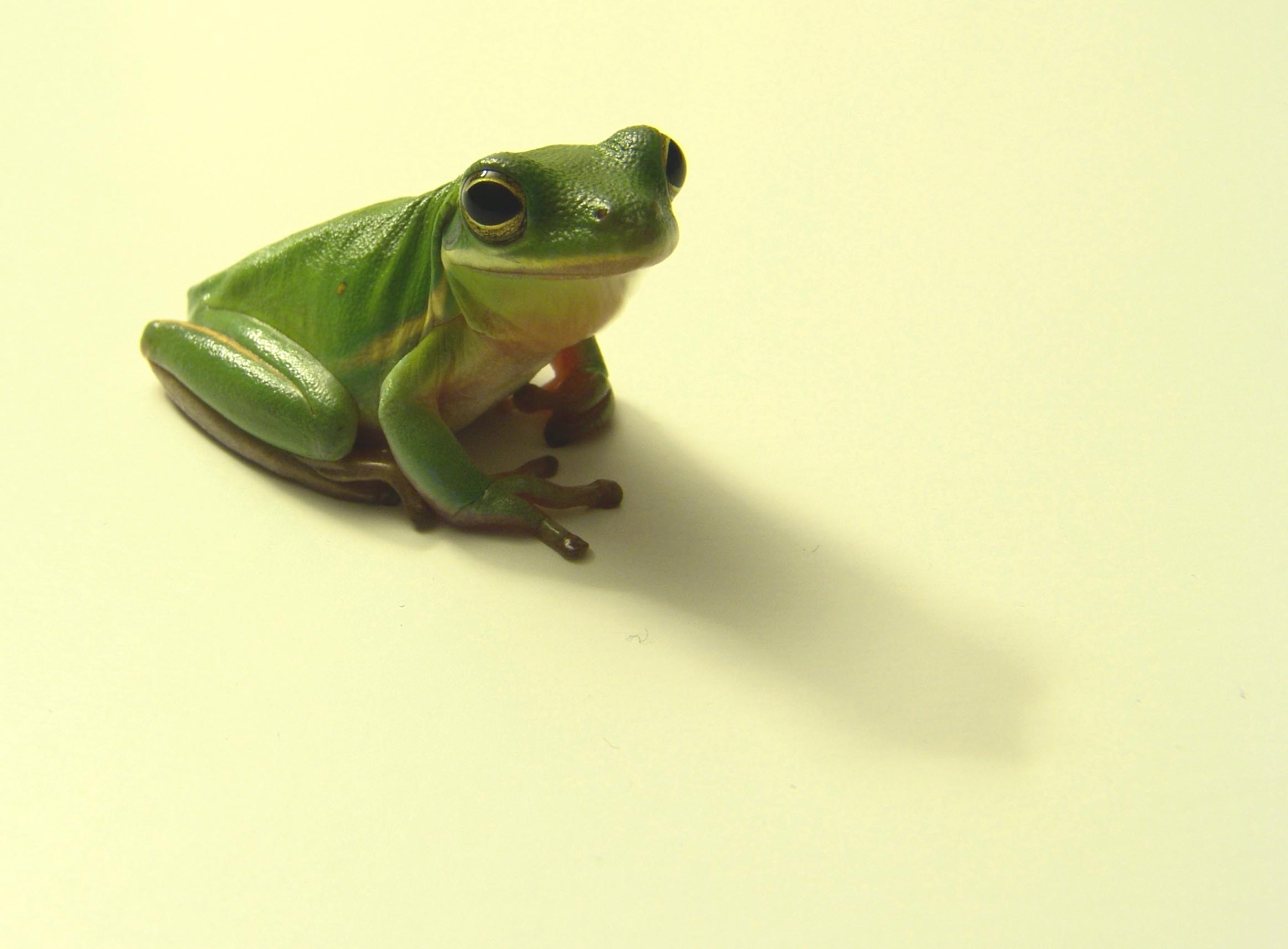
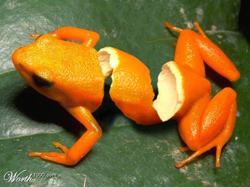
last time i used a frog, not everyone being conviced of the pic, we now face the challenge of creating something new. i’ve been at it for some time now butt i’ve seen it so much i “can’t see the forest trew the trees” (<=expression for not seeing the whole thing because of the details)
i’ll post the pics and hope that anyone has some bright ideas coz i’m all out.
i’m sure you all do, having seen some of the most “astaunasching” <=:-? ddesignwork on the site here
thanks in advance for any ideas.
Attachments:

 Dennis Van Der Lingen replied 19 years, 9 months ago 8 Members · 21 Replies
 -
21 Replies
-

Dennis,
Sorry to be so English but could you translate what the text says to give me an idea about what you do 😳
-

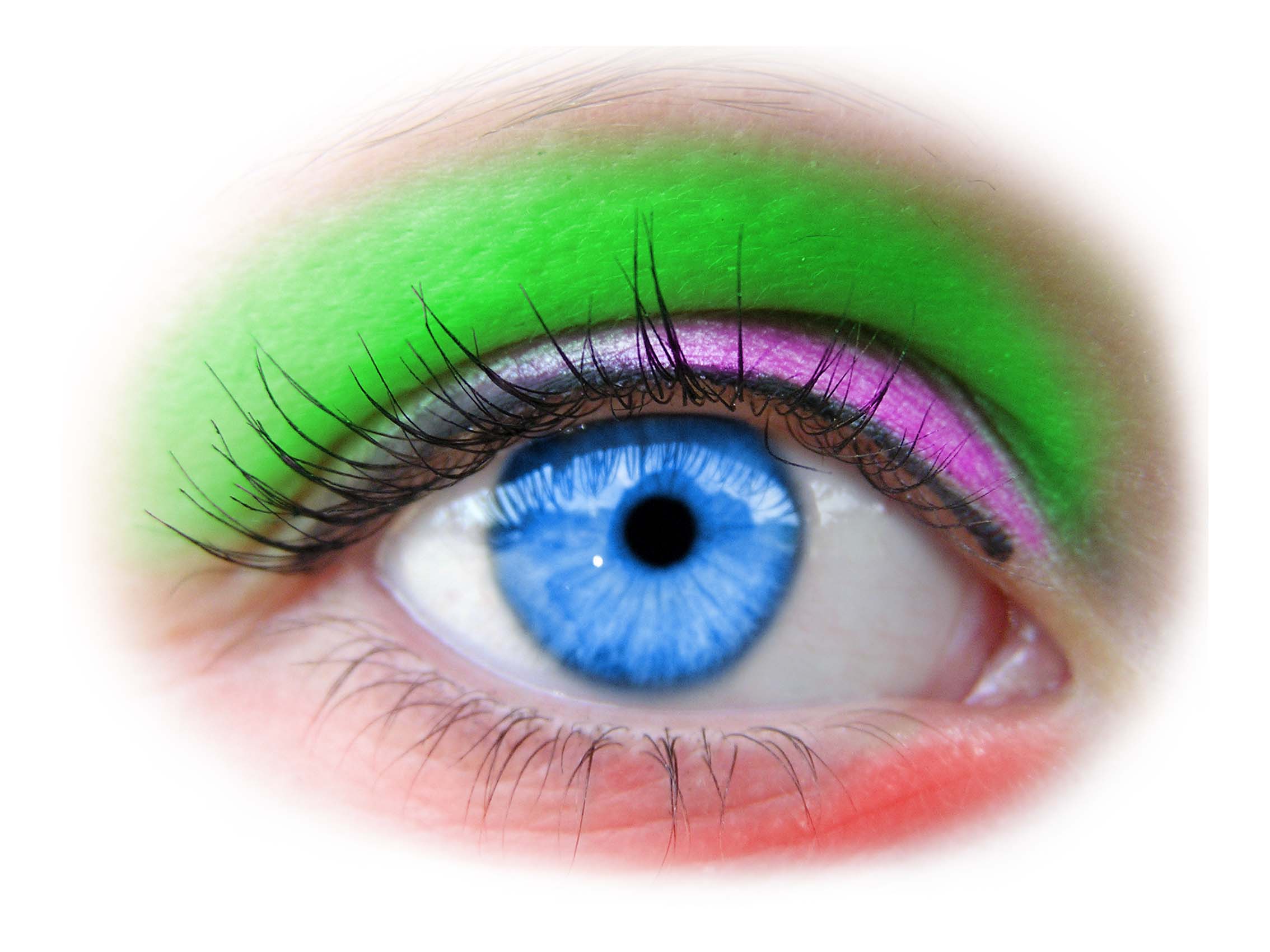
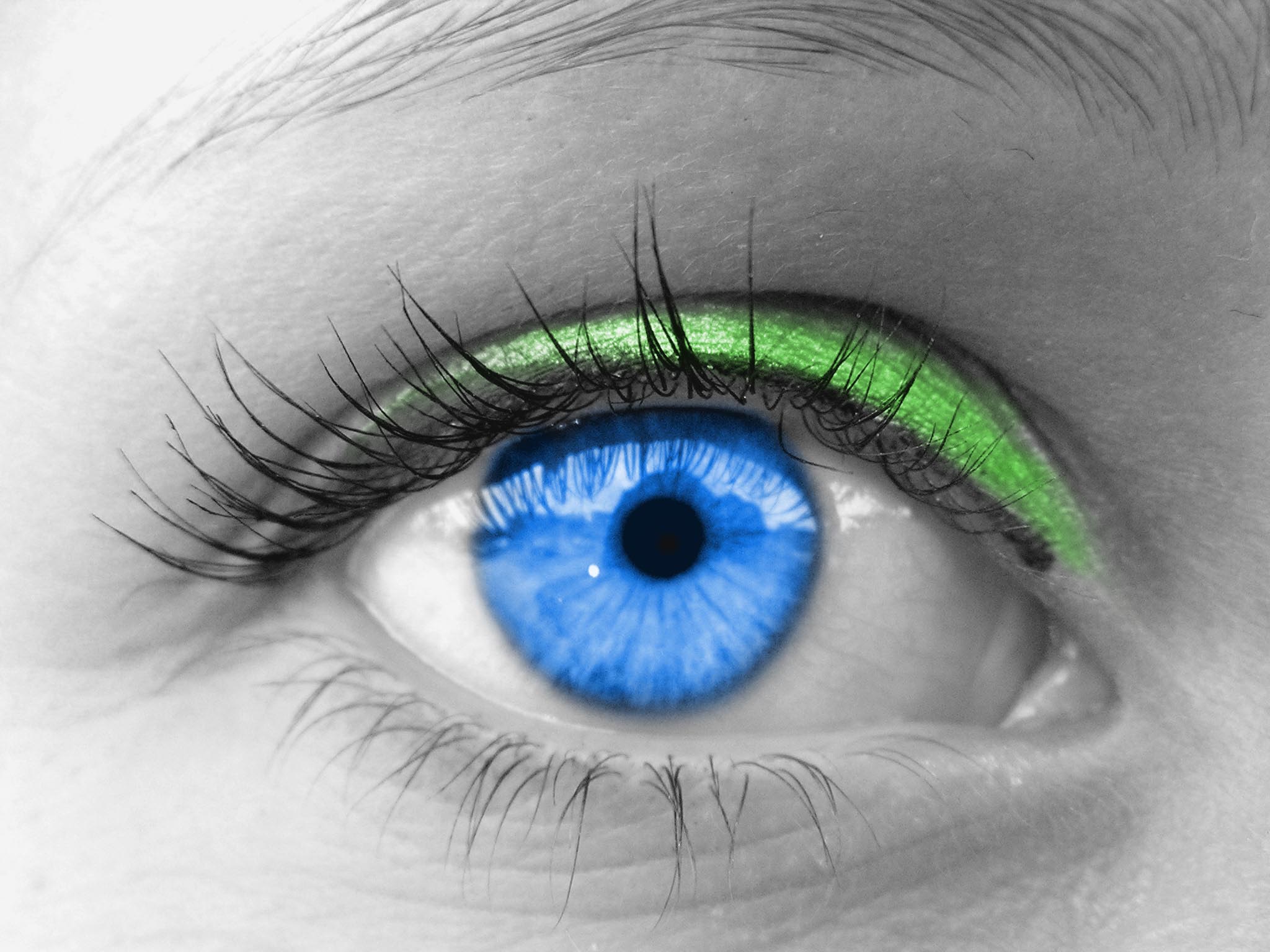
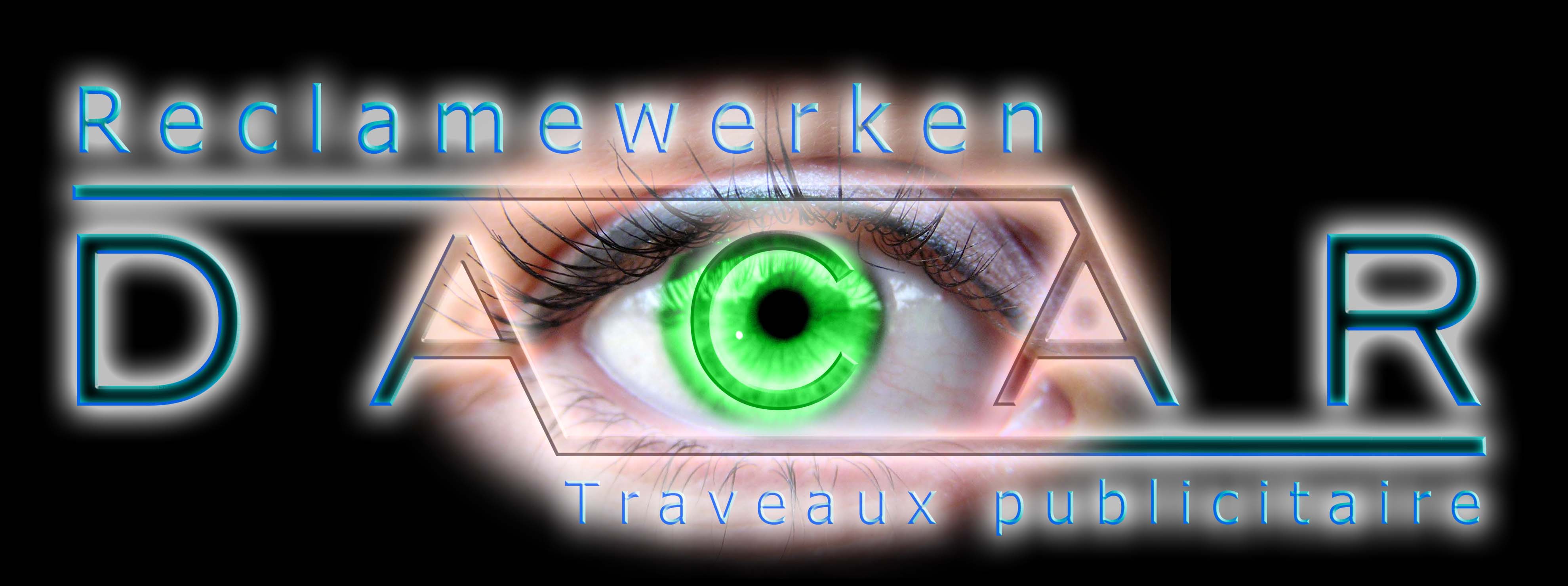
here’s what i’ve come up with so far:
the idea was to have a photo with color accents,
it has to be self standing (being able to use it on all colors of backgrond) to be versatile enough.anyway, is this the right way to go or should i dismiss the eye thing and move on to other things?
keep in mind the photoshopped eye is not finished and is not yet fine tuned in terms of colors, saturation, levels,….let’s just say everything
Attachments:
-
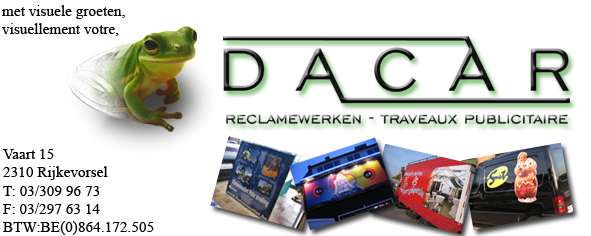
here’s the translation:
met visuele groeten: with visual regards (dutch)
visuellement votre: with visual regards (french)reclamewerken: signs (dutch)
traveauw publicitaire: signs (french)left bottom is contact data, adress, tel, fax,etc…
-

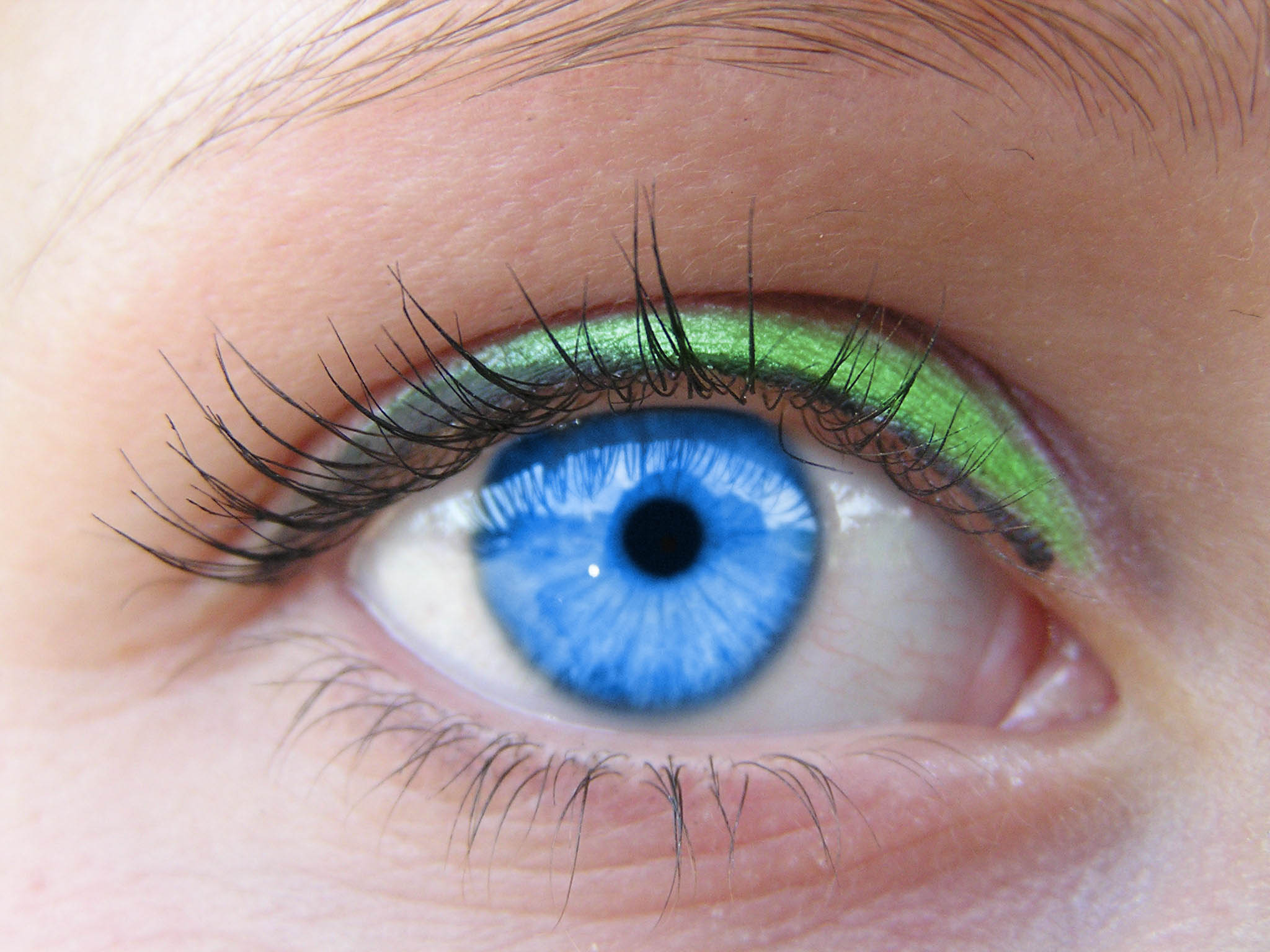
Here’s some I found brousing the web a while ago if they are of any use.
Attachments:


-
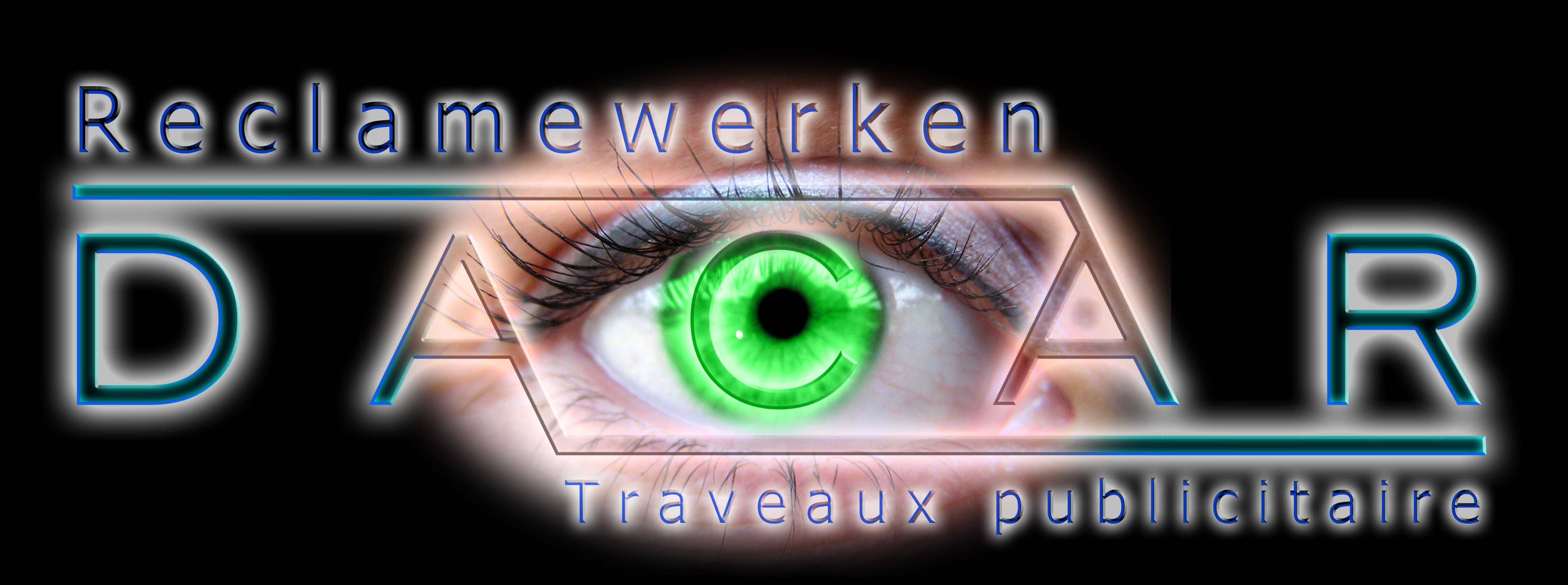
some good ideas
here are two things i did with the eye, if i can’t find a good idea to do with the eye i’ll move on to something else.
Attachments:
-

maybe have another smaller picture or text within the eye?? if you see what i mean? actually in the pupil.
-
what sites do you use to get these images, i use alamay and corbis but often get as good images
-

i like what you have done with those eyes dennis mate… 😉
maybe your not as mad as your picture makes out? :lol1: :lol1: :lol1: 😉
-

very nice dennis….i like that very much, would love to know how to do it in phs 😕 😉
nik
-
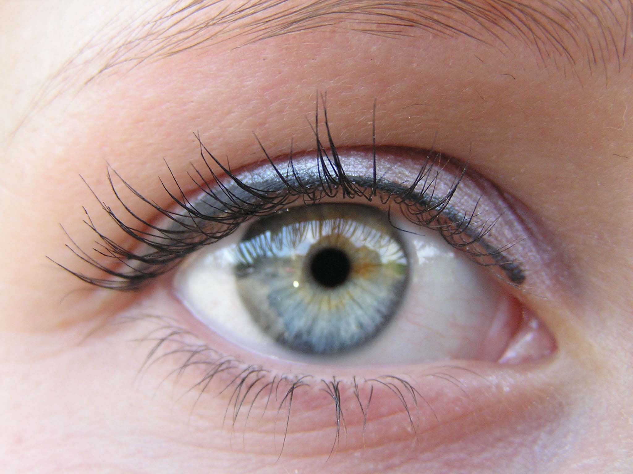
the eye and the frog are from the net.
the sites i frequently visit are:
http://www.yotophoto.com
http://www.morguefile.comhow i do this is not that difficult
i’ll try to show you in the next post, it’s mabey not a bad idea to post photoshop tutorials on the site, i can’t acces the tutorial thread so i’ll post a pic, mabey not so bad to mail some cool tutorials to robert so he can post them on the demo threads.mabey a poll to chech the need of some good psd advice
i’ll stop rambling here and work on a explanation picture
-
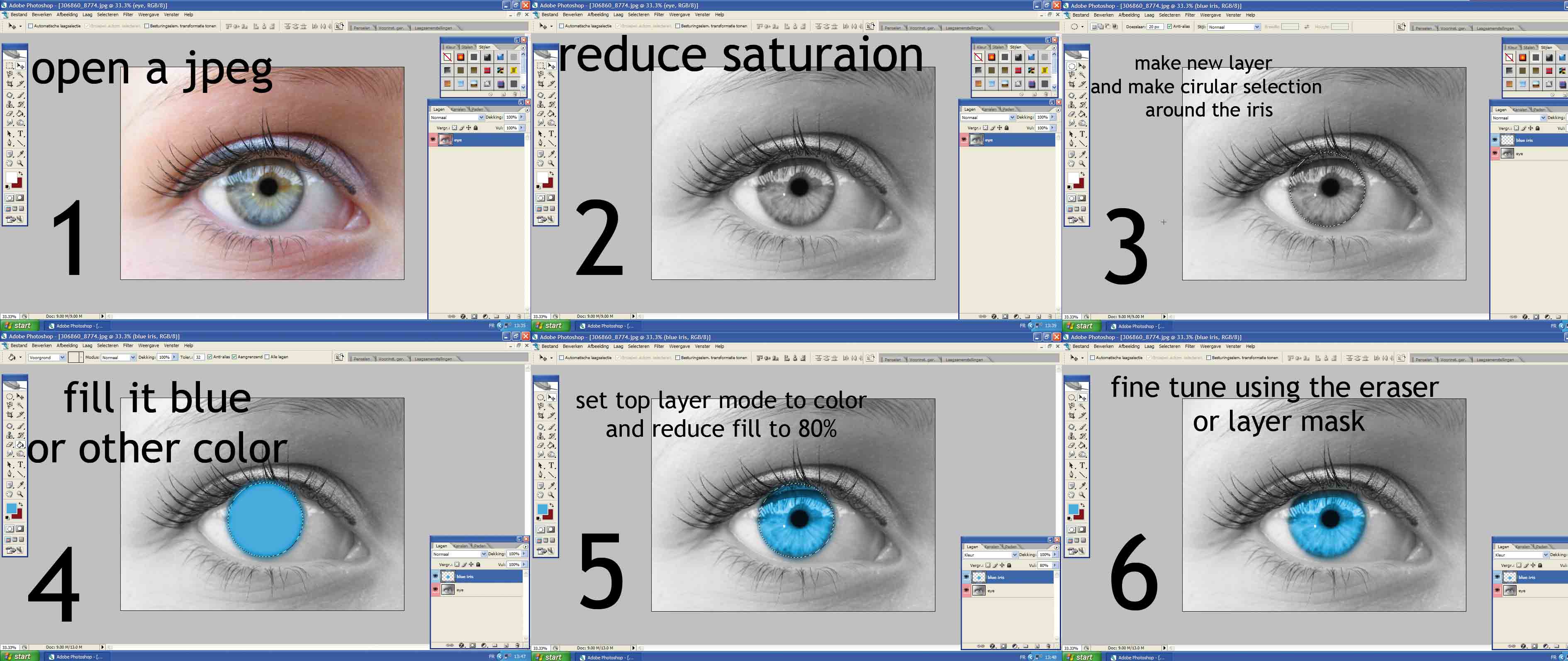
here it is, how i did it.
its a bit difficult to cram all the info in 6 screenprints but i hope it’s clear enough
this was done quit fast so if you want another tut just ask
Attachments:
-
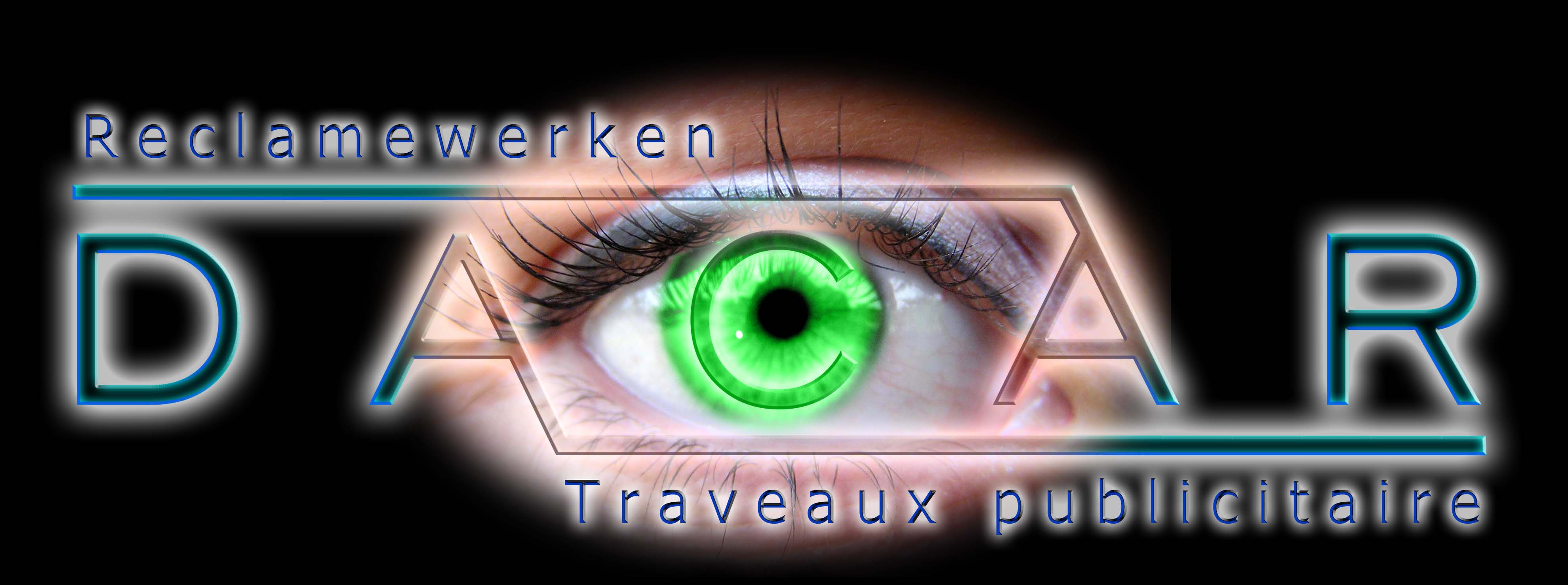
how about this?
is this any good?
got the idea from matt’s reply.
Attachments:
-
that looks fantastic mate!! wow, very vivid spot on dennis, spot on!
-
i’ve shown it around and gotten a few remarks.
so i’ve fine tuned it a bit.if everyone agrees with this and the members of the board here think it’s ok i think we’ve gotten ourselves a new logo. 😀
Attachments:
-
yeah i really like that dennis, real nice job mate. hay you can design a new logo for me!!!! :lol1: :lol1: :lol1:
-
yeah the bottom words are better now you have darkened them more, its easier to see.
-
dennis, have you tried slightly making the c in the eye darker around the edge? but just the edge of the c to see what it looks like?
-
quote matt2112:yeah i really like that dennis, real nice job mate. hay you can design a new logo for me!!!! :lol1: :lol1: :lol1:
hahaha, i’m not good enough mate, this is just some basic stuff i’m nowhere near the pro’s.
i just hope the design gives a possitive, proffesional and modern image
-
chris, it just says signs in french and dutch.
about the C i’ll c what it looks like tomorow, but everyone is positive about it and the new logo has been born.
there is still some fine tweeking to do on both the eye as the letters, but this wil be the definitive logo.
i want to thank you all for sharing your opinions and giving me the ideas i needed to get a nice result.
mabey i’ll post some photoshop tutorials, seeing as i was asked on how i changed the iriscolor

Log in to reply.