Home › Forums › Sign Making Discussions › Graphic Design Help › I would like some constructive help please with this van?
-
I would like some constructive help please with this van?
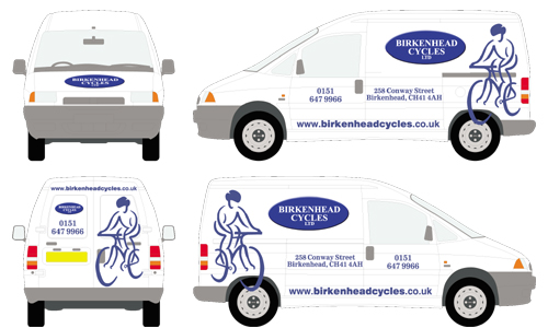
Posted by David Arch on 24 June 2004 at 12:03I would like some constructive help from anyone willing to offer on the design of a Fiat Scudo van for a cycle shop. My attempt is shown below and the customer is pretty keen on keeping the cyclist logo, the rest can be played around with. The oval logo is their current main logo but they are willing to change it if I can come up with something better.
Attachments:
 BostonSigns replied 21 years, 5 months ago 9 Members · 9 Replies
 -
9 Replies
-

I think it looks pretty good as it is.. simple but effective, the onlything I would alter which is only my opinion is that the phone numbers look a little lost on their own.. maybe a pic of a phone or the word would tie it in a little
Cheers
Ian -

I think it’s fine.
The only suggestion that I would add is this:
I would move the biker on the sides “in” a little bit, closer to the oval.
Love…Jill
(If you see the phone # as a problem, on the doors- maybe put them inside a similar, smaller oval, reverse cut. I think you’ll be just fine. I think that adding a pic of a phone would “busy up” things…no offense.) -

I’d change the colour of the cycle to another blue either lighter or brighter for some contrast as the all one colour is a little boring, change the position of the tel no and address, make them larger and smaller respectively, as to the logo on changing it well that depends on how much they want to spend on the van, maybe just do something simple like add an inline to the oval and maybe a drop shadow in pale grey , but I’d make it a good 20% larger, oh and bin the postcode too.
-

I second all the suggestions Steve has given you …… especially adding a lighter shade of blue for the cyclist
Carrie 😀
-

Yep, looks good but I’d swap the positions of the phone number and the address then make the address smaller and the tel no bigger. Personally, I always hate to see tel numbers on 2 lines, I think it looks really untidy so I’d be tempted to try and get the tel number in one line but with such a big logo (bike) I know it becomes difficult.
-
Hi Archie,
Maybe try and get the design off the wheels!!!!
Vinyl on wheels in motion does not tend to last long in my experience. 😕sorry mate……
Nobby 😉 😉 😉
-

any chance of uploading the “bike image” in vector format mate, gives us a chance to have a mess around and upload modified versions for you to maybe use or take what you wish from..
just an option, it gives us a chance to mess around with it too.. 😉 -
How about adding a large copy of the cycle in white reflective on the van as a goast image, seen it on a few vans it is effective. another option is making the oval 3D hence adding a bit more depth to the design!
But it is nice! just a few options!!!
😆
Paddy

Log in to reply.