Home › Forums › Sign Making Discussions › Graphic Design Help › I would like some constructive help please on this layout?
-
I would like some constructive help please on this layout?
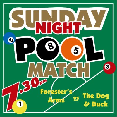
Posted by Bill Dewison on 15 February 2004 at 11:01Here we go again 😀
I’m still working on the R. Lee sign, but at the same time I’ve been putting together some other sample signs.
This one has been designed as a kind of internal pub notice sign, which means I don’t need to tie it to the customer with name & address etc. I intend to use Oracal 651 Gold metallic for the ‘SUNDAY’ and the ‘MATCH’. Initially I was going to put shadows beneath the balls, add in a cue, all sorts of fancy effects, but I decided to keep it as simple as possible.
I’m laying the background green on this afternoon, I would like some constructive help
Cheers, Dewi
Attachments:
 Lorraine Buchan replied 21 years, 10 months ago 9 Members · 17 Replies
 -
17 Replies
-

I think it looks good mate..
Only thing I think is that two thirds down everything makes my head want to squint round at an angle a bit.
I would maybe straighten the 7pm.. I think that would help keep things flowing..
The second would be the names at the bottom, feel a bit open/small/spaced not sure how to describe it..
I wouldn’t add anymore to it I think the overall effect is good. 😉 -

Hi Dewi,
Looks great basically – I think you might just be able to make a living out of this kinda work my friend 😀
I tend to agree with Rob on his comments, possibly move the yellow ball out the way a little, straighten the time a bit (not necessarily horizontal though) and enlarge the team names a little. Not sure about the yellow text on its own with no outline – loses a bit of definition where it goes over the white lines on the table. Could you give this text an outline too (maybe black text with white outline)? or maybe it would be enough to just enlarge/reposition it a bit.
Just a few thoughts anyway ! Keep up the good work 😉Nigel
-

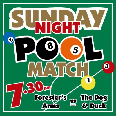
Thanks for the suggestions guys 😀 Any better?
Cheers, Dewi
Attachments:
-

Good work Dewi. Still not sure about the team names – but agree with Nigels comment about them needing more definition. I think it was because they were crossing the white lines in the background. Another way around this would be introducing a break in the white lines and reverting back to a single colour (Yellow?) for the names – try painting the new white outlines you have introduced back to green – this will produce the breaks around the white lines that I think it needs?
Either way, it looks good to me and you could go on forever tweaking it.
I’m looking forward to seeing the pictures of your shop once it’s opened. 😀
-
I think thats better now Dewi, you could try Phills suggestion too, but personally it looks fine now I’d say.
Nigel
-

Looks good Dewi, but I wouldn’t use the 651 gold like you are going to, its probably just me but I dont like the 651 gold at all, seems a bit flat and more of a coppery colour than gold. The 751 gold is far better I think and I always use this if I need a gold colour.
-
I’ll give the break in the white lines a go Phill, its a great idea and a simple solution. After saying that, I really like the way it looks at the moment. There is an alterior motive to doing it this way as there are several pubs who do pool matches up and down the street of my shop. My cunning plan is to sell a metal board with magnetic strips with the teams names on. This may alter the design anyway, but thats what I’m hoping I’ll sell by displaying this example. I was going to go with good ole dry wipe markers and white vinyl, but I like the magnet strip idea, its more fun to make and more profitable to sell.
Martin, thats exactly the reason I’m using the 651 Gold. I bought it the other day because when I looked at the 751 it was a little too shiny for my liking 😀 Valid point though Martin, and useful for ppl to note when they require one or the other of these gold colours.
Cheers, Dewi
-

great design dewi!
agree totally with the gold 651 (auh) too brittle and as martin rightly says it’s a yukky gold!!
remember to watch the magnetic strips dewi!! did not take long for the horrible wee people about my area, who took delight in taking off the magnetic strips, i had made for all the taxi firms names on the doors!!
Nik
-
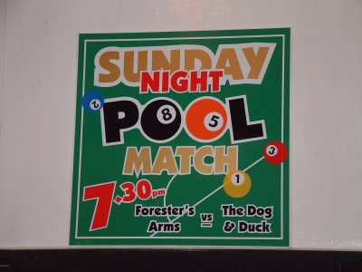
Made this sample sign today (didn’t have digi at workshop but I’ll take a piccy tomorrow)
Did exactly what it said on the tin, cut the vinyl and then spent 5 hours applying it! 😮 Ok, ok, stop laughing 😕 So it took me a while, but I wanted to do it all dry and I hit the odd problem. Namely the fact that it now has more bubbles than a pint of draught Skol! D’oh!!! I’ve got alot of learning to do.
The gold bizarrely looked great, but some of the pool balls where in a somewhat translucent vinyl, so now you can see the white underneath that it overlays. I really should have spent more time on the drawing board with this one and made sure this wouldn’t happen, but in my rush to become junior signmaker of the month, mistakes were made 🙁 The good thing is I wasn’t short of a single tool or material throughout, so at least I know the workshop works for making signs 😀
Anyway, its my first bigish sign and its a sample, so I’m kind of happy with it. Thank you to everyone with your help on the design side. Now if I can get a little more practise on the application side, I’ll be a happy teddybear 😉
Cheers, Dewi
-

Dewi
you have to make the mistakes to learn by them, if you make the mistakes on your own boards then hopefully you’ll learn what not to do when your doing your customers boards.Kev
-
And here is the said sample board 😕 It’s in no way perfect, but as you say, mistakes made now will save on them later. Considering this was my first attempt at a multi-layered sign and only the 3rd full sign I’ve ever made (though I’ve made a couple today), I’m still fairly pleased with it.
And weeding, sheesh! spent most of today weeding like a demon, I’m getting better and better with it now though and only one small cut to my left forefinger 😀 Blood and sweat, its all going in 😉
Cheers, Dewi
Attachments:
-
Well done mate, looks great to me 😀
You got to expect the odd cut finger I guess, even if it’s only a paper cut !
If you want any weeding practice I have just run a sample small cut of a job cut in a holographic film file below – the final job will be based on this design but is nearly 100 sq m – Oh my god, that is going to punish my poor plotter 😕Nigel
Attachments:
-
Obviously I’m tempted Nigel, tempted, but um.. oh, did I mention I had to go over to that thingymajig tomorrow and do that watchamacallit? 😉
After the weeding job I’ve done today, I seriously do not envy that one 😮 How did the logo thing go btw?
Cheers, Dewi
-

Well done Dewi,
I wish my third ever sign looked as good as your sample – to be honest I look back and cringe!
Great job mate but I’m looking forward to seeing pics of the shop. (?) (?)
Cheers
Joe -
Like Joe says, If I think back to my first few signs they make yours look a really professional job ! I remember about a half dozen people all came round to see me cut my 1st job on the plotter and when I hit the GO button it wizzed out about 3m of vinyl and then chewed up the whole lot in front of everyone 😳
Trouble was one of them was a plumber whos van was waiting on the drive to be signed up – that was embarasing !The customer picked up his large range of logos this morning and studied them intently for several minutes – then announced he would have to show them to his missus for approval ! So we’ll have to wait and see on that one thanks for your help anyway guys – got me out of a hole 😆
I’ll count you out of the holographic film weeding then ?
Nigel
-
To be honest I think the only reason my work is at this stage is because of uksignboards. Not just saying that, I’ve learnt so much from everyone here. Granted I did some training to help with the application and generally what the sign trade does, but everything else I’ve been taught by YOUR skills and YOUR examples.
Least saying it that way, I know who to blame when it all goes pear shaped! 😉 😉
I think I’ll leave the weeding for now Nigel, its looks monsterous! Hope that guy comes back with a logo choice soon, dying to see what he goes for.
Cheers, Dewi
-

Great work Dewi, Nice to see projects coming together like this!

Log in to reply.