Activity Feed Forums Sign Making Discussions Off Topic Chat I think that I was fair with my response??

  • I think that I was fair with my response??

    Posted by Hugh Potter on March 18, 2016 at 7:16 pm

    Why can’t people just leave well alone??

    Someone has decided to redesign a very well know fishing rod label, a company I’ve had some involvement with, and asked opinions… I feel I was fair..

    I’ll probably get shot down in flames for this but, you asked for it!! my professional opinion… as a designer who has worked with rod manufacturers for a number of years and who is pretty anal about this kind of thing, is thus…

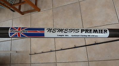
    "Cono-FLEX" The font used is awful and barely readable, The black text doesn’t have enough of a border to clearly define it from the background and it’s got a mix of lower case and upper case script which.. just not done.

    NEMESIS, not horrendous in itself but the red should’ve been added as external outline or contour / stroke, not as a thick outline which eats well into the upright sections of letters, I think it’s been stretched vertically out of proportion too much.

    "PREMIER", would have been better with light outline to seperate it from the drop shadow and give it better definition and depth.

    "rod info at the bottom" has been stretched horizontally out of proportion. it would’ve looked much better if made smaller and slotted in under a downsized ‘premier’ and the sticker made more balanced.

    How is the sticker printed? on clear or white and with what printer?
    If laser or water based inkjet it will fade in no time. Clear or white vinyl? if it’s on clear then it just won’t work unless the whites are printed white, darks will look .. dark. If on white vinyl it’s going to look, well, just wrong and imbalanced.

    I feel bad for pissing all over your bonfire but honestly, that should not be allowed within 50ft of a conoflex fishing rod, it is no way at all better than the original Nemesis premier. Rod labels have a lot of thought and time put into them. I have no doubt you’ve probably put a lot of time and effort into it but please, burn them and stick with the original, if conoflex had asked me to make that decal for them I would have told them the exact same thing.


    Attachments:

    Duncan Wilkie replied 8 years, 3 months ago 12 Members · 19 Replies
  • 19 Replies
  • Simon Worrall

    Member
    March 18, 2016 at 8:02 pm

    I would say you were more than fair, Hugh!

    That is one of the worst designs I have ever seen!

    Simon.

  • Chris Wool

    Member
    March 18, 2016 at 8:55 pm

    Just a redo or 2 in word it will be fine

  • NeilRoss

    Member
    March 18, 2016 at 9:34 pm

    Just sad!

  • Robert Lambie

    Member
    March 19, 2016 at 1:49 am

    it is utter crap! 😕

    design up a couple of options and send them to them pointing out the obvious along with an actual quality sticker with your design and see if you can’t win some work from them. if nothing else it is a nice way to stick your foot in the door. 😉

  • Gil Johnson

    Member
    March 19, 2016 at 10:20 am

    Oh dear, that’s well up there with the worst of them!! 😮

  • Jean Oakley

    Member
    March 21, 2016 at 12:00 pm

    terrible looks like a 12 year olds been let loose with fonts. so unreadable and nasty :yikes:

  • Martin Cole

    Member
    March 21, 2016 at 12:39 pm

    cant see much wrong with them Hugh, why all the fuss

    😉 😉

  • Glenn Sharp

    Member
    March 21, 2016 at 4:26 pm

    Surely that’s a wind up Hugh ??

  • Hugh Potter

    Member
    March 21, 2016 at 5:21 pm
    quote Glenn Sharp:

    Surely that’s a wind up Hugh ??

    nope, the bloke is serious and is offering them (and to make others) for sale!

  • David Hammond

    Member
    March 21, 2016 at 6:03 pm

    Give them credit at least it doesnt have watermarked images on it, or word art, or clip art.

    Other than that, it’s erm… well you know, not very good.

  • Simon Worrall

    Member
    March 22, 2016 at 3:48 am
    quote Robert Lambie:

    it is utter crap! 😕
    it is a nice way to stick your foot in the door. 😉

    Excellent! 😀

  • Glenn Sharp

    Member
    March 22, 2016 at 8:02 am

    Have you had any response to your comments yet Hugh?

  • Jamie Wood

    Member
    March 22, 2016 at 8:39 am

    Most amusing. It looks like someone is trying a new career. Fail.

  • Hugh Potter

    Member
    March 22, 2016 at 12:39 pm
    quote Glenn Sharp:

    Have you had any response to your comments yet Hugh?

    it went quiet after I posted!! there’s a few though..names omitted!

    "These look the biz mate .would u part with a cupal please for my box as I have the ariganl nemasi + these would look great on my box .yours hopefully"

    "Thanks Hugh Potter I probably ask for that yes your right as a professional sign maker yourself. I’m afraid I am not but the customer that I am rebuilding the rods for wanted the rods whipped up with red white and blue whipping the labels he had on there was just cono-flex nemesis premier in plain white lettering nothing else and when I ask the customer if he wanted the labels put back on with the union Jack on he said yes I said save me the time to search around to find some originals that I would do them my self and incorporate the colours in the labels so has you can see. And yes you may think that the font on cono-flex is awful barely readable and sorry as for as for a mix of upper and lower case being used please look again at your name and way you type cono-flex and not to piss on your bonfire but please look closely to the word cono-flex on the original labels in the picture which I have found.
    As for nemesis your probably right but these photos don’t do the labels justice the premier I think stands out well enough, and as for the rod casting details had been stretched and out of proportion but I again I ask you to look at the original label and as I believed this might of been designed by a professional sign /label company.
    So thank-you for your honesty and professional opinion thanks"

    "Just to add my tuppence. If that rod complete with the new style decal came up for sale I’d immediately think "fake" and wouldn’t give it a second look."

    "I’m not qualified to comment on your design but stick to the original mate."


    Attachments:

  • Jamie Wood

    Member
    March 22, 2016 at 2:47 pm

    I don’t think the original looks all that either. All upper case Brush Script???
    Too many different fonts used. I think the Cono-Flex bit looks better on the
    original though.

  • Hugh Potter

    Member
    March 22, 2016 at 3:47 pm
    quote Jamie Wood:

    I don’t think the original looks all that either. All upper case Brush Script???
    Too many different fonts used. I think the Cono-Flex bit looks better on the
    original though.

    I agree but the original is infinitely better! I did design & make a few labels for Cono-Flex before they sut down, I didn’t use all caps script!

  • Martin Cole

    Member
    March 22, 2016 at 4:29 pm

    It’s lucky Jill isn’t around.

    Brush script a good slap, Brush Script all in caps.. hung , drawn and quartered minimum……

  • Hugh Potter

    Member
    March 22, 2016 at 6:33 pm
    quote Martin Cole:

    It’s lucky Jill isn’t around.

    Brush script a good slap, Brush Script all in caps.. hung , drawn and quartered minimum……

    I never fail to think that when I see all caps script of any kind!

  • Duncan Wilkie

    Member
    March 26, 2016 at 8:33 pm

    I’m at a loss for words Hugh. All I’ll say is it’s like taking a brand new Jag. and painting it with a long knap roller.

Log in to reply.