Home › Forums › Sign Making Discussions › Off Topic Chat › How not to letter a van!
-
How not to letter a van!
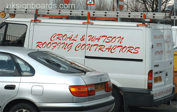
Posted by Robert Lambie on 5 March 2004 at 23:21another i saw today…
a perfect example of a bad use of font.
Brush script, all capitals! This sort of thing makes me cringe.
I don’t know if this was a case of the sign maker not knowing what he is doing or the customer insisting on something he has done at home on his PC.
Attachments:
 Steve Maple replied 21 years, 8 months ago 14 Members · 28 Replies
 -
28 Replies
-

😆 😆 😆 well spotted nik! 😉
i never noticed that..
the probable reason for this is they did not know what to line up with? 😆 😆
for anyone new to the game.. look for 2 letters the same. in this case your base line would be the two letters “o” or “R” 😉 -

Aw Shucks, Robbie…
They just wanted it to look “Fancy”.
This is the kind of thing that REALLY
gets my knickers in a knot.
Some lame-o buys a plotter and BAM!
They are a sign maker!
They probably did an all-caps Old English sign
for their church too.
I swear I have seen this van in Butler County!
Love…JILL 😕 -

yes i agree jill i have had an abundance of customers (no taste) insisted on old englsh type 😮 😮 try and tell them it does not read!! 😮
the customer is always right 😥Nik
-

Just to make you despair even more Rob, I bet they applied it wet. 😉
-
yep rob! as well pointed out! you would be better doing it upper and lower case for that letter!! would look a tad bit better!! 😮 big g would not make a difference if it was wet or dry!! still look awful!! 🙄
Nik
-

Rule 1 of Sign Club: Do not use Brush Script
Rule 2 of Sign Club: DO NOT USE BRUSH SCRIPT
-
I don’t know about that. Of course it’s old hat to those of us who have been seeing it for 20 years or more. But I still think it’s a good looking font when used correctly. Here, it isn’t.
-

One of the old classics, especially in the days of £200 a time fonts.
Trouble is, its been used and abused that much in the last 20 years…
Hands up (and be honest now!), who’s used it without welding the lower case letters?
Now that’s almost as bad as all caps.
-
I love it when you see the spacing opened up so much that the lower case letters don’t even touch. Nice.
-

Yep, thats really really nasty 🙂 Having said that I must say that I have used this font (out of choice on a couple of occasions) and loads of times at the customers request !
But I ALWAYS adjust the kerning so I can weld the l/c letters together neatly and I often remove the little projection links on the 1st and last letters where they don’t have to join up 🙂Nik/Rob you have got me VERY worried now – am I really that blind or stupid ? I’m looking at the back doors on this picture and I can’t see what you are on about – please will someone put me out of my missery 😕
Nigel
-

Nigel you are kidding you mean you can’t see the spelling mistake!
Dave
-
Just joking mate, look at that top left line that’s not a line it’s a curve! like the bottom one! In fact have they stretched the lettering?
Dave
-
… dont do that to me Dave 😥 I’ve just had to go and find a dictionary to check how you spell “contractor” !!!! My spelling is near as bad as Robs I think 😉
But now you mention it I guess there is a slight curve to that line, you have to be a bit eagle eyed to spot that at such an angle of photo – Nik, i’m impressed ! I always rule a base line on to the app tape with fonts like that before fitting to avoid such problems – thanks for putting me out of my missery Dave !!Nigel
-

I think we should give some constructive criticism and show just how good a van like this could look with the use of some simple design skills. 😮
Alan

-
Nice one Alan, that is so much better, fantastic, there is just one thing I would change………. 😆
Brilliant!
Dave
-
quote DaveBruce:there is just one thing I would change……….
I know exactly what you mean Dave; I should have opened up the kerning just a tad on ‘ROOFING CONTRACTORS’ well spotted. 😛 😆 😆
Alan
-
Like it Alan 😀 ! I would constructivly suggest a little more colour though – maybe make the name magenta and give it a light green drop shadow ? 😉
Nigel
-
Thanks Nigel.
This is what these forums are all about; helping each other develop and fine-tune the skills that normally only the customer’s nephew has. 🙄
Alan
-

AND MY PET HATE IS
lettering logos etc fitted to a astra van that is in alignment with the top of the panel like it is on the drawing of the van looks so wrong going down the roadchris
-
ops sorry
posted last with out seeing the post from a newcomer on a astra van who unfortunetly has fallen in to the trap non the less a good effort and only by sharing and discussion can we ALL improve i have been at this for a fare while now and have proberbly learnt more since being a member
than in the last few yearschris
-
I didn’t get this bad in my ‘early learning’ stage 😀
If you like Brush Script type fonts but want an alternative, well balanced and readable style try a font called
‘Soubrette’ 😀
-

There was a programme on the t.v. the other night where a guy and his family moved to sunnier shores to start a luxury boat business. His new boat was unwrapped on the cargo ship and aargh! the boat name was done in all caps brush script – nice (not!) on a £500,000 plus craft!
Showing my age I remember buying brush script as a lead typeface from monotype foundry many years ago -still got it.
These fonts are called “Title Fonts” and were never meant to be used as all caps.
All the best – Paul the printer. -

“This is what these forums are all about; helping each other develop and fine-tune the skills that normally only the customer’s nephew has.”
Alan, you have brightened my day.
mrsticker,
I know what you mean about Astra vans but sometimes however we do them they don’t look right. I used to think that the Astra was the worst possible vehicle to work on, but then along came the new Vito. 🙁
-
and his tattoo’s
for the resurgence of all cap tat
– spose at least you can peel off that laughable disgrace
vito’s – twin sliders too – nasty
impossible to do nicely

Log in to reply.