Home Forums Sign Making Discussions Graphic Design Help help please with design & colours for magnetics?

  • help please with design & colours for magnetics?

    Posted by Marcella Ross on 12 March 2008 at 16:23

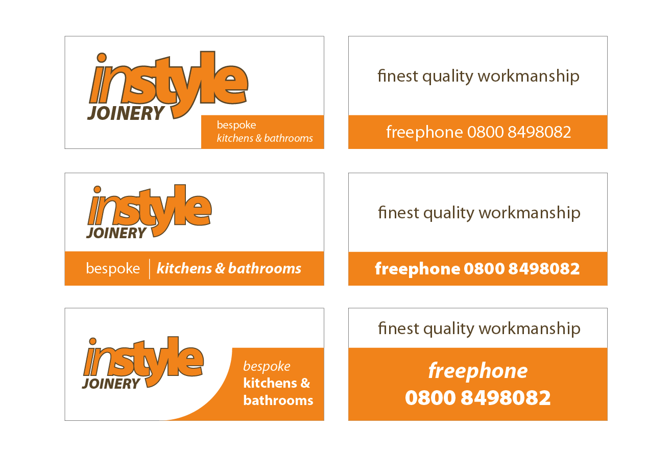
    OK, I’m trying to come up with a design for magnetic panels ……….. which I hate because you feel really limited!
    I am at a loss with this ……… his colours are orange and brown, but he may be open to suggestions. Both mag panels are to be the same size 1190 x 515mm and this is the exact wording he requires.
    I can’t seem to find any suitable font for the name. 😕 Or manage to get this looking right ………. it’s naff! 😕


    Attachments:

    Marcella Ross replied 17 years, 7 months ago 6 Members · 8 Replies
  • 8 Replies
  • Graeme Harrold

    Member
    12 March 2008 at 16:27

    Was there a reason behind the company name as this could be a good starting point. I instantly want to break it into "In Style" as two separate words either by a space or two colours.

    Just an idea………. 🙂

  • Marcella Ross

    Member
    12 March 2008 at 16:39

    nope ………. got to be Instyle as one word.
    I feel restricted because it all has to fit within these panels and nothing I’m doing is working. 😕

  • Jill Marie Welsh

    Member
    12 March 2008 at 16:41

    What you have there looks about a million times better than most mags I see.
    The only thing I’m not flipped over is the script on the second layout.
    I think it needs a more contemporary feel, like in Valentino from Signfonts.com or LHF Stanford Script.
    Or even Rapier.
    I actually like them just fine.
    Love…..Jill
    edited to show you the fontz.


    Attachments:

  • Harry Cleary

    Member
    12 March 2008 at 17:25

    Just playing with shapes and angles.


    Attachments:

  • Marcella Ross

    Member
    12 March 2008 at 17:33

    thanks …… !

    Jill I was searching for a script font and had used Rapier initially then changed it, but I like the others you’ve used better.

    Is it just me or do the colours make it look old fashioned? His notepaper is really bad and I was trying to make it look more contemporary with the font used for Instyle but keep thinking it would be better in dark grey or something.

  • Glenn Sharp

    Member
    12 March 2008 at 18:15

    these wouldn’t be my natural choice of fonts but I’m limited at home ….although I did think it looked a bit different……..I’ve gone for a black background aswell as I think it looks a bit more modern than the brown


    Attachments:

  • Chris Gusman

    Member
    19 March 2008 at 00:36

    Just a quickie but what about something like this Marc?
    Don’t know if you’ve done these already.

    Don’t worry about trying to find a typeface that suits a name too much, just try playing around with a typeface that has variations in weight.

    The typeface used for "Instyle" in your original post i think is too light, and has lots of negative or white space within the letters and makes it difficult to read.

    hope this helps!
    Gusset


    Attachments:

  • Marcella Ross

    Member
    19 March 2008 at 09:46

    Customer has decided to put ALL this info one one mag!!!!!!!!!!! 😮
    After several emails toing and froing, with 3 requests to ‘make the phone number bigger’ 😕 there is a different layout altogether with the name in Sarah Script!

Log in to reply.