Home › Forums › Sign Making Discussions › Graphic Design Help › help please on layout of new van please?
-
help please on layout of new van please?
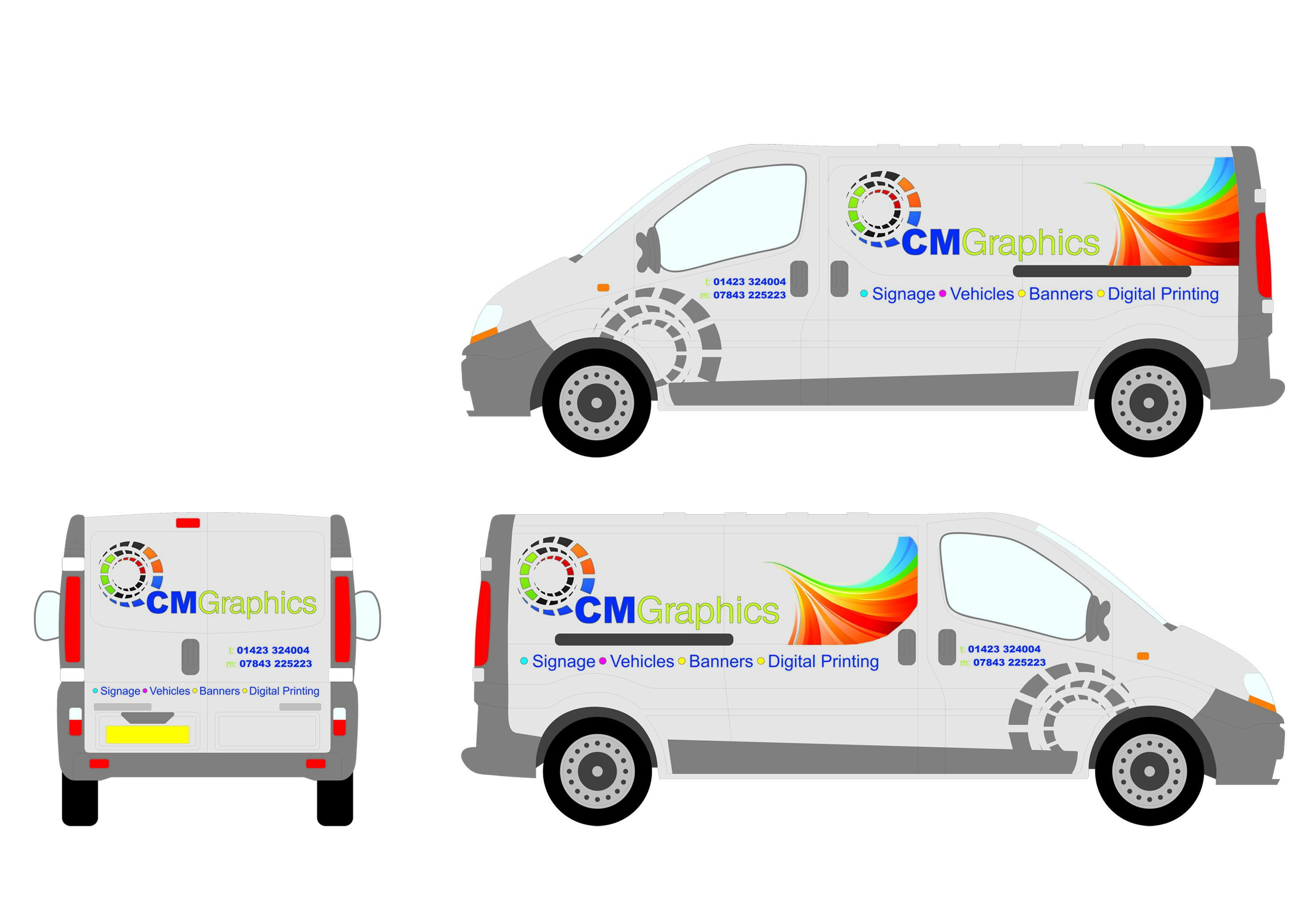
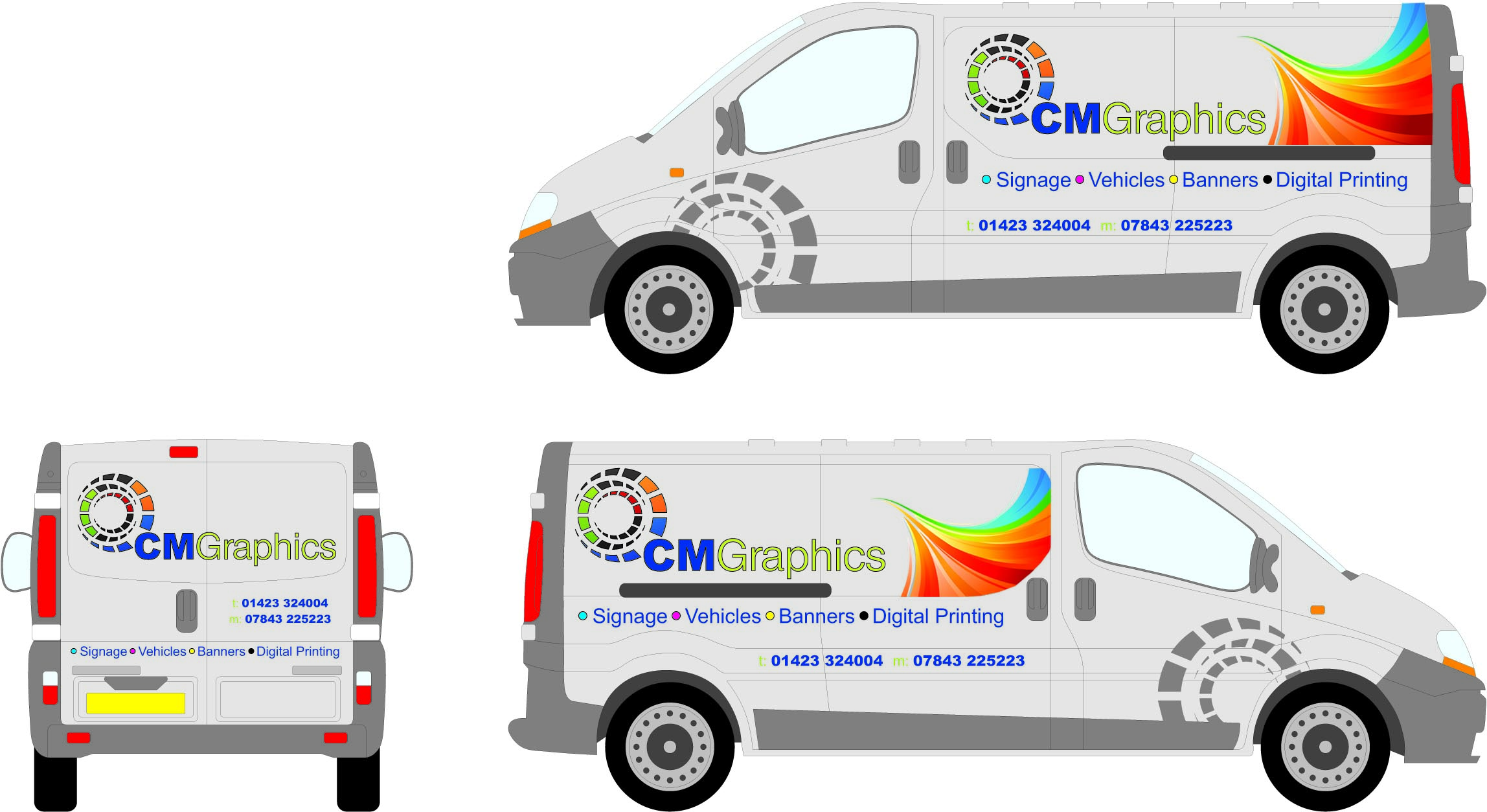
Posted by Mathew Gibson on 18 August 2008 at 14:44Any Thoughts on how this looks? All opinions welcome apart from telling me to go home and not bother!!! 😀
Shane Drew replied 17 years, 3 months ago 14 Members · 25 Replies -
25 Replies
-

I really like the simplicity of the design as, and the "rainbow" colored arch works really well. The only thing I would change would be the last color of the dot "DIGITAL PRINTING", maybe change it to an orange or green.
//Simon -

I like the overall design and effects, abstract yet simple, I think it might be better to put the phone numbers on the side panels under "digital Printing" so that it is not cramped on the door next to the abstract design and could also be slightly bigger but not too big.
cheers
Warren
-

I find it very very busy, with two graphics competing with each other as to which is the actual logo.
The CM is what hits you in the eye rather than "graphics".
Should be more emphasis the other way round in my humble opinion.
Don’t like all the colour change dots on the bullet points, again, draws the eye off the message. -

I love it! Ive always loved colourful graphics.
Id try the coloured disc logo bringing the colours over the grey outline so it softens the look like the swooshing colours and gives more of a contrast to the outlined name.
As Warren suggests, the phone numbers in the middle panel off the doors.
If I saw it going down the motorway id think….they look like they know what they’re doing. -

Love It!!
Maybe change the colour of the word GRAPHICS, apart from that Brill
Ian
-

have you posted this before mathew, im sure ive seen it around the boards somewhere 😀
-

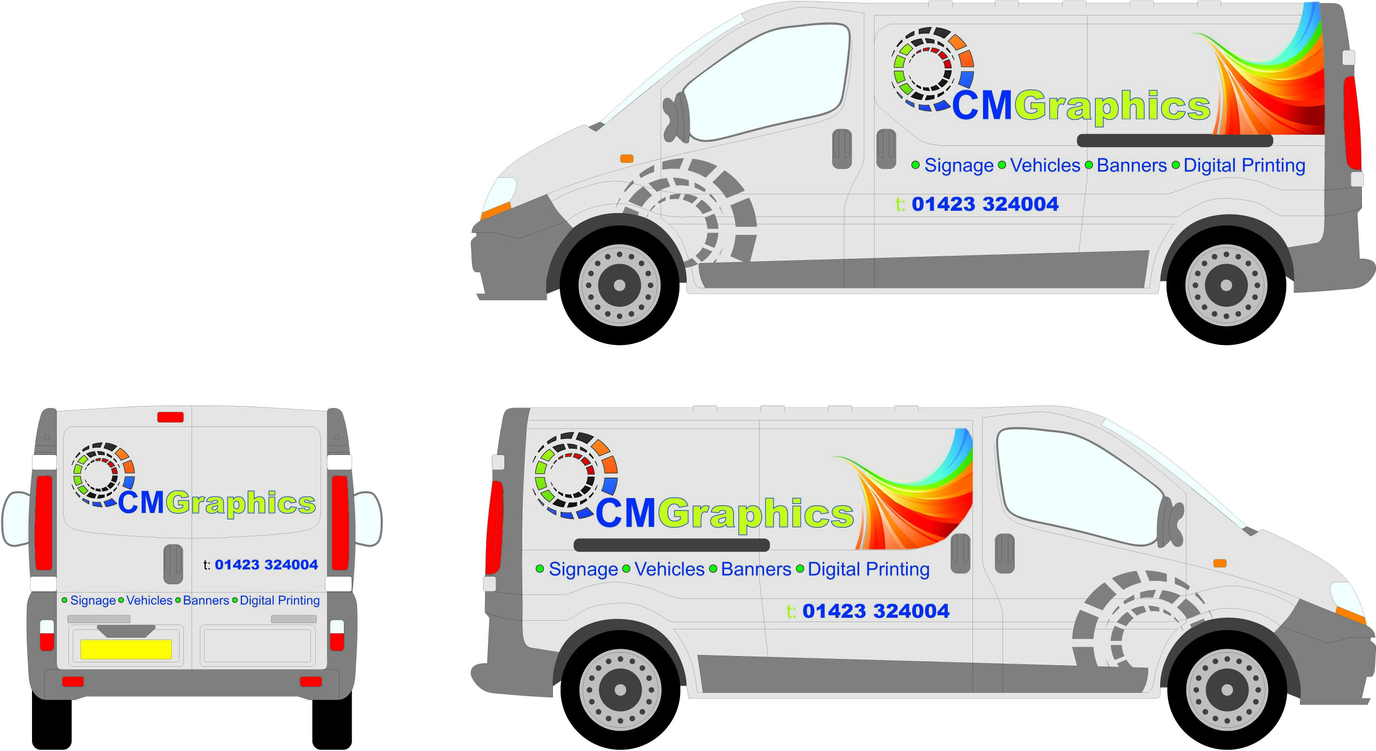
a couple of little changes any better????
-
Nicola, the rainbow swish has been used before by someone, I thought Id seen it before too..its off of istock…a very popular download.
try phone numbers one above the other on the sides like the back. -
change the colour of the "t" and "m" or lose it all together, also the black dot before "digital printing" looks out of place as it is so much darker than the others, I know it is CMYK but still looks odd, try RGB & Y maybe 😕
The outline does make "graphics" stand out more but I don’t like it with the design, everything else is simple and stylish yet that outline makes it look "cheapish" a drop shadow might be better or even a soft shadow if you don’t mind the visible cut line of the graphic.
JMO 😉
cheers
Warren
-

Just a suggestion…why not put a thin blue key-line around the word "GRAPHICS" to tye it back in with the CM
-

I think it only needs one graphic icon, not the swooshy thing.
"Graphics" needs to be bolder or outlined or a tad darker as it is nearly lost. Since Graphics is what you do, it should not be the weakest element.
I would only use one phone number.
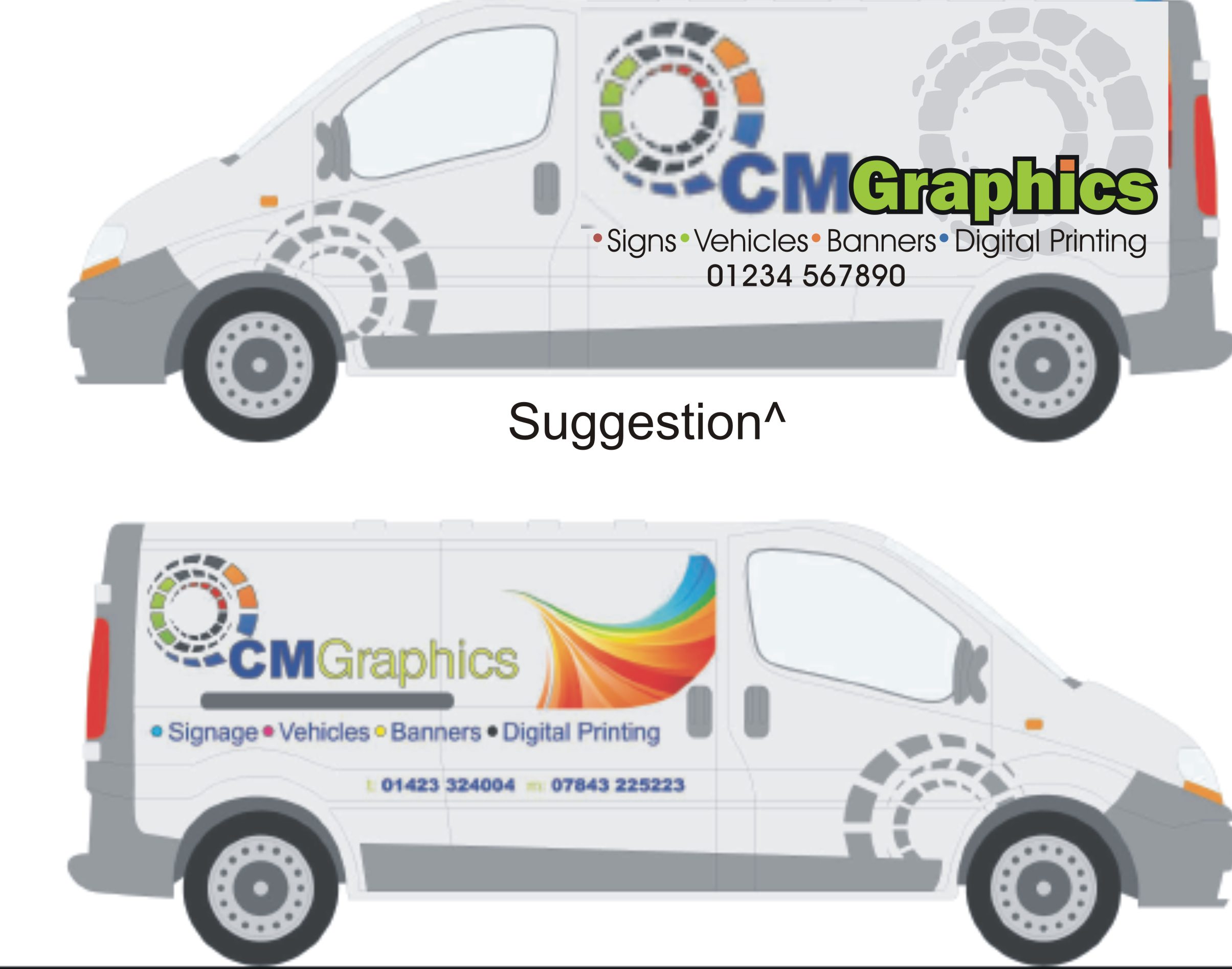
"Signs" is shorter than "signage" and sounds more down-to-earth, to me. Here’s a quick blurry suggestion (top van)
Love….Jill
Attachments:
-

I would make the swirl bleed off and be much bigger, relate to the circle design by rolling into it. The type I would work between different weights of the same font and use just black and grey or maybe grey and petrol with white space………..I think the outlines and any shadows may date the design !..Would be nice to have a vector and do a quickie.
Cheers
-
Here are the main elements if anyone fancies a play
-
A couple of changes on feedback i have got
-
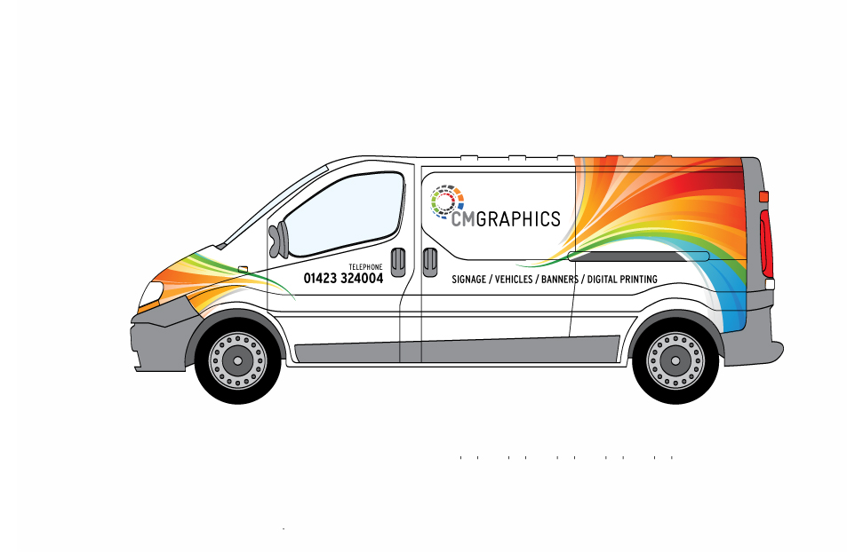
Don’t have much time Matthew…..her’s a quick version.
Cheers
Attachments:
-

Very nice, that aint arf bad Andrew,
I also like Jill’s first one.
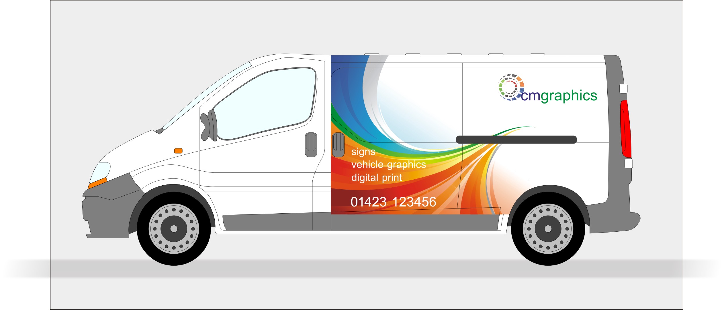
here’s another variation
Attachments:
-

It’s a close one between Andrews and Martins but for me Martins just shades it……….the swirl seems to lead you into the name and just seems a bit easier on the eye
Love them both though…..very nice
-
Andrew’s looks good, but if you took Martin’s and enlarged the CM Graphics part a tad, that would be real nice.
Love….Jill -

What if you switch the swirl on martins so its coming out of the back of the van? Might make it look more seamless in terms of the lines of the vehicle,
-
 quote Jason Xuereb:What if you switch the swirl on martins so its coming out of the back of the van? Might make it look more seamless in terms of the lines of the vehicle,
I like Martins, first class, but as Jason says, I’d have the swirl coming from the back on both sides.

Log in to reply.