Home › Forums › Sign Making Discussions › Graphic Design Help › help needed with vehicle layout please?
-
help needed with vehicle layout please?
Posted by Hugh Potter on 9 October 2007 at 20:22Hi all,
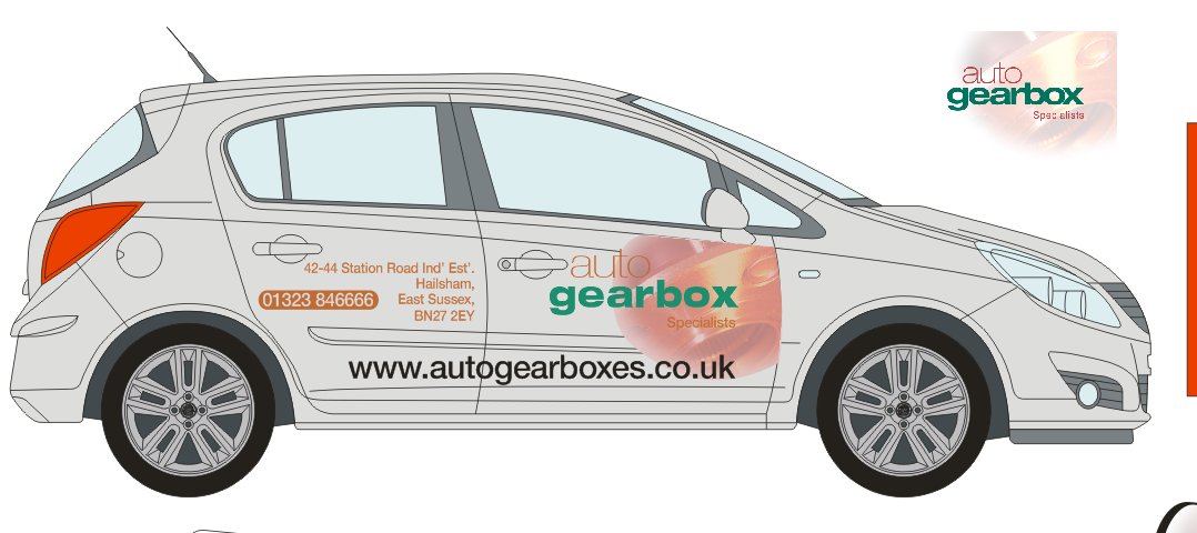
must be 18 months since i’ve posted here !! anyways, i’ve come up against this little job for a local gearbox shop, they’re getting two new corsa’s, 5dr, 1.4 a/c (relevant ?) in star silver, not too sure how close my silver is to it as i couldn’t find it on the vauxhall website, guess it can’t be too far off though.
the logo (print) with the text on it, is how they want it, although the original square sample is as per the top right of the outline, so it can be played with. i’m no good with photo manipulation so it’s still got white edges, sorry.
the other text can be moved around, most of the fonts are helvetia based, they’re not exact as i’m waiting for a couple to be sent to me (helv bold con etc).
please feel free to rip it apart and see what you can come up with, cdr12 only i’m afraid, can’t seem to save ai in less than a 34mb file ! all converted to curved.
if the image remains where it is, it’ll need to be mirrored on the other side, unless anyone has a better idea.
ps, i don’t do wrap, so it’d be nice to keep it fairly simple, unless someone want’s to suggest part wrap and come fit what they suggest !!!!
thank in advance.
Hugh.
Hugh Potter replied 18 years, 1 month ago 11 Members · 28 Replies -
28 Replies

-

i wonder if it’s poss to make it look as though you’re looking through the bodywork ‘into’ the mechanicals ? i know what i mean but am unable to show it practically (lack of photo manip experience !)
-

Hi Hugh.
This is the best I could do.
I suck at photo stuff as well, and am new to Corel 12.
Is it really necessary to put the address on a vehicle? I usually just put the town.
Love…..Jill -
thanks for taking a look and having a stab Jill, it’s a tricky one ! normaly i do just cut vinyl, or just print, have never had to mix the two in such close proximity before, i really envy some of the cleverer photoshop peeps on here !
re the address, it would need to be at least ‘hailsham’ (town) followed by the county ‘east sussex’. but i agree, not all the address would be needed, well… that said, they’re in an out of the way estate, so maybe good to have it as there are several tranmission places on several estates locally. hmmm
i’ll have another play in the morning i think. been tidying / sorting the workshop all afternoon, had to move my race car engine from storage, and all the spare parts, Yank V8’s just too big!! so even more to re-organise and cram in…. shattered now !
-

Hugh,
I would ditch the digi graphic, its to subtle for the man in the street, a cut vector vinyl gear would work much better,Peter
-

hugh that graphic is week have a look on i-stock for gears some very usable stuff there.
chris
-
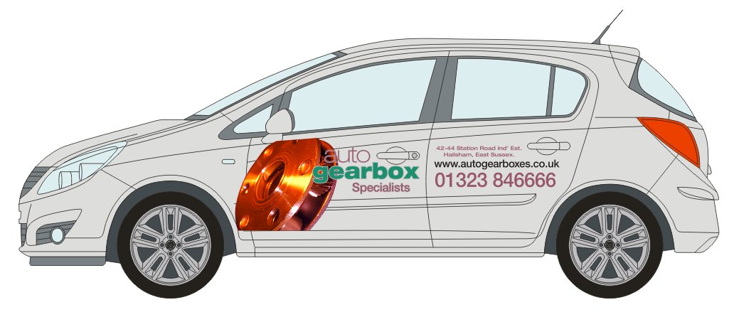
ok, having a play while i wait to hear fro them, gonna see if they can send me the original image. had a lok on istock, lots there but nothing that jumps out at me in the first 10 pages of 160 odd !!
is this any better ? altered the hue / contrast etc.
still not sure, if i go this route, whether or not to have some kind of outline, or ‘cut away’ effect around the image, making it look as though you’re looking into the body of the car. ?
Attachments:
-
Hugh I still say lose all the street address info.
If you are going to put it on there avoid all those abbreviations on the first line.
Love…..Jill -
Hi Jill, i’ll suggest it, but will have to see what they wanna do, i used abbreviations because ’42-44 station road industrial estate’, is a tad on the long side !!
H
-
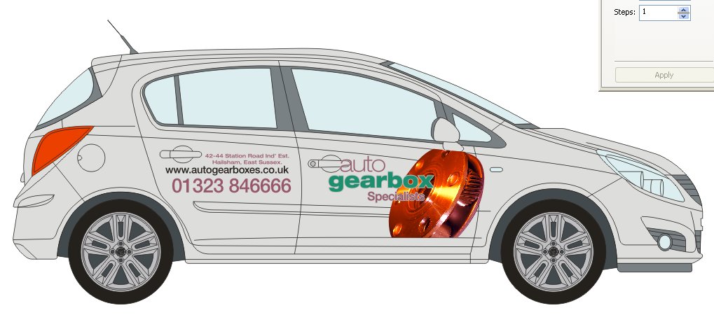
right, i have the full res, original pic, as you can see, it’s a lot crisper, a huge improvement, the feint gear just didn’t do it for me.
does this look any better, and can it be improved upon ? i need to put a contour colour around the web address to make it stand out on the gear (or even reduce it’s size), but otherwise ???
all idea’s welcomed.
Jill, they wanna keep the whole address, sorry !
Attachments:

-

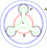
From a mechanical perspective (mechanical engineer by trade) the picture is all wrong, its just an "epicyclic member" and although is a component in an auto gearbox just looks like the first graphic they found. I would urge that the reconsider and go with Peters sugestion and use a cut gear, however I would go 1 stage further and sub the "O" in box with an epi member…………..
Bold outer gear (Annulus) with 3 lighter gears inside (planets) and a single centre (sun) gear. All of which interconnect.
Attachments:
-

That graphic is being placed as a centrepoint to the overall layout and yet means diddley squat to joe public.
Like already mentioned, use gears or even a photo of a gearbox, not a bit which looks more like space junk.
Otherwise the message would almost be clearer with just the text.
Still, as I always say, customer gets what customer wants, so you may be stuck.There is much emphasis on the web address but it is in the worst position to be viewed when on the road.
I think I might try the web and phone number with equal prominence up on the back door and wing and the address moved lower.
Yes the web address will be half the size but at eye level in traffic.Always difficult working on cars rather than vans – not an easy one this.
-
i think if i make many more changes to this, then they’ll be telling me to bog off and the job is gone !!
i appreciate what you’re all saying, but really, i need some on advice on working with what is there, rather than changing owt else. i’ll post a new cdr up (can’t do ai as the file is huge for some reason) so anyone who’s inclined to, might have a play with it,
the design above was just a 2 min thrown together with the new image, not finished in any way !
thanks.
Hugh -

Hi Hugh, i agree with using a simpler, more understandable image but i also think you need to work on the hierarchy of information. I feel the company name and web address are competing with eachother to much, also think about how this layout will transfer onto the other side. The colour of the word "auto" may get lost in the image if you mirror this layout. I find the image is a bit to strong behind the company name aswell. I would drastically reduce the size of the address as this information is only likely to be read when the vehicle is stationary.
I think the colours are giving it an oily feel which i feel is one way to approach it.
Sorry to go on a bit, only constructive criticism.
-

thought i’d have a go and see wht i came up with, let me know what you think
Attachments:

-
i just googled cogs and gearboxes. and ta da. glad you like it 😀
-
Absolutely on the ball there with that design Steve.
Topical, eye-catching, memorable and different. -
I Like that Steve, looks pretty cool, if you have no problem with it, i’ll show it to the customer and see what they think, i really don’t know if they want to get away from the original part though.
here are the last options i sent them, i’ll be popping around to see them later so will hopefully get a better idea.
thanks for the help,
Attachments:
-
no problem show who ever you like fella’
With the original picture, to me "mr average" car user, it doesnt look like much of a gearbox 😀
Glad i could be of some help 😎
-
thanks Steve,
fair point about the image, it doesn’t look like a gearbox to me either, but, i reckon if you put a modern gearbox infront of 80% of motorists they’d not recognise it ! lol.
thanks again.
Hugh -
this is probably about some drivers, thats why sometimes its easy to be straight forward and obvious design wise.
Good luck with the job mate.
-
HI all, went round and saw the customer today, looks like it’ll have to be as it is, as i drove into the industrial estate i knew that ! their new signage is white, and it works really well, so this design is here to stay, i just need to figure a way of toning down the image a little,
does anyone know wherei can find a pic of the said corsa above (1.4 club -i think- 5dr in star silver,) couldn’t find it on the vauxhall website, i’m hoping to save a trip to the dealers for a sneak about !
ta.
Hugh


Log in to reply.