Home › Forums › Sign Making Discussions › Graphic Design Help › help needed please with my first logo design?
-
help needed please with my first logo design?
Posted by Andrew Banwell on 13 December 2007 at 21:42Hi All,
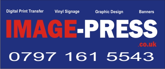
Well, I can turn on my cutter and cut basic text. I am half way through a Corel tutorial and feel that I now have attained the creative level of a dead bullfrog 😳 . I have set my self the project of some simple two colour vinyl logos for the car before the end of Christmas (hot) . Please feel free to rip it apart and help me learn. The background colour is the same as the car to give me an idea of what the finished article could look like in place.
Attachments:
 Adrian Yeo replied 17 years, 11 months ago 16 Members · 34 Replies
 -
34 Replies
-

hi lots of help will be coming
best bet is start keep to black and white till the shapes start to look right.more later er red on blue no
chris
-

Just can’t find the fill tool in X3 that works on the car 🙄
Regards
Andy Banwell -

HI Andrew,
i’m not sure if it’s my eyes playing tricks, but it looks to me that the top line of text, rather than being level, staggers down from high left to lower right ? make sense? maybe just me!
the only thing i’d really change is the phone number, looks much better as (made up number) 07771 329456, or 07771 329 456, we’re all kind of used to seeing codes in the book as 5 digit, so really it’s second nature to read them as such, i do the next 6 digits as the customer prefers, some like it split, others don’t, o prefer it split 5/3/3. much more easy to remember if grabbing for the nearest pen.
it gets easier mate!
dunno what outlines you’re using, but usually you need to ungroup the vehicle, then click on various areas until the whole thing looks selected, then use the colours on the right to change it, then regroup. usually best to ‘lock’ the image when you’re working on it, saves a lot of swearing!
Hugh
-

Never, ever, ever, ever, ever place red text on a blue background (or vice versa). 😕
However, if you seperate the red from the blue with a white outline around the text it would look fine. 😀 -
quote :usually best to ‘lock’ the image when you’re working on it, saves a lot of swearing!
keep forgetting to do that
keep swearing at it 😉 -

The red on blue could indeed be saved by the addition of a thin white outline.
However, the font choice is rather ho-hum, and the phone number appears to be stretched.
It all looks like typed out words, not so much like a logo.
Sorry if I sound mean, I am just being honest.
Love….jill -

[Victor Meldrew mode on]
Sorry excuse me but I am going to sound even meaner 👿 I see one of your services you are offering is Graphic Design 🙄
Trying not to make it personal and I know we all have to start somewhere but why are so many people jumping on to the sign bandwagon? I thought all Brits used to want to own a restaurant or pub, or would be property developers with no experience whatsoever. Looks like they all want to do signs now, it can’t be that hard 😀
Tomorrow Mathew I am going to be a Lion Tamer!
[Victor Meldrew mode off]
-

Wow David, I voiced similar sentiments a while back and got lambasted for it.
How things have changed, years ago there were apprenticeships etc to learn a trade.
Now the entry point for businesses similar to this, where technology has advanced to such a degree, see full blown businesses set up overnight with little more than a home computer and a £250 chinese plotter.Of course these new setups benefit greatly from all the experienced professionals who having spent many years producing high quality skilled work, gladly giving much of their free time providing free training to anyone who asks.
It’s an odd slant on distance selling – if a new sign business set up 1/2 mile down the road from an established business, would they be able to get this depth of information from that established business?
Unlikely, to the point of not b****y likely!
But that same established business is likely to provide a mass of information from the basics of design to a list of suppliers to any new business as long as it doesn’t appear to affect them directly.
Well of course it’s going to affect someone somewhere.
So you can’t blame people for setting up in business when it’s so easy!Well Andrew, you go for it and good luck. We all started somewhere.
You will see a couple of books being mentioned as essential reading on this site.
Do yourself a favour and don’t just buy them, read them. -
Yes Sorry Andrew it does look mean now. I should have been ranting about Estate Agents :lol1: I know I was in a bad mood for something. £2100 + VAT for printing a few A4 sheets which I could have done myself. Thank god I didn’t need a HIP which is a rip off as well!
Lets all become Estate Agents
-
quote David-Foster-:Lets all become Estate Agents
You can start up an Estate Agency with no training, credentials or conscience!
-
Yes David I was going to add that but I couldn’t edit my post. It’s going to be tough for them in the next 12 months. Where did I put my violin :lol1:
Sorry gone Off Topic.
Yes get the books as has been said, Mastering Layout, Mike Stevens from Wrights of Lymm.
-

I would carefully consider offering graphic design services for now, if you have to ask for help on basic layout, and colour choice, like they said above buy the books and then read them, then read them again.
I see that you are offering digital printing so assume you have actually bought decent gear and are not one of the cheap Chinese plotter crew, unlike the cowboy opening a "sign shop" in my town, there’s me, a traditional sign painter, The grain, which is the sandblasted wooden signs, and now this guy who seems to be only able to produce exterior signs from white 3mm foamex, (sometimes 5mm).
He stretches fonts to the point of them not being recognizable, has his text from edge to edge with no space round it at all, and his latest 3mm foam sign is a cooper black stretched upwards in an arc, in blue with a red drop shadow, makes me feel sick just looking at it, and this is in a town of 5000 people
So shortly his work will speak for itself and will hopefully dry up apart from emergency car park signs etc.
The moral of this is, dont try and run before you can walk.
The guy I mentioned has a cheap ebay plotter, and absolutely no knowledge of sign making whatsoever so its annoying to lose work to customers who don’t know any better or what they could have had instead.
The best thing I did was to join these boards so you have taken a step in the right direction so far.
Good luck -

Hi Andrew
Good on you for putting your first design on here don’t knock yourself it takes guts. I would say buy the signmakers bible by Mike Stevens "Mastering Layout" its about £20 and it will bring your work on loads. Also on youtube there are loads of tutorials for the most popular software like coral so you can pick up some good tips and techniques there.Steve
-

Hiya, Have a look at the font used on your own website as it is a little more fun looking font and could look quite good. Have a play round with colours and see what looks good and what doesnt. Steer away from red on blue or as has been said put a white outline round the red. I agree with Hugh as the top line does appear to be staggering downwards. I would steer away from offering Graphic Design until you are more certain of your ability to create a good layout. But good luck in your venture. 😀
-

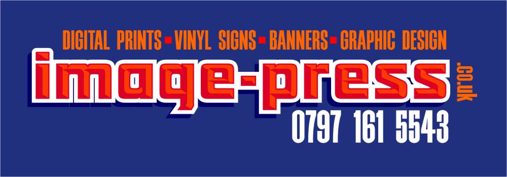
Hi Andrew
I am in no way a designer and also a newbie sign maker but thought I would tweak what you did without really changing too much, just to show a slight difference to what you had but a different impact.
I’m sure if this thread develops the designs will go bigger and better but I just wanted to post something as I cannot explain much more than what has been said.
Just something to look at if you wanted to keep the similar concept you already posted.
Cheers
Warren
Attachments:

-
Cant offer anything at the minute as up to my eyes in T shirts, signs and ties.
But Warren is on the right tracks, I would just make the border white and ever so slightly larger slightly bigger for more impact.
but then again I wouldn’t use those colours unless I had to.Our town bus is blue, has bright red lettering and a really thick yellow drop shadow, well not even a shadow just the same letters stuck underneath the top ones, Ill take a pic and make a rogues gallery I think, there’s enough of them round here to get a nice portfolio happenning
:lol1: -
Nice work, Warren.
I am no designer either, but I tried to use colors you seemed to like (which still make my eyeballs rattle a bit)
:lol1:
I think of a layout as arranging furniture until it fits nicely.
Kudos to you for not writing "Tel:" in front of your phone number…forgot to say that last night.
Do buy the Mike Stevens book.
Love…..Jill
Attachments:
-
Hi all
Warren & Jill
All sign painters are sign designers, whether we choose to recognize it, and accept the responsibility or not. Does this sound familiar?
Me thinks you are maybe a touch modest.Steve
-
Hi All,
Firstly I would like to thank everyone for the responses so far. I would like to respond to some of the comments but in no particular order.
1. I do not have a clue what I am doing at the moment and am using this site amongst other resources to try and learn (I have ordered Mastering Layout 😀 ).
2. I am not trading at present and the logo design is just a project to help me learn (So the services offered on the logo are at present purely fictional). The colour choices were pretty random and based on the colour of my car. Also several people asking what outlines I am using (?) Please could you expand on this as I was unaware I was using any outlines 😳
3. I have no Chinese equipment, I have gone one better than this and scrapped together just enough to buy an antique Roland Cutter. 😳
4. I promise not to open a shop half a mile from any of you and to not sell to customers until I have an acceptable professional grasp of the business.
Once again thanks for all the help and a Merry Christmas to you All.
Regards
Andy BanwellPS. If Santa is looking I want a second hand affordable 😀 wide format printer or if possible an sp540v for free :lol1: .
-
Hi Andrew
Well your first move was one of your best, a full UKSG membership, with that and the will to succeed you have the tools to be successful.
Good luck and don’t be afraid to ask for help.
Cheers
Warren
-
HI Andrew,
re outlines… in your original post you said you weren’t sure how to change the colour fill of the car, we naturally assume your using a cd of vehicle outlines, be it ingrams or impact (better choice) etc, in hindsight i can see you may have been talking about a photo of a car, not an outline,
an outline is basically a wireframe vector drawing of a car, which can can fill with colour to make a reasonably accurate representation of what the finished design will look like, and for doing your layout on.
if it’s a photo, you’d need a draw an outline around it, and fill that, or simply lock the image and use it for layout purposes only, not a colour reference. i have often done as you did thee, and just filled a large box to act as a background while choosing colours etc,
Hugh
-

We all have to start somewhere, but take on board what these guys are saying – helped me no end, and still learning 2 years on!
I too want Mike Stevens’ book, but I can only find it on Amazon UK at £36+, yet on Amazon USA its like £20…… where did you order yours from Andy??? 😕
-
I ordered it from http://www.handover.co.uk Once you browse the site you just do a search for mastering Layout and you will find it. £23.50 including postage.
Regards
Andy BanwellP.S. Looking at their site design they need to read this book themselves 😀 .
-

Hi just to reinforce, the board is your best resource and well worth the money. As an aside, I am not sure about your strapline on your web page. Suggests a printer to me, not a sign maker.
Good luck with it all.
Peter
-
Thanks for that Andy
Just ordered it through them now, so hopefully that will make some good bedtime reading along with all my study books for my IT courses that I am doing at minute.
-
Hi Peter,
That’s quite an aggressive picture there. As my web site doesn’t actually exist, the strap line is pretty well non existent. I have mentioned that the logo is purely fictional at the moment and I apologise if it winds you up.Regards
Andy Banwell -
quote David Glen:Wow David, I voiced similar sentiments a while back and got lambasted for it.
How things have changed, years ago there were apprenticeships etc to learn a trade.
Now the entry point for businesses similar to this, where technology has advanced to such a degree, see full blown businesses set up overnight with little more than a home computer and a £250 chinese plotter.Of course these new setups benefit greatly from all the experienced professionals who having spent many years producing high quality skilled work, gladly giving much of their free time providing free training to anyone who asks.
It’s an odd slant on distance selling – if a new sign business set up 1/2 mile down the road from an established business, would they be able to get this depth of information from that established business?
Unlikely, to the point of not b****y likely!
But that same established business is likely to provide a mass of information from the basics of design to a list of suppliers to any new business as long as it doesn’t appear to affect them directly.
Well of course it’s going to affect someone somewhere.
So you can’t blame people for setting up in business when it’s so easy!Well Andrew, you go for it and good luck. We all started somewhere.
You will see a couple of books being mentioned as essential reading on this site.
Do yourself a favour and don’t just buy them, read them.Yup – You’ve got a point David
But well done Andrew for signing up for full membership – it shows some degree of commitment. You’ll do well 😀
-

I don’t think it was the sentiment behind what David said that got people going…………I think it was just the way it was said
-
Mastering Layout arrived this morning and with a nice surprise…. It was only £18.18 including P&P. Merry Christmas All.
Regards
Andy Banwell -
Ditto……… what a present for us both. Thanks for the bit of advice on where to get it from too.
Now for bedtime reading 😀
-

Thanks to Steve for mentioning "the bible" & Andrew for the Handover link :thumbsup:
Just ordered my copy 😀
-
Finally received my copy of Mastering Layout this week, Handovers had emailed to say they had a run on copies and had been cleared out, I wonder why 🙄
Similar to Andrew, checkout showed £23 but only charged £18 odds :thumbsup:Just finished reading the first 20 pages & what a great book, looking forward to when I understand it 😕
-
 quote Neil Speirs:Finally received my copy of Mastering Layout this week, Handovers had emailed to say they had a run on copies and had been cleared out, I wonder why 🙄
Similar to Andrew, checkout showed £23 but only charged £18 odds :thumbsup:Just finished reading the first 20 pages & what a great book, looking forward to when I understand it 😕
Got mine this week to at the same price. Gets easier the second time around! Think the intro sums it up, read it once for an overview, and a second and third time to digest… he wasn’t kidding!! 😀 😀 😀

Log in to reply.